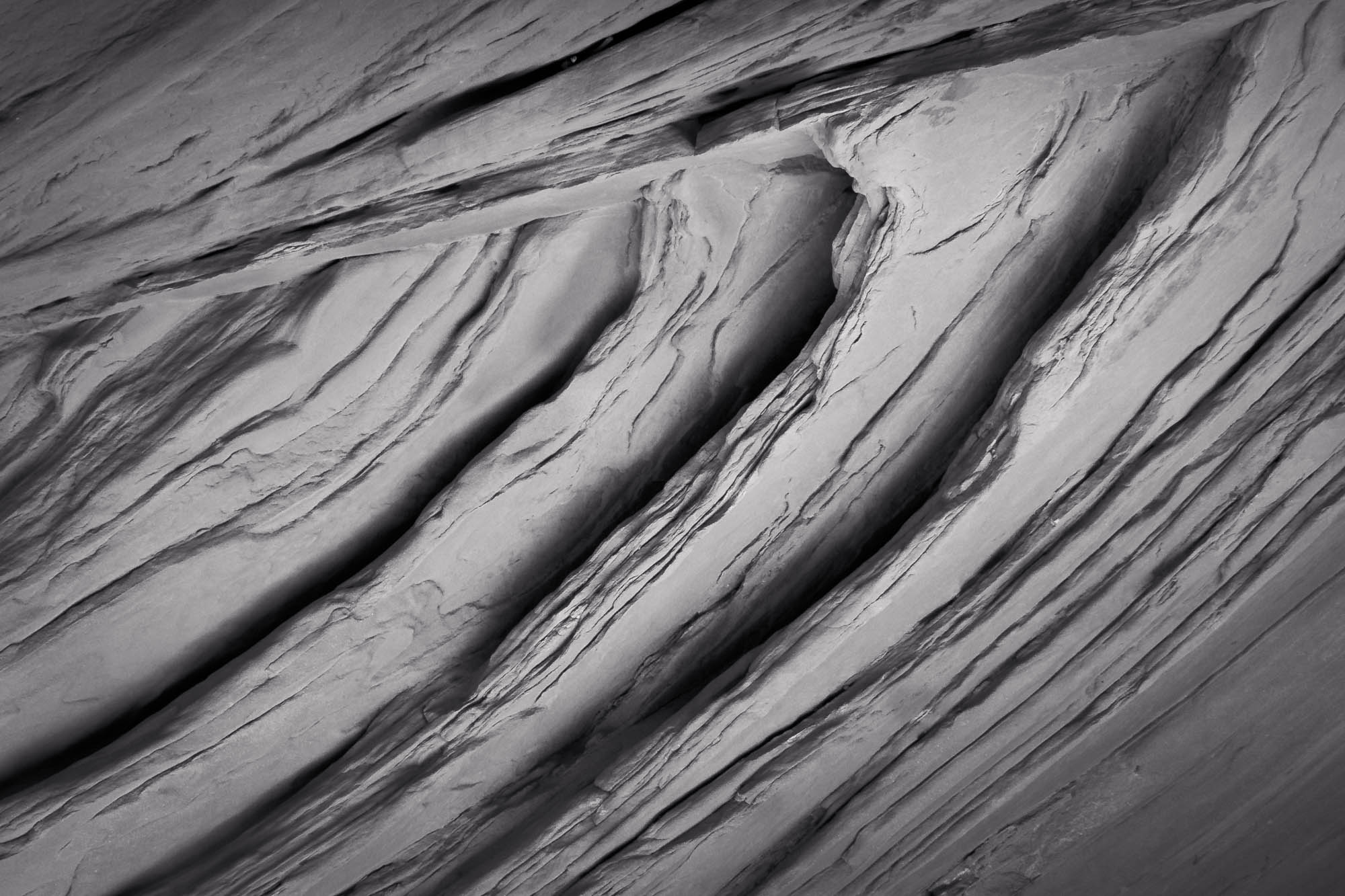
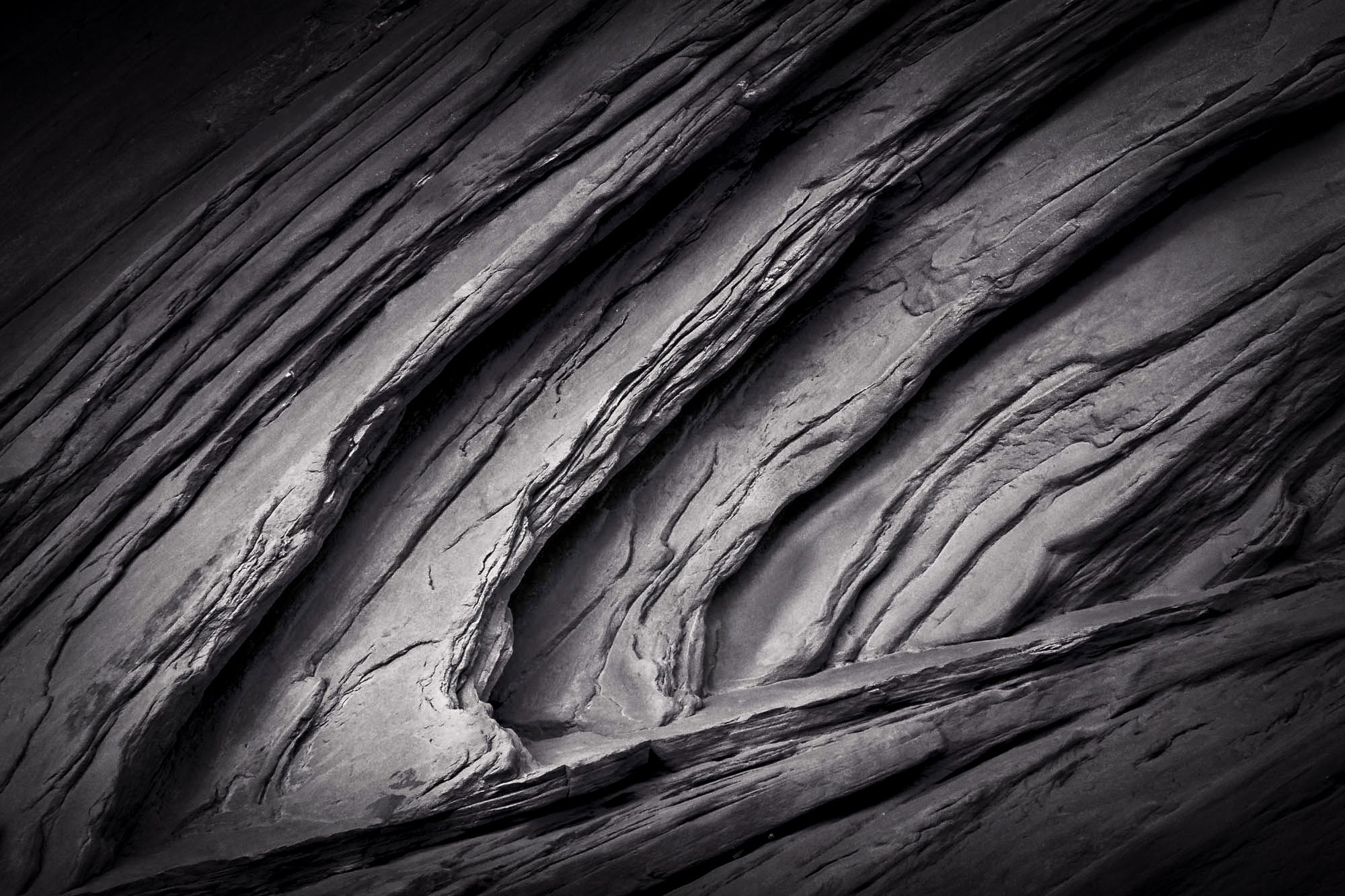
I was intrigued by the texture of this area of a canyon wall.
Looks a bit gaudy in color, so went with monochrome, with a little hue introduced via LR split toning.
Plenty of cropping , rotation, and contrast options exist; this one is a bit off horizontal, as that seemed to feel a bit kinetic, and moderate contrast.
Does it stir you? or more a bit unstirring ?
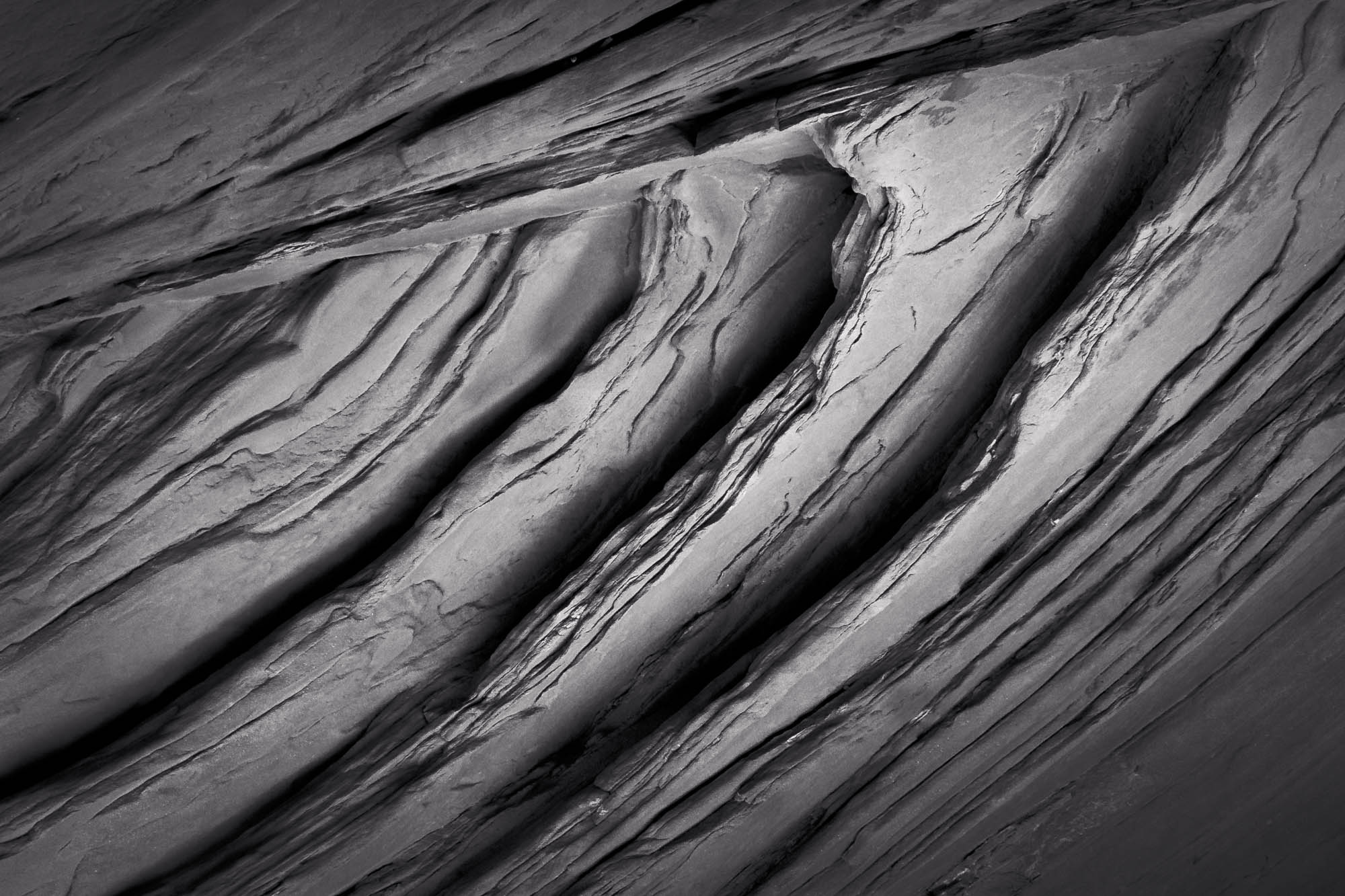
I really like this, especially the more contrasty version. It even has a metallic look to it. I find it a real nice abstract study in lines, textures and tones.
Very interesting image, Dick. I like that it is in B&W, because I think that helps draw our attention to the lines, shapes and texture. It is so easy to miss even seeing a shot like this when we are out in the wide open spaces, looking at the “big picture”. I think I like the more contrasty version the best.
I like this image a lot. The increased contrast is good, but I might even go further with some more dodging and burning to create more depth. It’s a bit abstract, so my eye wanted it to be flipped for some reason.
Dick: Nice work exploring the abstract possibilities. I actually prefer the original since there is more retained detail throughout the frame. Well seen, composed, captured and presented. >=))>