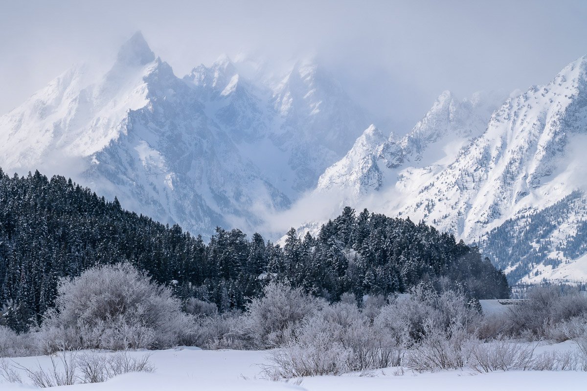
I took this last week on a brief trip to the Tetons. The mountains peeked out momentarily as I was driving, so I pulled over and grabbed this shot from the roadside. Full disclosure, I didn’t notice the painterly feel of the mountains at the time.
Specific Feedback Requested
I’m a beginner and would like any feedback. I’m particularly interested in your thoughts about the composition and color balance. Just starting to play with split toning. Did I over do it? Would this be better as a black and white?
Technical Details
Is this a composite: No
1/160 sec at f/14
200mm with 2x teleconverter
I think your compositions works well Jay and it has a very painterly look about it. I like the light on the mountain and mist. The cool tones work well.
Hi Jay Beautiful image I can see the reason you stopped your car. I like the color balance and I think you did a nice job of processing it. When I was looking at it I tried cropping a little off the top left side and bottom. I also dropped the highlights and increased the shadows a little bit. I’m not sure I improved on your original image but another option for you to consider.
Wow, what a scene! Your toning feels right to me - it conveys cold. I do like John’s crop from the right. There might be just a tad too much of the dark hillside relative to the light bits.
Hi Jim, I am a beginner too. Hope you don’t mind - I downloaded your image to practice some edits. Some cropping, adding a tiny bit more detail in the mountains and minor cloning. Your original looks really cool - the mountains look mystical . Thanks for mentioning split toning. I never heard of it - so I looked it up and learned something new.
Here is an example of the editing I did.
Jay, outstanding image, it has a magical, dreamy feeling to it. And great job on the split toning, it looks perfect. After seeing all the reworks, I have to say I prefer the original post and wouldn’t change a thing about it.
You captured a gorgeous scene and processed ti very well! I love the colors! The shape of the dark trees offsets and echoes the shapes of the mountains. My only suggestion is a very small thing – I would consider adding a tiny bit more at the bottom, to give the closest brush in the LL a bit more room.
Thank you all for the great feedback. The different takes on the comp/crop are really interesting. I was vacillating up and back as the different opinions rolled in. I’m going to set this aside for a few days and then try out some of the comp suggestions. The knowledge and generosity of this group is a gift. Thank you all!
Ben, I’m glad you downloaded the image and thanks for you comments. I like your idea to bring out more detail in the mountains . I like how John accomplished it above.