An improvement with a little microcontrast (which is not the same as sharpening):
Original:
Critique Style Requested: Standard
The photographer is looking for generalized feedback about the aesthetic and technical qualities of their image.
Description
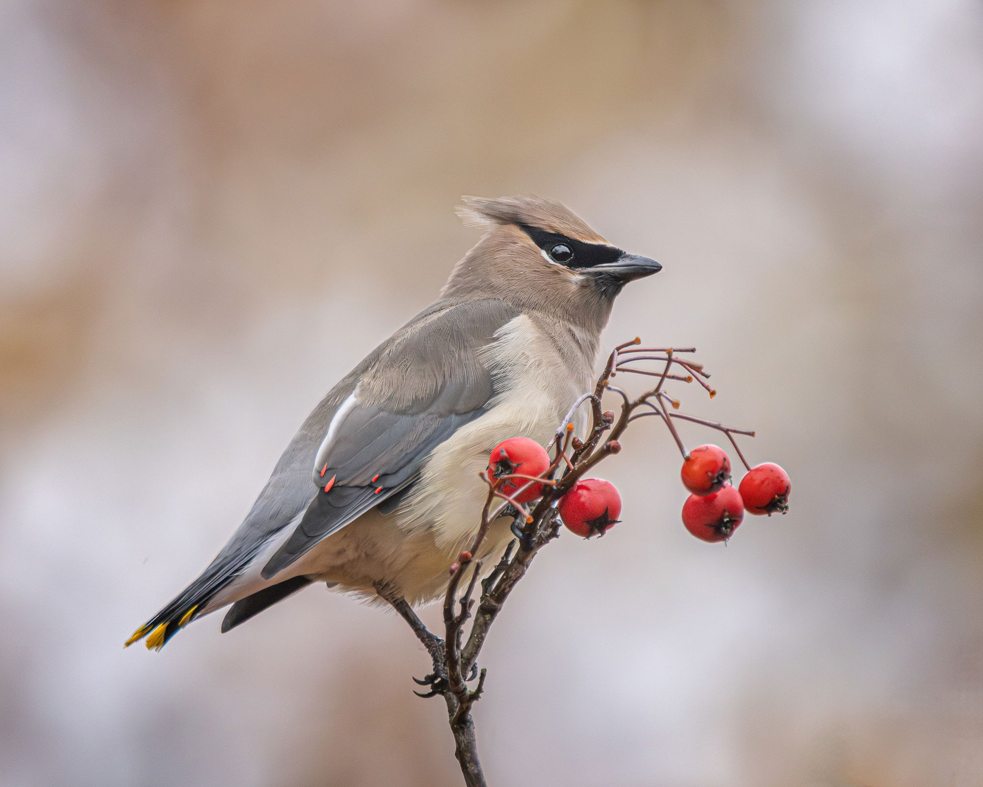
Wednesday the light was too low with heavy fog to get enough SS to try for berry tosses so I went for portraits. The Hawthorn is a dense tree to the chances for a nice BG are slim. I got lucky with this one.
Specific Feedback
All comments welcome!
Technical Details

Denoise in LR and cropped to 43% of the original pixels. In PS a few very small branches cloned out. BG is as it was with two darker areas lightened just a bit.
Critique Template
Use of the template is optional, but it can help spark ideas.
Vision and Purpose:
Conceptual:
Emotional Impact and Mood:
Composition:
Balance and Visual Weight:
Depth and Dimension:
Color:
Lighting:
Processing:
Technical:
1 Like
Nice detail and an amazingly hue matching background in this one, Diane. I wish it had posed a touch more side-on as this angle makes it look a bit chubby.
A wonderful portraiture of this bird. The detail is amazing right down to the small red tips on the wings… 
Really nice shot Diane. Likes: The background bocah, the overall crisp detail and coloring, the reflection offf part of the eye, red bits on the bird matching the berries, a nice clear view. Seems like the bird was intentionally posing. Dislikes: none. Things you could play with: Making the background more high or low key (See YouTube for more info A/R) sometimes dramatic results if it works.
Waxwings are my favorite 
Diane:
Nice look at the cedar wax wing.
For some reason, paradoxically, it looks a little soft until you zoom in on it and then you realize that it’s actually quite sharp. Maybe it’s the body position that is the impression of softness. I do agree with Dennis body position could be a little improved. But the background is wonderful and goes real well with the image.
The image does look soft until you examine the larger versions. Sharpness is excellent! The BG is very nice although very close in color to the waxwing’s crest in that area. I don’t think that you need to do any major edits to this photo as it looks pretty good to my eye. You may want to dabble with some micro-contrast enhancement, but not an essential edit. Very nice and like this as presented…Jim
Thanks, @James_Bartek, @David_Schoen and @Jim_Zablotny! Good idea, Jim, about the micro contrast. The light was so lousy and the ISO so high, I didn’t push things looking for small detail, but in this case I was able to dig out a little more. RP above.
I think messing with the BG brightness would look phony as the delicate outline of the bird would be difficult to select. Denoise sharpened the light area of the tip pf the crest too much and I had to soften it again. (AI has some distance to go…)
Nice job on the repost, Diane. These take a gentle touch as their plumage is very fine and smooth. Some of the denoise packages are getting pretty good. When I came back from Costa Rica in 2022 I tried every one on the market and they all destroyed the crest of a Resplendent Quetzal, but by the beginning of this year I was able to reprocess it from the beginning and it came out pretty nicely.
Hi Diane, love the color palette you captured on bird and background. The other colors on bird and berries offer a nice contrast. The micro contrast really worked well. Well done.
Hi Diane
The repost is sharper, but I like the original better.
Peter
Really nice, Diane. Good job on the repost. I like the pose and how the bird seems to fit into the perch. The berry color mimics the color in the wings and the background is nicely complementary. I’m curious as to what you did with the micro-contrast. Definitely sharper.
Hi Diane, what a cool image. I love the soft colors and glow. The Waxwings up here in Oregon tend to have a much darker coloring…but that may be due to breeding season.
Regarding the repost - I kinda would like something in between. The repost looks great, but when I view the full size, it looks a little too sharp on my monitor…still a wonderful image of a very cool bird.
Thanks, @Dennis_Plank, @Allen_Sparks, @Peter_Morrissey, @Allen_Brooks and @David_Bostock! (And apologies, Dennis – I missed you on the first thanks!) The microcontrast is laughably simple – I use the Texture slider in ACR/LR. If I decide to do it after I’m in PS, I make a new composite layer above all the existing ones and go to Filter > Camera Raw Filter. If it’s too strong I can just reduce the opacity of the layer. Too easy!! And probably should do that with this image, but I won’t take the time to do a RP. Gotta get to work taking down the drip timers before we have a frost, then back to the Waxwing tree.