Critique Style: Standard
The photographer is looking for thoughtful feedback on the image as a whole, especially around the areas noted below.
Feedback Focus: Artistic / Expressive
About This Image
Forres, Moray, Scotland
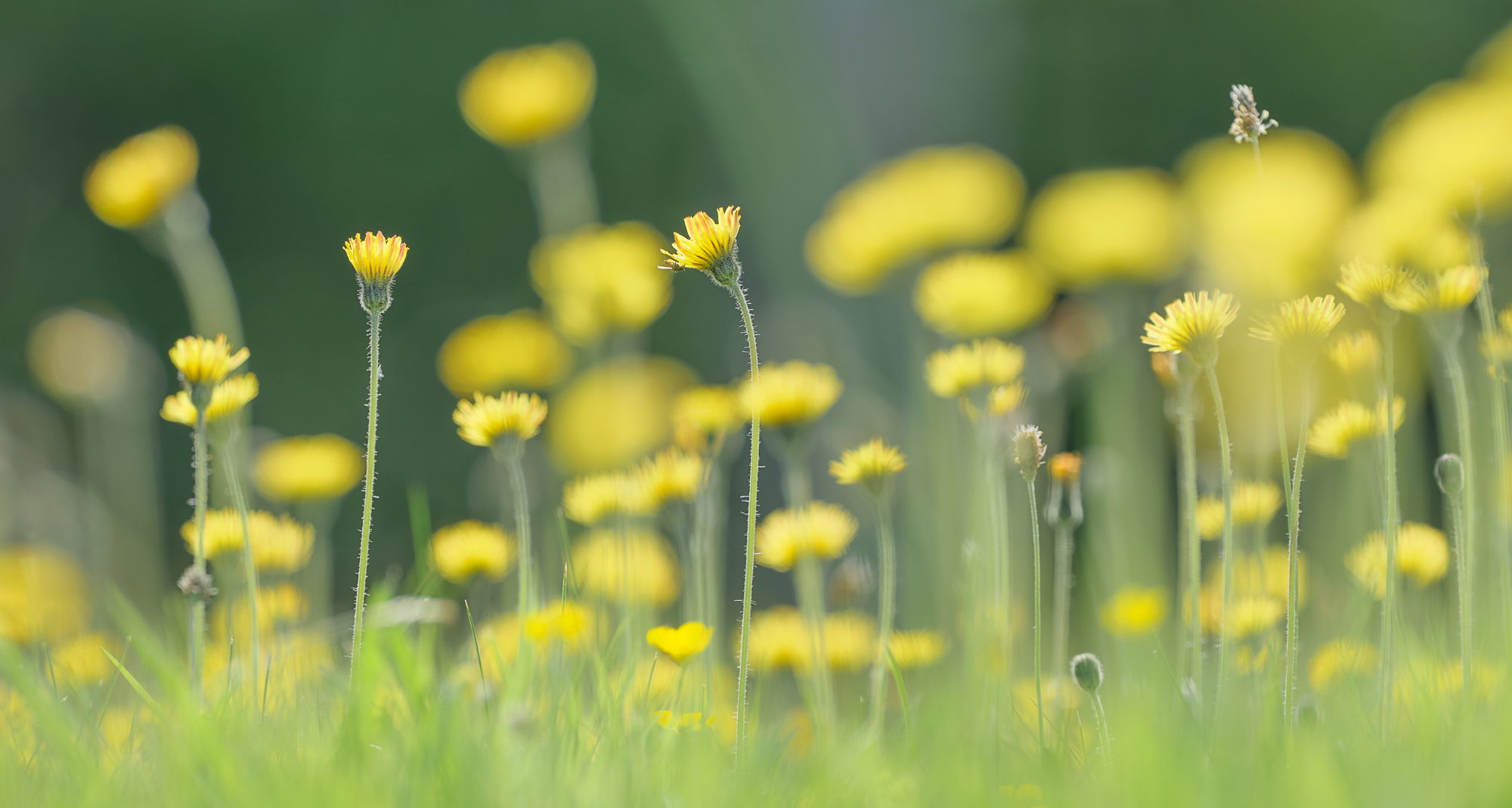
Lying flat on my belly in our back garden amongst a host of golden flowering Celandine. I used a long lens and a wide aperture concentrating attention on a single predominant bloom placing it where possible in an area of the picture that would encourage the viewer to gravitate there. The result is multiple defocussed areas and blobs of yellow against a backdrop of diffuse green grass and above dark unlit hedges. It was immense fun, ticks aside, and I love most of the resulting images.
Feedback Requested
Happy to hear your opinions.
Technical Details
Fuji GFX50S, Fuji GF 500 lens, f5.6, 1/320 second, ISO 400. Tripod height about two inch’s.
I love these images that are more than just a shallow depth of field. The creaminess of the bokeh adds a lot, and does help isolate and contrast the more in focus areas.
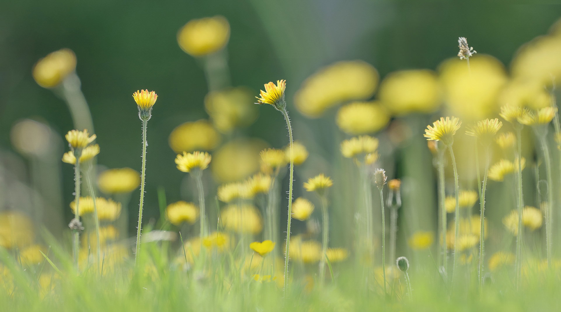
Visual notes based on the original image:
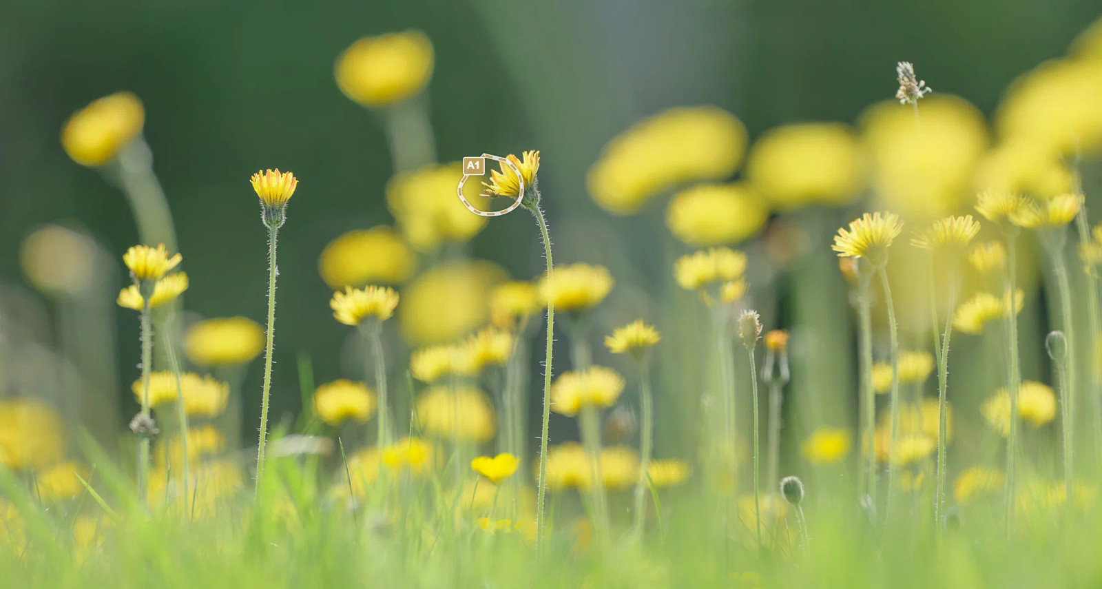
It’s a tiny nit, but the obsessive part of my brain would love to see that central bloom not touching the background flower. I don’t know if shifting the camera slightly left would have then caused issues with the in focus bloom on the left, but if not it might have been worth a go to try and isolate that central flower.
I am really enjoying this image Ian! Gorgeous colours and I like the composition. The effect of the ground level perspective is very engaging. The bug on the hero flower is icing on the cake.
I wonder if there is another version of this image with @John_Williams suggestion incorporated and maybe with the background OOF flowers dulled down…just a bit? Just a thought.
Thank you Glenys. I do have several different versions, not sure that any of them are better or worse than this one. Hello Glenys. Just realised the adjustment you made to the original image, thanks to feedback from Huw. The background flower overlapping the in focus one has been reduced in saturation and brightness which does indeed enhance separation and the improvement is apparent and desirable. Oddly I think the bright white outline of the adjustment indicator that has been a new and recent addition to the critique platform actually masked the visuals and subtlety of the adjustment you made. It might be something that David Kingham could modify ie. Reduce the opacity of the adjustment footprint location indicator opacity, it probably doesn’t need to be quite so strident.
1 Like
Hi @Ian_Cameron
Bit late here but love the image. The yellow meadow is lovely - love your selective focus.
the letterbox crop is inspired - works really well.
Love @Glenys_Passier 's solution to the overlapping flower, and her revision keeps the in focus/out of focus layers separate so the eye can settle on the in focus star of the yellow flower parade
Regards
Huw