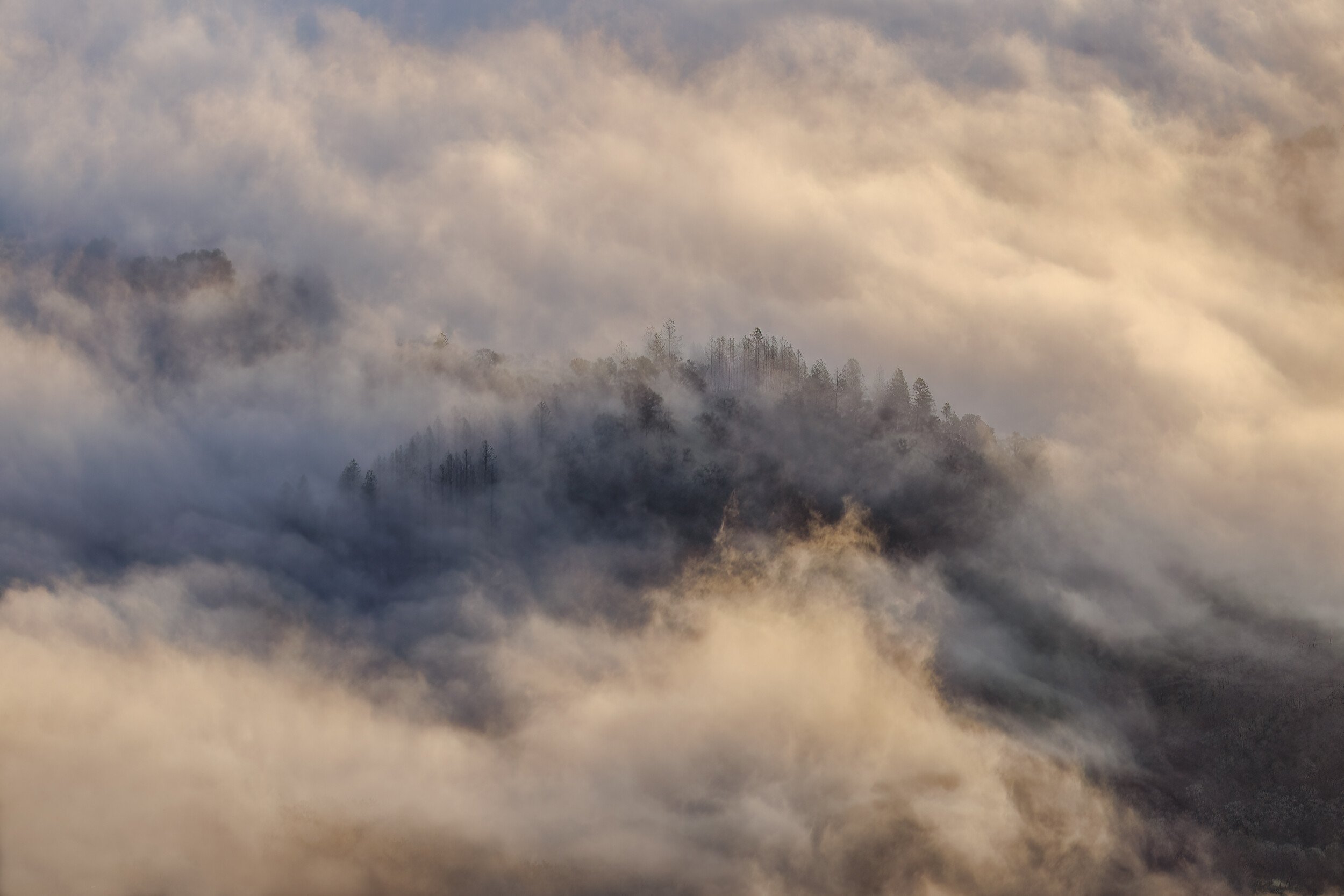
After a lot of rain (a really lot, all winter) today was clear and there was some shallow fog in the low spots. This is an aerial shot at the start of a wild goose chase hoping for some scenic snow. The sun is just hitting the mist.
Type of Critique Requested
Aesthetic: Feedback on the overall visual appeal of the image, including its color, lighting, cropping, and composition.
Conceptual: Feedback on the message and story conveyed by the image.
Emotional: Feedback on the emotional impact and artistic value of the image.
Technical: Feedback on the technical aspects of the image, such as exposure, color, focus and reproduction of colors and details, post-processing, and print quality.
Specific Feedback and Self-Critique
Shooting through plexiglas at an angle does not lead to sharp details, but I think that’s not vital for something like this. I’ve tried to tame contrast but it still feels muddy to me.
Technical Details
Shadows and Highlights in LR to lower contrast, then a touch of Nik Tonal Contrast in PS. Not cropped.
Diane, this is a stunning shot! I love seeing some detail in clouds and the different tones and colors make me feel like I could reach out and touch them. The peaks breaking through the clouds add so much dynamics to the scene. Very beautiful!!
I love these kind of images. They have such drama. I am lucky to live in East Tennessee near the Mountains and I often take similar images. It is beautiful the way it is, though I also think it would make a nice B&W image. .
This is well seen, Diane. Your last 2 images have lots of mood in them. This one in particular has lots of motion to it. I feel like I can feel the clouds moving through my hair. The details are actually really good so I wouldn’t worry about that at all and this doesn’t appear muddy at all to me. I like the color version but a conversion to B&W may help with what you perceive to be muddiness. Just a thought but I like very much as is.
Awesome! Love this image. The mix of light and fog is wonderful. I especially like the warmly lit part of the fog below the trees. Interesting too that the view or vantage point doesn’t necessarily impart an aerial view; ie. this could have easily been taken from another mountain ridge viewing across a valley. Of course that doesn’t matter, the view is beautiful.
One of my early thoughts was to remove the blue color up top and move more towards gray. But then the warm/cool contrast started to grow on me and I’m quite certain I love this as presented. No nits or suggestions.
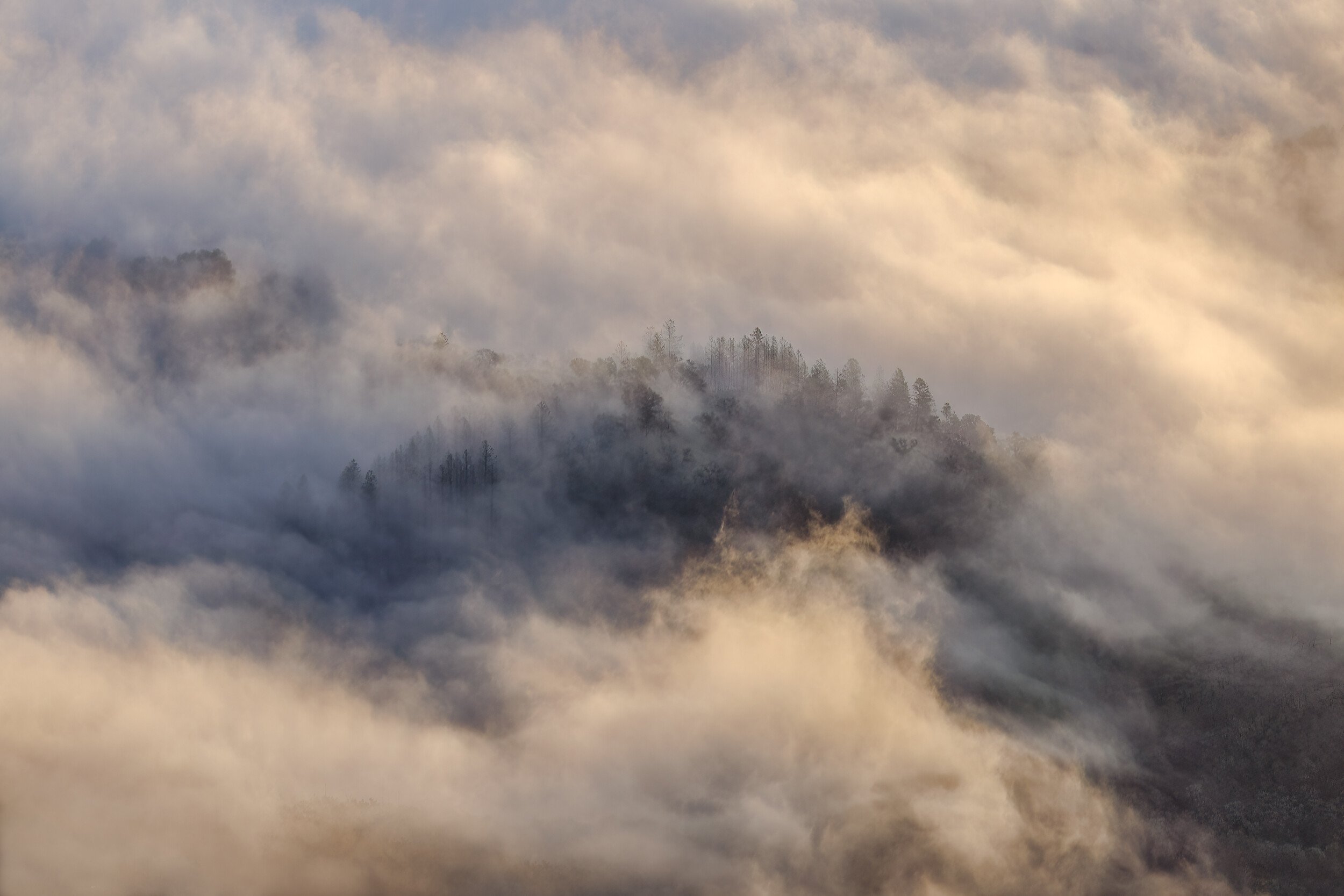
I was curious to see it in B/W and that led to two minor tweaks to the underlying image with low-opacity cloning. The detail int he LR bothered me, as did the brightest bit of fog toward to right. Both are added above.
Your two revisions are nice, but I gotta say that your original is my favorite. When I first looked at the original, I thought it might be a little dark and could be lightened a little, but then I thought it would take some of the contrast and color out of the clouds. I think the contrast and colors in the clouds that blend so well together are what brings out so much depth. This depth makes me feel like I could reach out and touch them. I feel the lighter version loses some of that depth. The B&W is my least favorite because I feel it loses even more depth. When I saw the original version I went “Whoa!”. The others I thought “these are nice”. I’m sure others will disagree, but I’m sticking with the original . Thanks for trying other styles though. I think it’s a sure way to make a better decision on the one that best works for you and it let’s others learn from it too.
The first color revision gets the vote for me. It’s crisp and mysterious and altogether wonderful. The hint of pastels throughout reinforces the quality of the light and mist rather than the trees.
Love this one Diane; it is especially enjoyable at full size where those sharp trees stand out.
I’ll add my vote for the original. I agree with @Kris_Smith about the pastels. In fact, there are just a few cloud areas that trend out of pastel and you might slightly drop the saturation there to even the scene. Here’s a crude example; it’s a subtle change.
I have to say that I am loving the mood in this scene, Diane. The soft warm lighting is sublime and this has an air of mystery to it with the fog swirling around the trees. I much prefer the color version as it just seems to suit the mood better; at least for me. The larger version looks pretty sharp to me so I think you are OK with that. No suggestions from me.
I really like the color version. It has a warm color that creates an uplifting mood. The colors work and the composition is spot on. It looks sharp to me but even if it loses a little sharpness with enlargement, I don’t think that would be a problem.