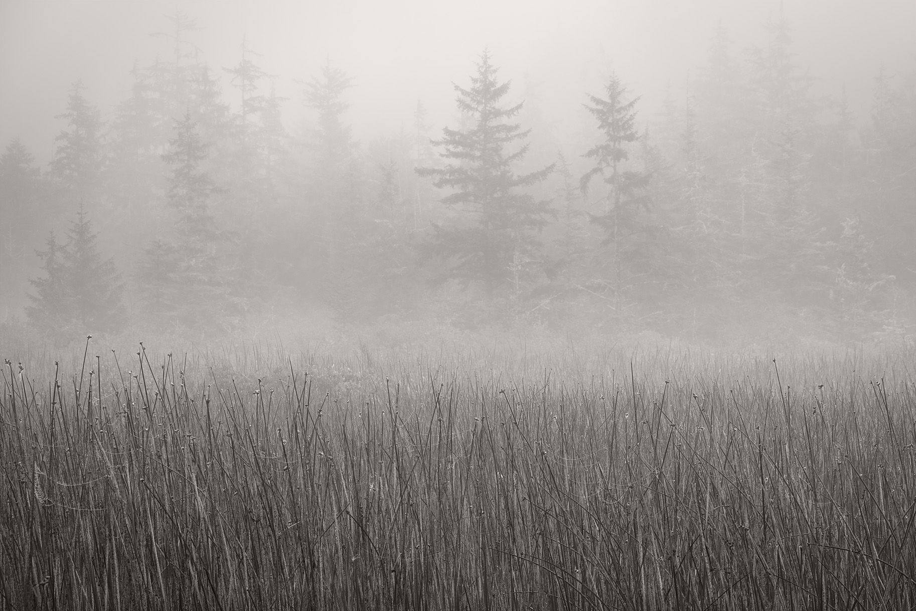
This image was taken on the same stretch of road that @Steve_Kennedy and I were prowling last month, but this is the opposite side of the road from my prior two posts.
Specific Feedback Requested
The original image was slightly more than 50% grass. Should I crop even more out, or does this balance look okay to you.
As always, all comments and suggestions appreciated.
Technical Details
NIKON Z 7II
NIKKOR Z 24-200 f/4-6.3 VR at 75.0 mm
1/40 sec. at f/7.1 and ISO 64
Truth in Blending Statement: Two images blended for depth of field.
Hi John! I love the fog and the tree shapes in it. But I do think as you mentioned it would look better with less foreground grass. It seems like there’s too much in the front that’s not in fog so it takes attention away from the fog. Unless you were wanting to show those grasses. But I think a pano kind of crop would be perfect.
John, this is wonderful. And B&W was definitely the way to go. I love the fog and the trees in the background. I guess you could crop from the bottom to lessen the grass, but not too much, I think it works as is. Well done!
I like this image quite a bit. Those two trees are a nice falling point for my eyes to rest and the FG takes me there too. The crop feels fine in terms of upper and lower balance. My only wish was if there was a third tree. =)
I like this one a lot John! The foreground grasses anchor the scene and the detail contrasts nicely with the veiled trees in the background. The trees have just the right amount of detail to keep my engaged in the forest. Nicely done!
This came out great John! I like the balance and the amount of detail you show. I’m glad you decided not to increase the contrast more to bring out more detail in the trees. This makes me want to work on a similar photo of mine, though mine has that odd political sign - I’ll see about cloning it out.
I like the contrast in the BW version between the sharp grass and the fog. In the color version the grass seen strangely more prominent but not in the BW where I think the crop is fine
I too wanted to see the color version but when you posted it I see why you went to a B&W. The color version grasses are too strong and the rest of the image feels monotone so the B&W treatment is perfect for this. I love the fog layered over the grasses in front of the trees making the two dominant trees stand out from the rest of the background. I’m pretty much ok with this as is. I guess you could play with cropping off the bottom a little bit but doing a scroll crop, I just don’t see how it improves the image. You had some terrific conditions to make moody images.