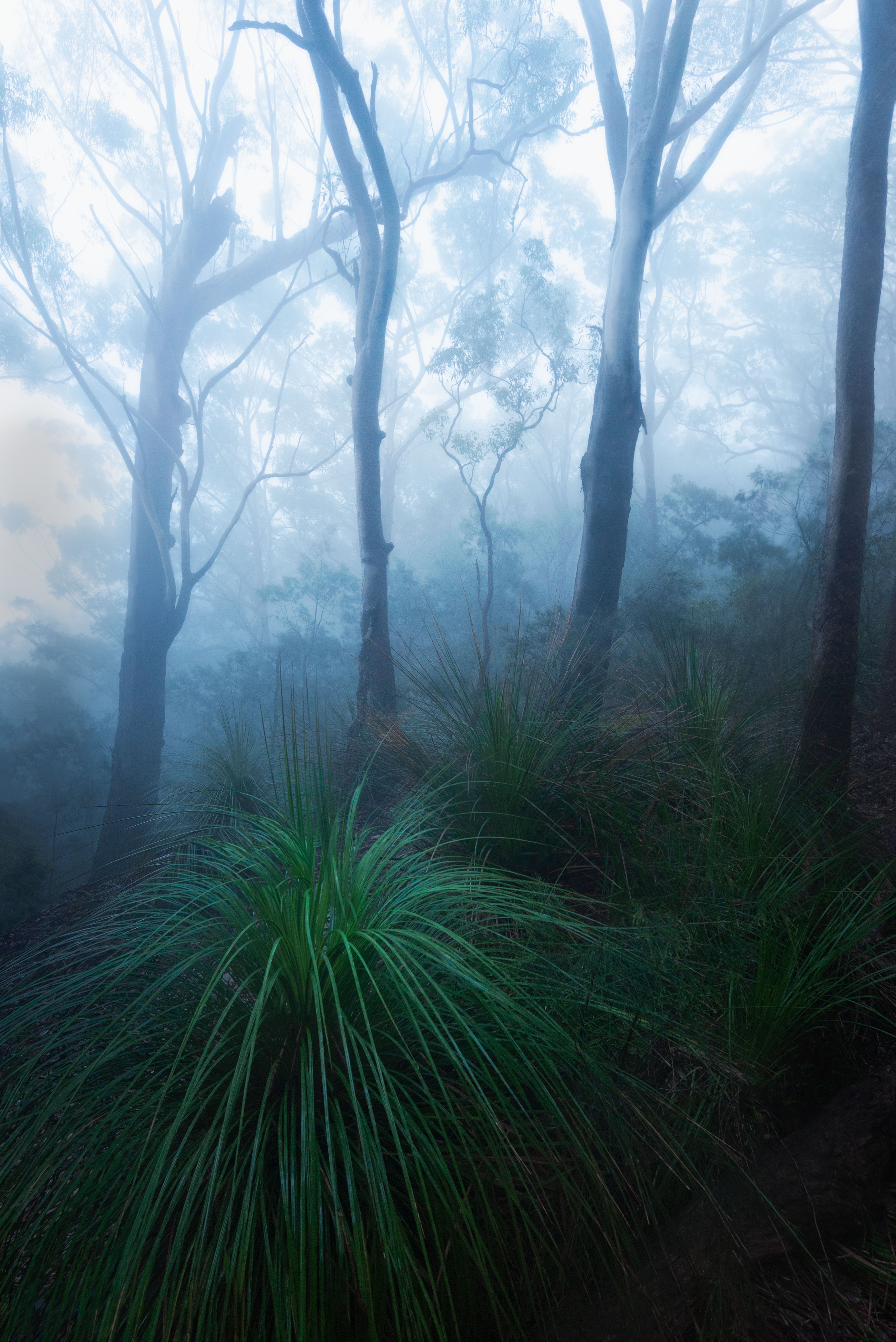
I’m trying to expand my editing past seascapes so here’s a foggy forrest shot I’m working on
What technical feedback would you like if any?
How does the composition look/is there anything I can do to help it, how do the colours look?
What artistic feedback would you like if any?
open to anything
Pertinent technical details or techniques:
(If this is a composite, etc. please be honest with your techniques to help others learn)
Single shot brought into photoshop & edited with camera raw/dodge burned
Dale, nice use of a wide angle lens in a forest. Not an easy thing to do. I like the moody, bluish look to the image.
The only feedback I’d offer is to consider the trunks in the background. The distortion of the wide angle FOV seems to accentuate the trees’ lean on the hillside. I’d consider a minor warp to make them look more upright, though I understand if the stretching/leaning effect is the creative vision you’re going for. Straightening the top of the frame/background is just my taste. If you go this route, it might be kind of tough considering how close the right tree is to the side of the frame. If you’ve cropped this or have a slightly wider view, I bet it would be easier.
Very nice. The blue and the green split on the diagonal work very well indeed. My suggestion would be to make more of that gorgeous fern . The highlights are wonderful but I think bringing them up (without being too heavy handed) could add a lot more life to the lower part of the frame.
I really like the mood and composition in this image. I do like the colors, but my personal preference would be to back off on the blues just a touch.
I do agree with @Kerry_Gordon and would like to see more of the fern and just a bit more into the shadows.
I like the concept and overall mood of the image. The tussock of grass has an interesting shape an makes for an interesting anchor to the image.
In terms of suggestions, i think the luminosity could be better balanced across the image. The most interesting details here are in the grasses, and they are way too dark for my taste. The brightest parts of sky are close to being blown out, and the brightness of the sky overwhelms draws so much attention that it overwhelms the interesting details in the foreground. In my opinion it can be risky to add too much contrast to foggy landscapes. The deep shadows of the foreground contrasting against the bright highlights loses some of the soft and gentle feelings that foggy images normally create. I think you can achieve more balance in the luminosity here without losing the ethereal mood.
White balance is a matter of personal taste, but for me the sky is too cool, as others have already noted.
I bought the highlights down a little to help keep the eye into the foreground a little longer, dodged the foreground fern to help anchor, brought down the blues a touch and straightned the trees
Gorgeous mix of elements Dale. I find combining such high and low key elements to be very challenging, and you’ve done an exquisite job with this one. The rework nails if for me.