More winter weeds! Oh stuff like this can keep me occupied for hours. I think this is an aster of some kind, but the snow clinging to the underside is what caught my attention - gravity defying! Plus there is so much texture.
Type of Critique Requested
Aesthetic: Feedback on the overall visual appeal of the image, including its color, lighting, cropping, and composition.
Technical: Feedback on the technical aspects of the image, such as exposure, color, focus and reproduction of colors and details, post-processing, and print quality.
Specific Feedback and Self-Critique
So like many of my minimalist photos, I struggle with cropping. I wanted the plant to have a place to lean into, so to speak, and to define it, but maybe it’s too much. Do you think the negative space adds or detracts?
Technical Details
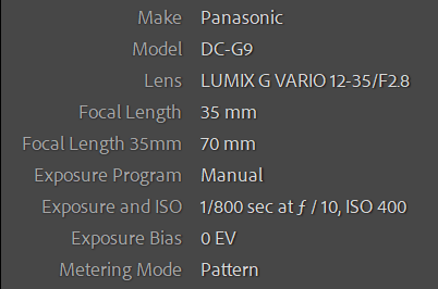
Handheld on my knees in all that lovely powder
Lr for everything - boosted exposure and whites for maximum starkness. Increased texture and sharpening, but not too much (is it crunchy?). Wb adjustment and some saturation and vibrance. It’s a larger crop than I might have done, but I left room in the field because I knew I’d want to have some options.
Hi Kris, I really like these winter images of yours (and specifically this one) and what I like best are the beautiful and warm colours in the dead plant. I also like all of the little details one can see when the image is viewed large. Technically I think this image is spot on and in my opinion the cropping is too. I like your placement of the pant in the frame, that it kind of leans in from the side to the center and I also think that the squarish aspect ratio just fits.
At first, I wasn’t sure about the big clump of darker snow clinging to the plant. In the smaller image it kind of just looks like a dark spot or a shadow, but once I viewed the image larger and for a bit more time, I see how crucial that clump of snow is to the entire image. If I imagine the image without that clump and just leave the plant and background snow the image feels more sterile. I don’t want to say boring because it’s not that, but it feels somewhat lacking –a simple image of an object, a dead plant. With the clump of snow however, the image becomes so much more and rather just being an image of a thing it because an image with a story, a story of winter. I hope that makes sense.
Aww, thanks @Tom_Nevesely - that was a really lovely response and I’m so flattered you took the time. Not that you’re trying to flatter me. That came out wrong, but I’m appreciative of the time and the attention.
The snow is weird and I had some dithering in processing with it. I wanted it to be natural and odd, but not overwhelming to the plant so I didn’t touch it at all, just let the global adjustments do their thing. It doesn’t happen often, but I like it when snow formations do gravity-defying stunts.
“Cling to me”? Just in time for Valentine’s Day Kris, lol. I do love your composition and am sorely missing snow this Winter. Nicely positioned to the left of the frame and leaning to the right. Just a perfect dried flower presentation in nature’s studio. Looks like you nailed the white balance and they do look like mini asters.
What caught my eyes immediately is the great detail you have gotten in the fading aster plant, Kris. Just beautiful. Yes, I do agree the spacing on the right works quite well in that it provides the plant space to fall if it choses or just continue to lean. Very nicely seen and captured.
Thank you to @Jim_Lockhart & @linda_mellor - I wasn’t sure this would resonate with anyone since it is just a bunch of dead flowers. Plus I dithered with that crop a hundred times. I guess my feeling for it was the right one. Plus I just love that snow. Didn’t even think about the approach of Valentine’s day, but that’s kind of nice, too.
This is a great minimalistic image, I like it a lot. Regarding the cropping I think it works well as is, but personally I would like to see just a little bit more space at the top. The colors and the details of the reed is very good, nothing to improve there. Then we have the snow, how bright and cool should it be? Personally, I struggle a lot with that in winter images! It is rather hard to judge without testing it hands-on, but maybe the snow could be a tad brighter? Finally, how to show the white hanging snow against the white snow BG? I think you have managed that very well, the hanging snow is shown but in a subtle manner that I find pleasing.
Thanks @Ola_Jovall - I’m glad to have you weigh in on this. Crazy what we put ourselves through. Also glad the hanging snow is natural looking, but still shows up as what it is.
Funny you should mention that! I always change the frame in the develop module in Lr to white when I work with winter photos. That way I can gauge what’s happening with the whites against true white. And as we northerners know, snow is hardly ever pure white.