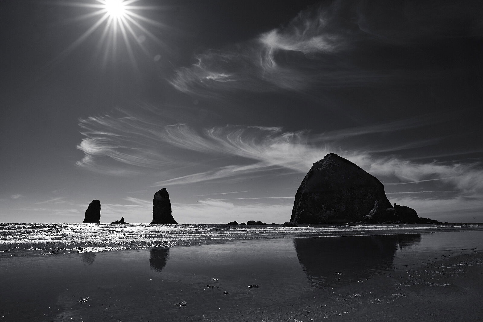
We got to Cannon Beach during the harsh light of afternoon, and it seemed like the images almost hurt my eyes. The color (although I’m sure I could modify it) was very harsh. However, I didn’t want to pass up the fact that we were there, and the clouds were beautiful above the rock formations. I’ve heard that in harsh light, black and white is often the best (only?) option, and that deep blues convert well. I decided to give it a try, and I think it’s on the right track.
Specific Feedback Requested
Should the sun be all the way in or all the way out of the frame, or is partial okay? I never thought of it before, really. I can’t get it all the way out (ends of the sunstar rays), but a 1x2 crop does eliminate most of it as an option. Any other tips (composition, black and white conversion, etc.) are also welcome.
Technical Details
Is this a composite: No
Sony A7C, 20mm, ISO 100, 1/500, f 11
Processed in Capture One using the Deep Sky brush to make it more punchy and then converting to black and white. Small contrast adjustment and recovered the shadows on the rocks very slightly and reduced the wave highlights very slightly to take the edge off. I was experimenting, so it probably wasn’t the most efficient, and I have an unnamed mystery layer that I’m not sure what I used for.
Karla, a good combination of cloudy sky and mid-ground rocks. I think the sunstar is distracting and draws the viewer to the top of the frame. Cropping the image to a 1:2 aspect ratio as you indicated will remove the distraction but you will lose the top cloud in the process. A more panoramic crop may suit the image. Darkening the sky worked well. Perhaps consider reducing the highlights / whites in the waves.
@anthony4 I couldn’t see a way that would get rid of the sun and keep all of the clouds, but I know what you mean by the sun being distracting. When I did look at the 1:2 crop, I felt like it was stronger without the sun and I maybe can eliminate some of the remaining brightness. I should be able to pull the water highlights down some. I’ll try to experiment a bit. Thanks for your observations.
For me this is a HOLY COW!!! I LOVE it! The sunstar is perfect for me as so much of the image is high contrast – and the B/W is a wonderful way to salvage that light. The areas of softer contrast set it off nicely, in the sand and most of the sky. The amazing clouds point at the sun and justify its inclusion.
Karla, the clouds and sky are especially compelling. My thinking is that I’d like just a bit more of the sun in the frame, so that there are some upward pointing, but short, rays at the top. Being able to see just hints of texture in the big stack on the right is a nice balance to the sun (although I might try just a touch of dodging there). The wet sand makes a fine lower portion.
Hi Karla, really nice image and I really like the sun star. I don’t think it takes away from the rest of the photo. I also like the reflection of the rocks.
@Mark_Seaver I may have another image from the series with a bit more space on top. I’ll have to look. I thought there were some distracting bits when I tried to lift the big stack more, but I might be able to be more selective and get more out of it yet. Thanks for your insight.
@Jim_Gavin Thanks, Jim! I guess it’s not cut and dried, which I appreciate also. Sometimes I don’t know what’s up to individual preference and what’s more a rule of thumb. So much to learn!