Critique Style Requested: Standard
The photographer is looking for generalized feedback about the aesthetic and technical qualities of their image.
Description
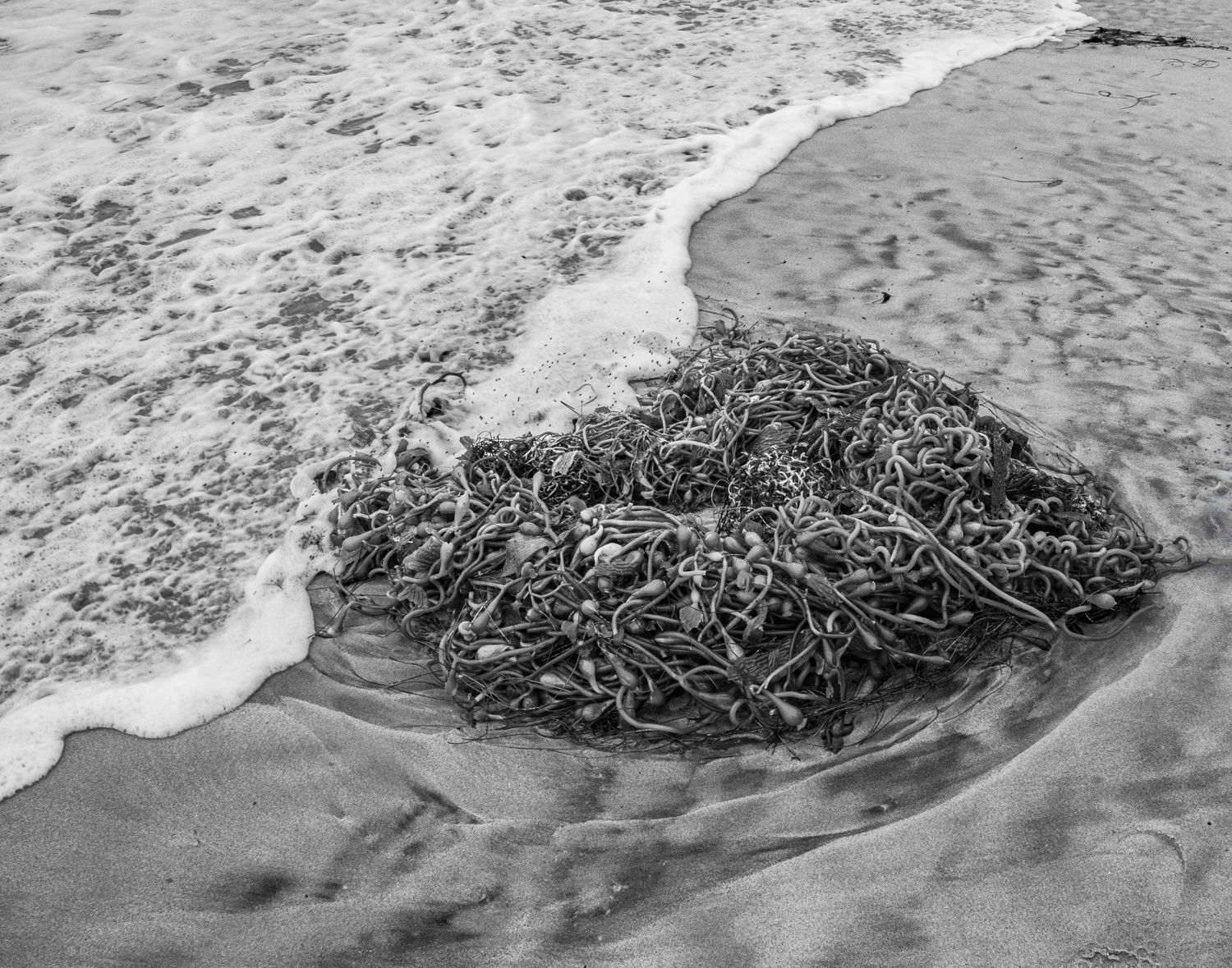
I took this image about 2 years ago and just re-discovered it when I was going through some older images. I was taken by the diagonal line of the surf and the heart shaped kelp. Processing it in B&W really captured my eye. (After I uploaded this, I removed the distracting stick top rt.) I’m really taken with this image. The edge of the foamy surf reaching out to touch the kelp touches a place deep within me…but I can’t explain why. Perhaps the connection of the water and the kelp?
Specific Feedback
While I’m taken with this image, I’m wondering if it speaks to anyone else? I want to make sure the processing does the image justice. Should the heart kelp be darker? Should the sea water highlights be reduced? (I’ve already brought them down a fair amount.) If anyone can add or subtract to what is already done here I’d appreciate it. Is there something that could be done to make it stand out more? (Note: The natural debris top right I removed after I uploaded the image.)
Technical Details
1/320 sec, f11, ISO 800 OM -1, 12-100 @12mm (24mm equivalent)
LR and PS; used PS to remove footprints and LR to remove debris in top rt
Critique Template
Use of the template is optional, but it can help spark ideas.
- Vision and Purpose:
- Conceptual:
- Emotional Impact and Mood:
- Composition:
- Balance and Visual Weight:
- Depth and Dimension:
- Color:
- Lighting:
- Processing:
- Technical: