Critique Style Requested: Initial Reaction
Please share your immediate response to the image before reading the photographer’s intent (obscured text below) or other comments. The photographer seeks a genuinely unbiased first impression.
Questions to guide your feedback
I’m interested in how you relate to these shapes.
Other Information
Please leave your feedback before viewing the blurred information below, once you have replied, click to reveal the text and see if your assessment aligns with the photographer. Remember, this if for their benefit to learn what your unbiased reaction is.
Image Description
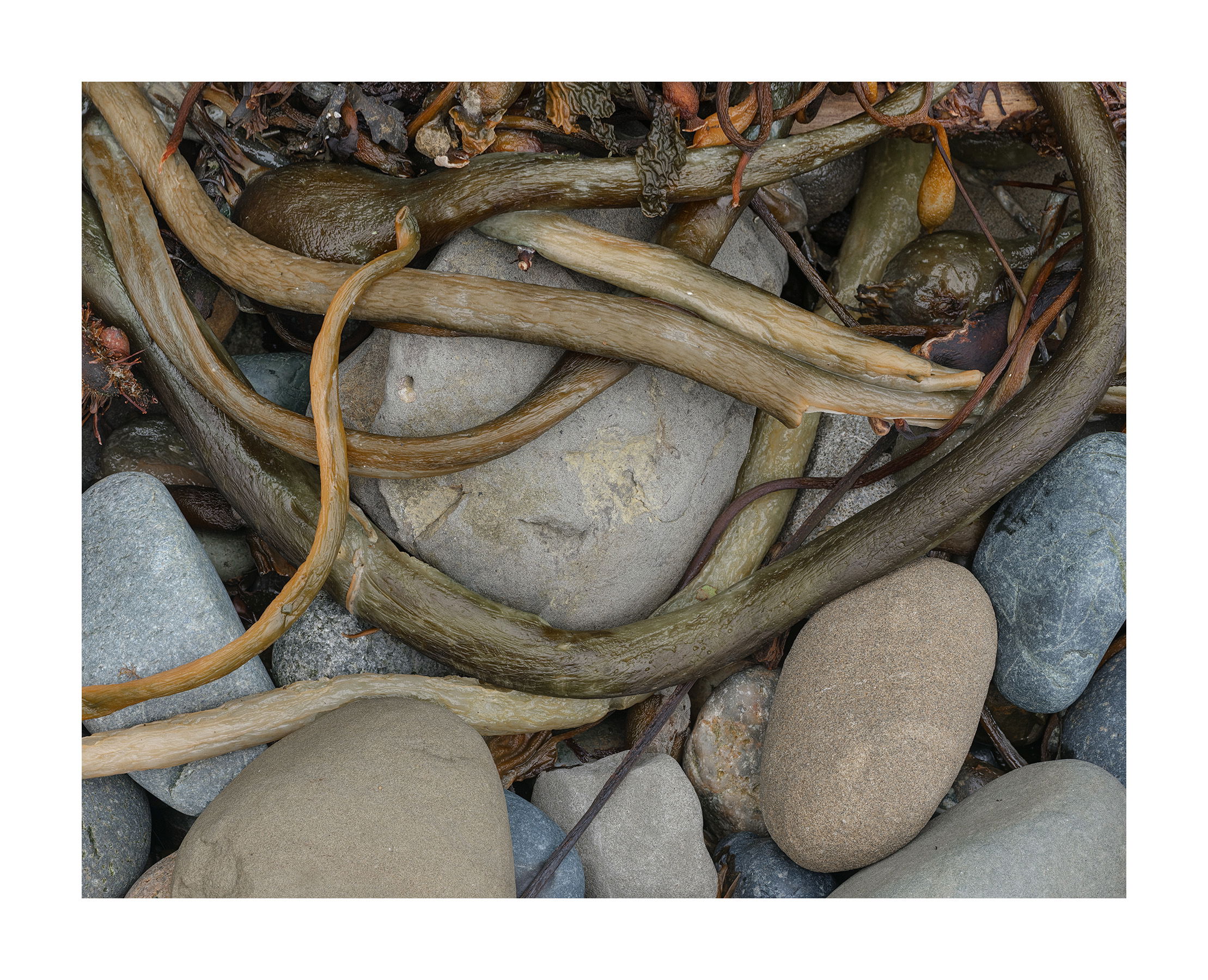
I have long admired Weston’s image of a tightly bound kelp that showed tension so well. So, with that in mind, I looked for similar compositions with the subject at hand. Unfortunately there were none. None of the samples remotely looked like what Weston had created. Eventually I just gave up and just worked with what I had. The smooth round rocks were incorporated with kelp laid out in a similar manner. I tried to come up with a comp where kelp and rock worked together. Of course, I say that now. But none of these thoughts were there when I made this shot. All was instinctual. I merely shot what felt right.
Technical Details
GFX50R, 45-100mm, f/11, focus stacked, cropped considerably
Specific Feedback
How does this grab you.
Critique Template
Use of the template is optional, but it can help spark ideas.
- Vision and Purpose:
- Conceptual:
- Emotional Impact and Mood:
- Composition:
- Balance and Visual Weight:
- Depth and Dimension:
- Color:
- Lighting:
- Processing:
- Technical:
1 Like
I’m not sure how I relate to the shapes but I find the photo interesting. The first thing I noticed was the serpentine pieces of wood (Is it wood?). Then I started looking at the smooth rocks below. There are a lot of semi-circles. It’s well composed and it draws me in.
It appears to be kelp wrapped around stones at the beach. What intrigues me is that it also appears that a multi-armed something is protecting something precious by wrapping those arms around it. Another thought provoking, well composed and seen image.
The tentacles are eating the stones! Oh, no! 
On a serious note, I find this to be well-composed and impeccably processed, Igor.
-P
Igor,
My first impression was that of a bullwhip. The larger, dark grey would be near the handle end, and the slimmer, smaller “s” on the left would bring up the end of the whip. The stones are simply a supporting element where the curved shapes of the (kelp in reality?) really make the image and tell the story.
No nits or suggestions really.
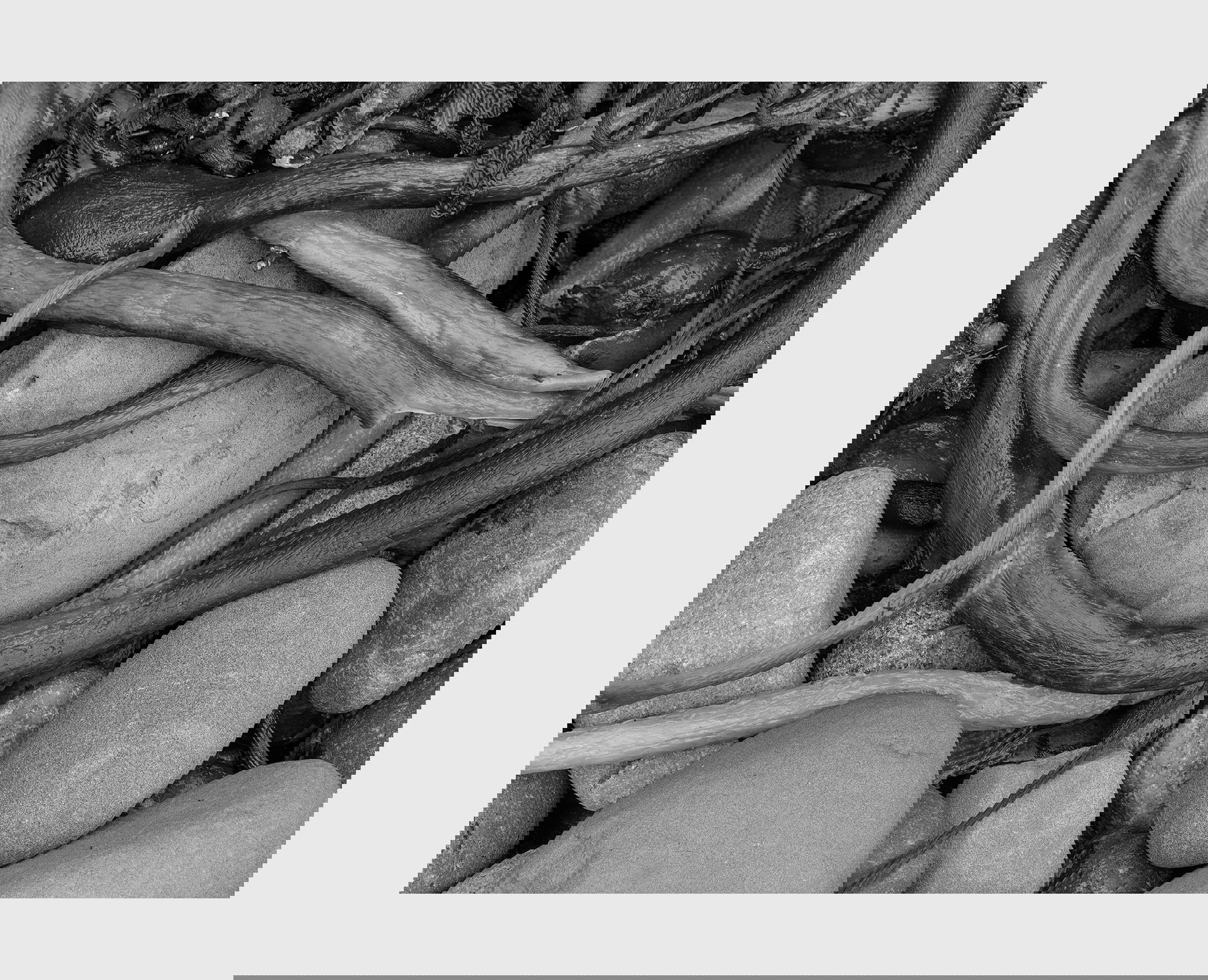
Given your description and goal, I’m wondering if you have considered B&W? Might be worth exploring
Actually it’s called bull kelp for that very reason.
1 Like
This one’s a little ADHD for me. I find chaos in images intriguing; sometimes it feels cohesive and sometimes it feels like my eye is splattered all over the place. This one shades more towards the latter. It’s an interesting photo, but it doesn’t suck me in with the “Oh wow!” that so many of your images do.
Wait until you see the next one. It’s even less wow. It’s more of a how, or even a why.
1 Like
Hi Igor,
I love the soft tones in this image and am drawn to the rope like strands of seaweed. I would like to have seen more of the seaweed and less of the rocks as I find they are distracting (the rocks at the bottom of the image) .
The ropes or strands of seaweed remind me of serpents basking in the sun which makes it an intriguing image.
Cheers
Diny
1 Like
@Preston_Birdwell, @Lon_Overacker, @Don_Peters, @John_Williams, @Jim_Gavin, @Diny_Jones
Thank you for your comments. I’ve made a print of this image and still like it very much. I’m not sure why it appeals so much. I think there’s a sort of harmony about it.
I decided to give it a try:
I think it sort of works. One thing I’ve noticed while printing b&w images is that if you don’t have good blacks and high whites they look muddy. They lack emotionless. But in this original image I actually dropped the contrast because it took away the sense of peace and harmony I was looking for. So yes, I can boost the contrast for the b&w but it becomes a different image in my mind. I kept the contrast low in this b&w but I know it won’t print well.
I can see your point in the b&w image. The round stones are a bit dominating. I think that’s because circles are strong shapes in general. However, it’s the interplay of curves in the kelp together with the rocks that this image is about. If I had the kelp on a flat background it would be a very different image. So it’s not an ideal composition but that’s what came out. Thank you for your observations.
1 Like