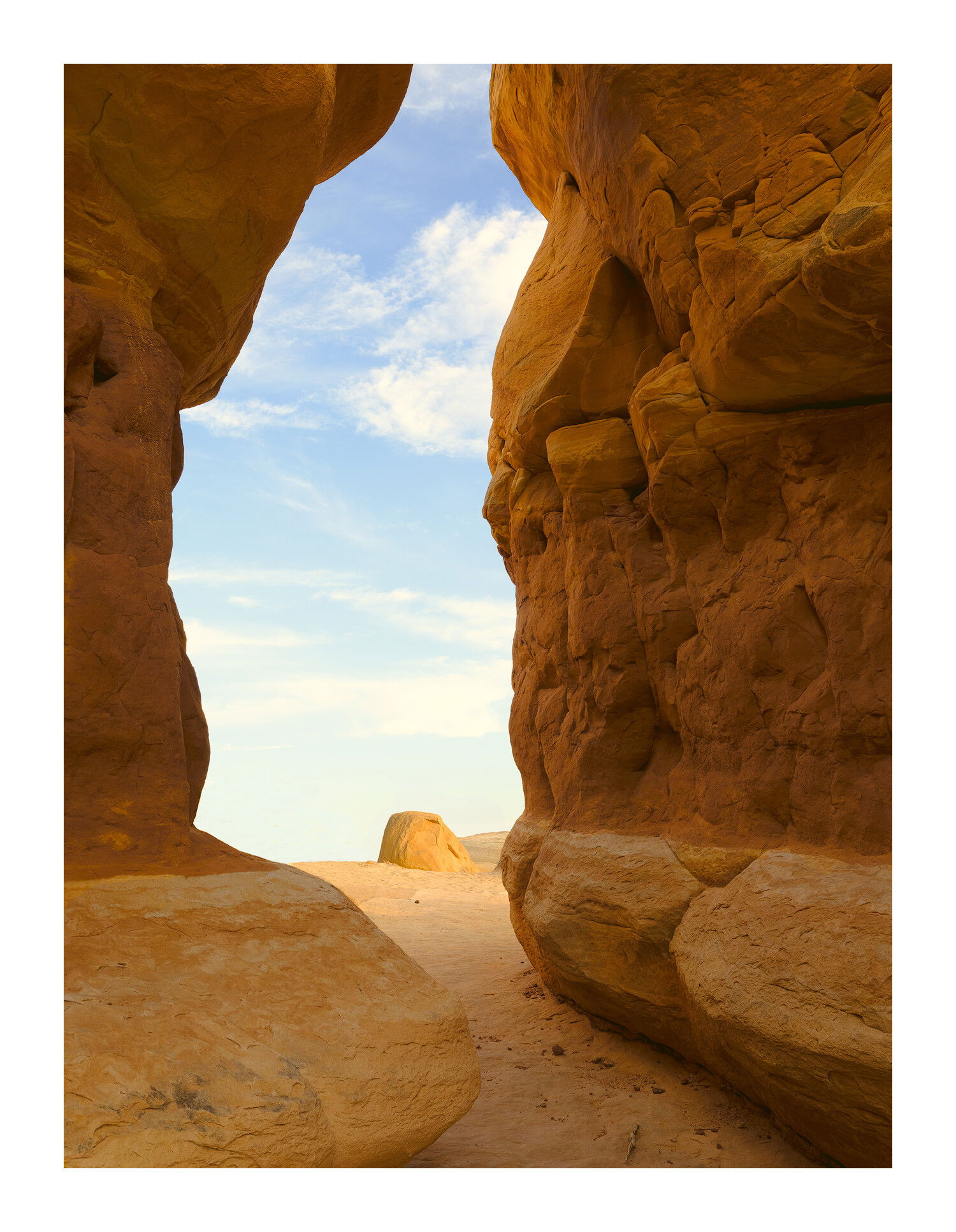
The washboard road seemed to go on forever but eventually I saw a group of cars in the middle of nowhere and knew I had arrived. It was too early for decent light but I scouted this 5 star rated place and saw nothing but cliche compositions.
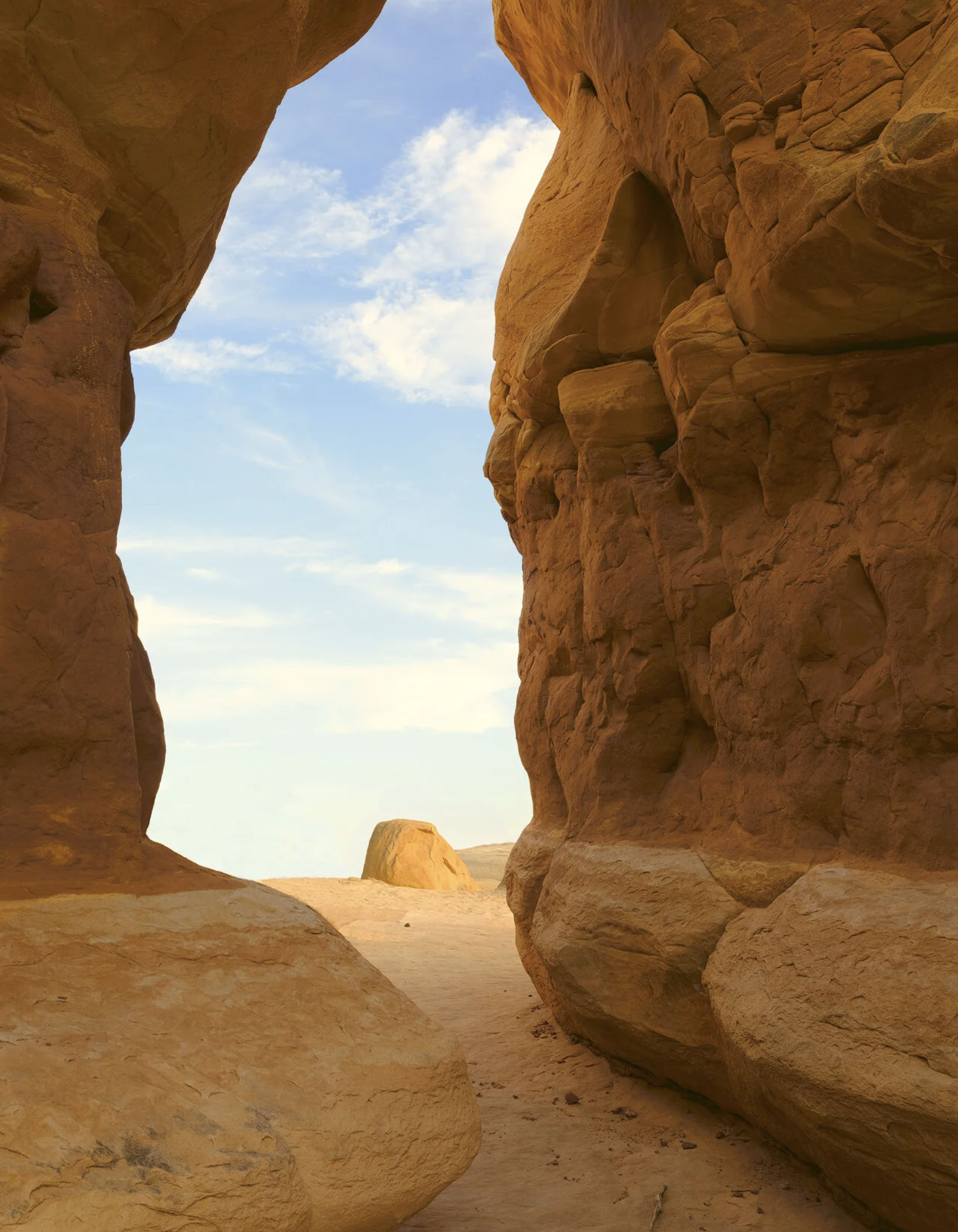
The evening bathed these large rocks in favorable light and they came to life. I’ve always been attracted by yellow and light blue colors in desert landscapes. They always seem so optimistic, full of hope, warm, friendly, and inviting. It was all those feeling I tried to get into this image.
A very cool composition, Igor. But I feel that the the merging of the horizon and the lighter base of the slot canyon is a little distracting. It feels like you just lose the bottom 1/4 of the scene. Perhaps darkening the base of the slot canyon will create more separation with the land outside the slot canyon?
I agree, it would enhance the spotlight effect on the distant formation. I would clone away the stick at the bottom, it’s intersection with the frame edge draws attention to it.
I like the graphic look created by the framing, and I like the unbalanced amount of space between the left and right sides of the slot canyon. The resulting hourglass shape is quite interesting. I also like that you included a lot of the canyon above the horizon, the interesting shapes and texture of the canyon walls justify doing this. The image does have a nice flow to it.
I really like this, Igor. Really well composed and processing looks good. I would be inclined to crop just a bit off the top (posted it as I could not really describe what I had in mind). I find the slight crop brings my attention more to the slot and out to the formation rather than drifting up and out of the frame, if that makes any sense.
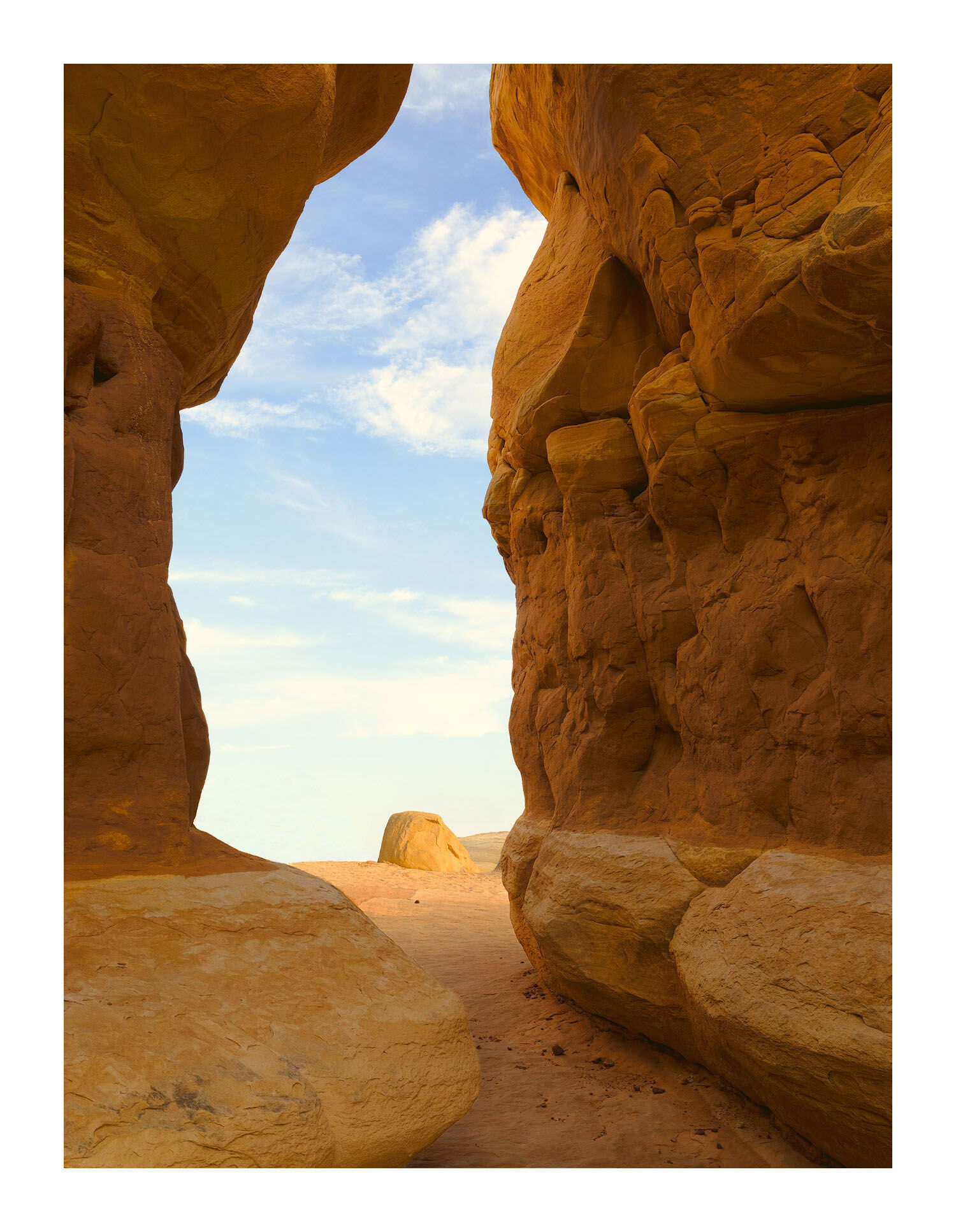
Igor, indeed it is a very lovely icon! My only nit is that the lower lighter part of the rock on the right intersects with the horizon of the distant lighter rock. I used content aware fill and the spot healing brush tool in PS to raise the distant horizon so that it doesn’t intersect with the foreground line created by the light and dark part of the rock.
Except that the sky was a very important element in this composition. Diminishing it doesn’t work for me.
I hadn’t thought that having the horizon level with the lighter part of the of the column would be an issue. However, now that I see the change I can see that Tony was right. It took a lot of careful cloning to achieve that. Amazing what you can do with photoshop. It’s incredible how well people zoom in on a weakness in image here and offer suggestions. I knew that spot was weak because I myself had done some cloning there and felt misgivings about the work.
I wasn’t sure what you and @Ed_McGuirk meant until I saw @Tony_Siciliano’s rework. One thing about this place is that this is not an entrance to a slot canyon but a space between two columns. I caught on the last possible second of sunlight as the sun was hitting the horizon. Therefore the difference between shadows and sunlight was small. The shadow you see in the opening has not been modified from how it was in the camera. It was this gentle light and the pale colors that attracted me to this scene to begin with. So a spotlight effect from outside to within was not my intention.
This is wonderful, Igor! The lighting is outstanding as is the color combination of blues and yellows. I prefer your original with the horizon. If I was going to do anything I would try to clone that area out rather than adding to it as that seems to call attention to it. This looks like a peak into another world.
I have added the reworks to the original post in order to see the changes. Now I see them clearly and understand them better. I couldn’t see the subtle changes Ed had made and I missed just how much Tony had raised the horizon line. I’m starting to warm up and better understand the benefits of Harley’s crop. I still don’t like the spotlight effect. This is supposed to be a path to serenity and darkening it works contrary to that. Maybe a gradient filter would have worked better. Raising the horizon line on second thought doesn’t appeal to me at this moment because it reduces the amount of sky.
Anyway, that’s my feelings about this at this moment but they often change from hour to hour. And wait until I start printing. Then the issues really become clear. Why is that?
Beautiful shot, Igor. After studying the original and reworks for quite a while, I still find your original to be my favorite. I find your composition to be thoughtful and well chosen, and I can’t really find any fault with your processing at all. My vote is to leave it alone and be happy.
I really get a kick out of the fact that on NPN you can post an outstanding image and still get a lot of suggestions to play with, as is the case here. This is lovely Igor, and proof that the number of suggestions/edits is not inversely proportional to the quality of the original image.
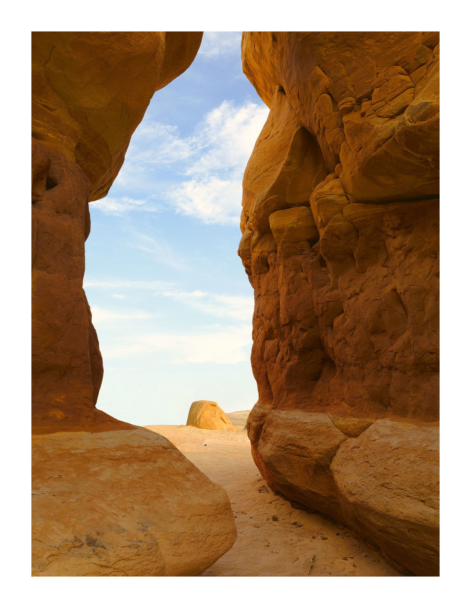
The fact that the horizon blends with the foreground wall isn’t a big deal for me, but if I was going to try to minimize that I would consider separating them by contrast by darkening the canyon walls and keeping the lightness of the path in to try and keep that “inviting” look it has.
The yellow caste to the clouds looks a bit odd to me, and I would probably try to move those a little more towards white.
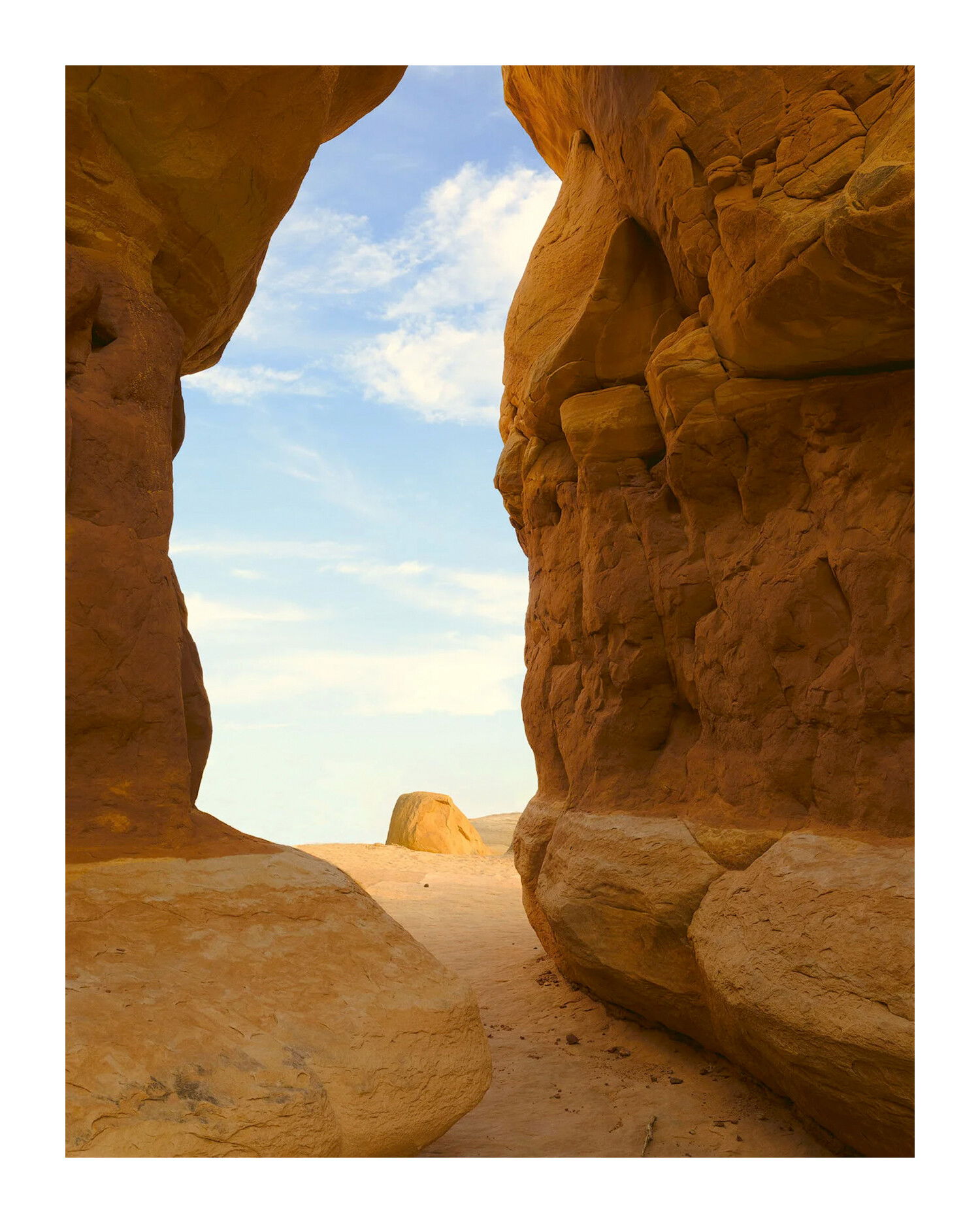
Because you don’t have near enough edits, I’ll add one more illustrating below.
There are a couple other points not in the edit below. The clouds appear to have some areas of low detail where the red channel is blown; I don’t know if the raw would allow that to be recovered, but if so you might play with that. And finally, It looks like there are some editing “circles” around the central rock. They are very subtle, but might be worth taking those out too.
Thank you for taking the time to edit this image. The changes are subtle but definitely noticeable and an improvement. I can see how you darkened the pillar on the left and can duplicate that but lighting the path so subtly may be beyond my capabilities. In the raw file that left column was considerably darker than the right so that a fair amount of dodging and playing with colors had to be done. And in the process I may have dodged the pedestal too much.