Single exposure at 200mm; 1/250 s @ f/5.6, ISO 200.
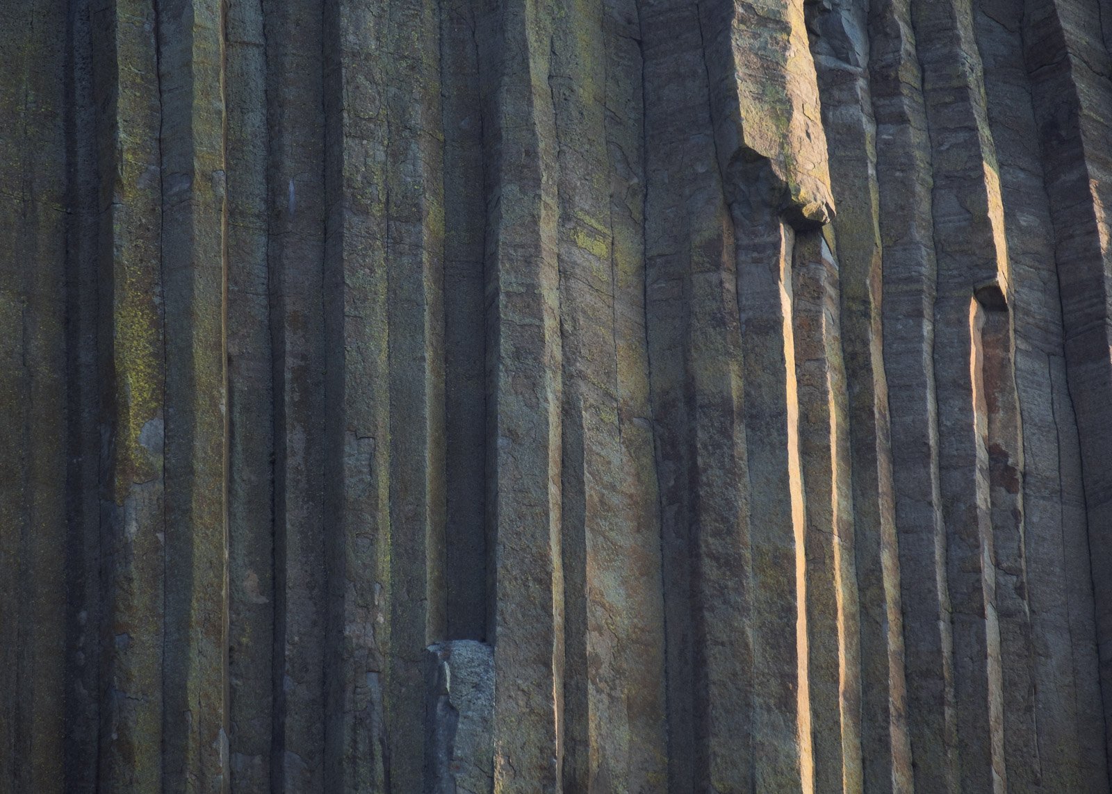
I shot this during an early morning hike at a famous western icon. Much like my last post here, I have spent an exorbitant amount of time trying to edit this image and am having trouble getting it to a point where I’m satisfied, particularly with regard to the colors. Would love some outside perspectives!
I believe that this is columnar basalt and I suspect that the western icon is the Devil’s Postpile near Mammoth, CA. I really like that you shot this subject as it’s different than what we normally see here at NPN. For some reason I often associate this subject with cool tones. As I look at this I think of the ancient Egyptian, Greek, and Roman temples and wonder how those ancient architects were inspired by features like this that they must have seen in their areas. It also makes me think of the vertical buildings of NYC. I really appreciate the appearance of sunlight coming in from the right and how you designed the composition to have that light in just one area. My wish would be that the light at the very edge of the frame not be absent, but be just a tad away from the edge. This is a really fine image. The bluish short column on the bottom center adds secondary interest once you start exploring away from the light. The yellow lichen on the left does as well. You could add contrast and saturate things to add a wow factor but I like this just fine. I went and added contrast using texture in PS and discovered that I liked this version with less texture even more.
I agree with Igor - I love this subject! It would be fine without direct light but that adds a nice extra touch.
Is there something in particular about the colors you wish was different? What you have here looks generally fine to me. Whenever I have doubts about colors I usually make a selective color layer in PS, lower the opacity way down (50% or lower) so the adjustments are less sensitive, and start fiddling around with its 36 sliders to see what jumps out at me. In this image (and many of my images) I tend to add a sprinkle of blue, magenta, and cyan to different parts. I also added some black here and there. Just to go especially wild, I warped it a bit so all of the columns were straight.
What an intriguing subject, I’m really glad that you shared this image with us. Overall, I love the subject and image concept.
Colors in landscape photography are one of the most personal and subjective aspects of what we deal with. With an image like this you will get a lot of different feedback, there is no "right"opinion. In the end it comes down to what type of mood or emotion you are trying to convey, or what your personal style is (if you have one).
Let me start by saying the image is great as presented. I love the nuances of the light and color here. My own subjective personal opinion would be to go in a direction similar to @Brent_Clark rework. I like seeing added contrast to give more definition to the light and shadows. I think because you have light here, I would try to further exploit the warm / cool color contrast like Brent has. And Brents crop eliminates a hotspot on the right edge, which jumped out at me in the original post. Starting from Brents rework, I might also consider a very gentle dodging of the green lichen on the left side.
Great image. I really like the simplicity and think this is a great one to play with the colors on. My first reaction would be to shift some of the greens to a bluer tone to make it more dichromatic. Or if you really want to make a dramatic shift, you could convert it to a black and white. I think this could make a striking graphic image too. I like it in color, but I like how B&W focuses more on the form and texture. Nicely seen no matter how you take this one!
I like this one, Nick. A fine take from that location. While I like the original, I am with @Brent_Clark and @Ed_McGuirk in the direction Brent’s repost takes. You can’t go wrong either way.
Wow, thank you all for the prompt and varied responses! Can’t tell you how much I appreciate you all taking the time to offer such detailed feedback here.
@Igor_Doncov - Good guess on the location but not quite right! Thank you for sharing your thoughts, and interesting approach on reducing the texture. My first instinct here was to emphasize texture, but I like your version too. Just goes to show you how many different ways there are to approach an image like this.
@Brent_Clark - Thanks for the kind words! I was intentionally vague about the kind of feedback I was looking for because I didn’t want to bias anyone’s feedback, and I was happy to see the wide variety of responses here.
Good tip on playing with a selective color layer; that’s a tool in PS that I rarely use, but it might provide just the parameters I am looking for. I really like your rendition, which confirms my suspicions that the shadows in my original edit are too green/cyan. Seeing your version makes that clearer to me.
Also, love your idea of straightening the columns. I tried that while I was working on this image but your execution looks way better than mine did.
@Ed_McGuirk - Thanks for your feedback! Agree that color is a very personal and subjective aspect of our art. I mainly shared this image to check my instincts against the tastes and preferences of other photographers.
I completely agree with all of this! Good work @Brent_Clark and thanks Ed for the second vote on his suggestions.
@Adam_Bolyard - Thank you for your kind words! Truly appreciated.
Yes! Confirms what I suspected. Glad to hear you feel the same way.
You bet I thought of that! I love the black and white version, personally, and I have some other images from this day that work well in black and white too. For this one though, I really wanted to make the color version work since I like all the subtle variations in color, and the natural contrast between the warm highlights and cool shadows.
@Harley_Goldman - Thank you for your kind words, and for the additional vote on some of the feedback above!
Wonderful job isolating this and creating something a bit different from this somewhat popular location.
I’m really enjoying your original. My only thought, suggestion would be to tone down the brightness a little bit on the face of the one section towards the top right. Interesting though, that
Adam’s b&w rendition - that bright face and line of the column is emphasized and I think strengthens the image when it’s just about light, lines, tones and contrast; in the color version, it’s more distracting (although quite mildly)
I really like where Brent was taking this; it brings more emphasis on the colors, color-contrast, lines, etc. and surprisingly less importance or distraction to the brightly lit face and column.
Good news is that you have a wonderful, natural abstract to work with. Good eye for seeing and capturing this one.
I ended up reducing the green/cyan hues that I was unsatisfied with and adding more blues to the shadows. I also introduced a bit more contrast and warped the right third just enough to get rid of the highlights along that edge.
Might end up tweaking things even a bit further, but overall I’m happy with the progress I’ve made. Thanks to everyone who responded here!