Coriolis

Critique Style Requested: Initial Reaction

Please share your immediate response to the image before reading the photographer’s intent (obscured text below) or other comments. The photographer seeks a genuinely unbiased first impression.

Questions to guide your feedback

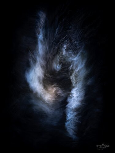
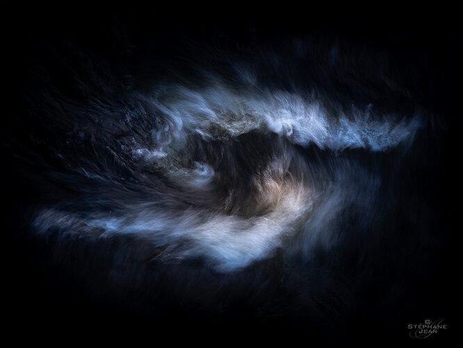
At first I decided to post this photo because I’m struggling which orientation to pick, but then I thought that it would of course also be interesting and useful to hear your honest (and brutal, if that’s what it invokes in you) initial reaction to this photo. Any deeper and perhaps second thoughts are of course also most welcome.

Other Information

Please leave your feedback before viewing the blurred information below, once you have replied, click to reveal the text and see if your assessment aligns with the photographer. Remember, this if for their benefit to learn what your unbiased reaction is.

Image Description

This photo is a part of a series of photos that I’ve been working with on and off for a few years. A major reason that it’s taken so long to reach a “final state” is that was my first deeper and more conscious journey into the abstract side of photography and I just needed some time to find my “voice” in the genre. It feels like all previous abstract endeavours (and there has been quite a few) were only playful experiments to find my bearings.

The subject, as so many times in the past 5-7 years of my journey, is water and it’s a candidate for an exhibition I might put together so it might also pop up in the projects section a little further down the road.

Specific Feedback

Apart from looking for your preferred orientation of the photo and perhaps an analysis of why, I’m looking for any feedback you might have to offer, with the order of importance to me being:
Emotional
Conceptual
Aesthetic

Would you say that it’s “portfolio worthy” or is it just uninteresting and weird? Any feedback is welcome feedback. :slightly_smiling_face:

One thing that I almost always struggle with in my abstract photography is what tones to give the photos and how far I should stretch reality. While I rarely make local colour adjustments (instead setting them with the overall white balance), this series have been an exception.
Do you find the choices I’ve made here pleasing? Are they over the top?
4 Likes

The vertical has more energy, as one would expect. I feel conflict, as if I have a big decision and can’t decide which way to go. For me, the vertical orientation is much more compelling.

(reading your comment…)

Portfolio worthy? Yes!

Tones? Not sure how you adjusted the tones, but they probably influenced my interpretation and reaction. The overall cool tones, and vertical orientation, give this tension. That one spot of warmth, though, give us a respite and strikes a more hopeful tone.

Over the top? No!

Pleasing colors? For me, the question would be the tones convey the mood or story you want. If you were to tone the lights to be warm, the interpretation of this would be quite different. If you’re doing a series, I think the toning would depend on the point of the series.

2 Likes

Super thanks for you analysis and feedback @Bonnie_Lampley! I’ve always, without thinking about the alternative, viewed it as vertical, maybe because it felt right (enough) but likely also because that’s how it was shot. But as I finally reach a possible print and exhibition that it might be a part of, I suddenly started to question that choice that was never consciously made before.
And I think that you make a strong point for the vertical orientation. :pray:

Regarding the colours, being a bit of an overanalysing creature, I try to go by intuition and feeling in my photography, rather than creating a story through them. Letting the photos be what they will without too much interference from my busy mind. But then I sometimes falter and start to analyse things and look at alternatives, often just creating an entangled mess in my mind. :joy:

What I’d like to ask you Bonnie (and I might edit my post to reflect this and add my own thoughts), is what you see, emotionally, figuratively and/or in your imagination, when you look at this? It doesn’t matter what it is and maybe you can’t put it into words but if you can, I’m most curious to know what it is. :slightly_smiling_face:

Stéphane, I too am drawn to the vertical orientation. Perhaps it’s because it gives the illusion of tension more than the horizontal version. I love this image! For me, it depicts the internal struggle we have. Keeping things like the ego, jealousy, rage, hate, etc in check. It depicts the vortex of human emotions. The darkness that surrounds the subject is a perfect metaphor for the demons we often fight. Yet there is that light, that hope near the center. It’s within reach but caught in the vortex and rough sees. Like I said, this image is powerful to me and it’s brilliant!

1 Like

Wow, that’s an interesting reaction, thank you very much, @Alfredo_Mora! I see what you see (now) but it’s very far from what I saw when I shot and edited it, maybe because it’s in a series with many similar (although not as symmetrical) photos. Now you’re making me reconsider the entire series…! :joy:

Thank you again for giving your view on this, and the kind words!

@Bonnie_Lampley and @Alfredo_Mora – Made a tweak (or rather a twist), rotating things a bit counter clockwise, that I think make them both stronger, although the vertical one probable still wins. It’s hard to tell how far to take things and maybe more wold be even better, I don’t know…

I’m not sure if I should add them to the main post but here they are for now.


Looks like they got rotated clockwise, right? I like the tweak. It helps add to the impression that I described earlier.

1 Like

I saw indecision and turmoil, as in a difficult decision - wrestling with an issue or emotions. I’d say it’s in the same vein as what @Alfredo_Mora saw, although he put it much better than I.

The slight rotation does accentuate that feeling.

1 Like

Stephane,

I must disagree with the others, I think the horizontal image is much better. The apparent flow of the nebulae gasses already conveys a sense of chaos and tension as the gravitational forces pull them into that Coriolis spiral. Keeping it in the vertical orientation builds too much tension that makes the photo hard to appreciate. There needs to be a balance to allow the viewer the time to really look at it and feel what is going on.

All that aside, I love the wispiness of the nebulae and the colors. Just outstanding work. What nebulae is this?

WAIT! This is water? Not what I thought at all. Can you share more of the technical details of how you captured this?

1 Like

I really like this. I can’t decide which version is better, but they are both interesting to me. I think it’s all quite pleasing.

Wow, brilliant images. I loved both, and I would pick the portrait orientation if I had to nitpick. The words that come to my mind in the initial reaction are - power, tenacity, and force.

It also depends if this is for print, a website, or a competition. My take would change as below:

  1. Competition - landscape orientation. (I suspect if the judges open the picture full screen - this image will WOW them with the grand impact)
  2. Website - portrait orientation
  3. Print - portrait orientation
1 Like

I bookmarked this and I’m coming back now.

What a powerful image! Wow! It immediately spoke to me when I saw it in my feed. Without reading you descriptions or the other comments, I would like to offer the following:

The image is powerful and intense. For me it speaks about being carried away, fighting adversities, struggling against the challenges of life, trying to stay clear of the storm and keep one’s head over water.

But it also speaks about courage and exploration, venturing into new universes, following the light, escaping the dark.

The image is loaded with metaphor for me and I just love it.

Personally I find the vertical even stronger than the horizontal because of the added depth - but that’s just me.

Now about this: what is reality?

What you see with your eyes? I don’t think so because I’m sure, what I see is different from what you see - so what is the truth, my or your reality?

What the camera sees? Definitely not because a camera sensor doesn’t capture reality, it captures data.

What you show with this image is metaphor, emotion, feeling, a part of yourself. You take what you saw and own it. That’s very real, too.

I don’t think an image necessarily needs to be pleasing (this one is though). It needs to be expressive, engaging, make you stop in your track (or your scrolls) like this one did for me.

If you don’t aspire to be a documentary photographer, there is no “stretching too far”. There are no limits in art.

I realise that I’m sounding pretty passionate here and that’s because I am. Don’t try to find “your voice”. Try to find all the different voices inside you, that make you you. And then express them.

Long story short: I love it!

2 Likes

Thanks again and yes, clockwise, of course. Must have gotten my wires crossed there for a second! :joy:

Thank you @Bonnie_Lampley!

Interesting analysis and POV, @Youssef_Ismail! Thank you very much! I’ll have to take a deeper look through your “glasses” and see if I see what you see…

Well yes, it’s a water whirl shot handheld from an old stone bridge in the small town where I live. We’ve seen some pretty wonky weather, especially in those last 5 years, due to climate change and this was shot on January 1st 2020, during a winter month that should’ve offered us an abundance of snow but instead gave us massive amounts of rain, forcing the opening of the flood gates of the small hydroelectric power station right down stream of the bridge which increased the speed of the flow significantly.

I’m assuming that there are big blocks of rock at the bottom of the channel (you can’t see them since the water is so dark) below the bridge that form these water whirls when the water flow is strong enough.

As I said, it was shot handheld, probably with a CPL to increase the contrast, deepening the natural darkness of the water. It was shot on a m/43 camera (Olympus E-M1 MkII) at 75mm (so 150mm FF equivalent) at f/4.5 and 1/6s. The editing was done in Lightroom Classic with a good dose of dodge & burning.

This is how it looks unedited:

It’s a bit tricky to catch these swirls as you need to try to predict where they will form and then also track them as they move away from you quite quickly. Doing this consistently with SS as long as 1/3s and up towards 200mm FF equiv, without getting any camera shake requires some pretty stable hands (which I don’t have) or powerful stabilization which makes me wonder if I could’ve done it with any other system and lens combo (by far offering the best stabilization on the market at the time with IBIS and lens stabilization in sync – sorry for sounding like an ad… :roll_eyes:).

I don’t think that I could’ve done it with a tripod either as I had to move the camera very quickly when I detected a swirl forming while also trying to pan with the moving swirl (perhaps with a gimbal head and some practice but I’ve never used one).

Thank you for sharing your thoughts, insights and reaction, @Subha_Joshi. It’s most appreciated and interesting. I love your ideas on choosing the orientation based on its use – never thought of it that way. While I it’s possible that I might compete with it, printing is the main goal for now.

Thanks for the feedback and for stopping by and having a look, @Matt_Payne!

1 Like

Super thanks for that feedback @Astrid_Preisz! It’s fantastic to hear that you saw all that! :blush:

Regarding this:

I’m onboard with all that you’re saying, at least as long still done with “taste” (which is of course subjective) or some sort thought, feeling or intent.

Personally I really do prefer “pleasing” (to the eye, mind or guts). I feel like there’s enough cruelty, hardship, negativity, stupidity, you name it, in the world that I don’t need to use my art to show more ugliness or negative things. I shoot to feel better, not worse. Despite this, I also firmly believe that these things need to be captured and shown to the world to educate and inform about the bad things that happen too. I just don’t want to be the one to do it and would rather try to strengthen people so that the might find the strength to find the “evil” of the world.

For my own stuff (not trying to dictate what others should do) I also like to try to restrict myself to help showing the hidden beauty of nature (as opposed to the obvious) without altering it “too much”. I’ll happily use techniques like long exposures and ICM to stretch time, or shallow DOF, b&w and dodge & burning to highlight the beauty that I see with my eyes and/or mind but prefer to keep colours fairly close to the natural realm. This photo (and most of the series), to me, takes it just beyond my usual limit when I manipulated the colours on a more local basis. But sometimes I’ll “indulge” a little and make an exception. :wink:

1 Like

All that you say is very valid, Stéphane. I was just raising some genera questions, because I found out (for myself) that reality is a term that can mean so much.

I know many people who can’t connect with any kind of abstraction and want to stick with representational photography. The there are others who say they turned their back on traditional landscape photography. I want to keep all doors open for myself. And I am fortunate to be able to enjoy both - traditional photography showcasing the natural beauty of nature and abstract photography playing with your senses. And I just love to be out in nature - there is where I recharge and where I gather my strength.

You created a wonderful image and I would love to see the rest of the series when it is ready. :heart:

Of course, @Astrid_Preisz – and I think that they are excellent and very important questions.

Regarding the mix between landscapes and abstracts, I also appreciate having access to both those worlds, even though I’ve slowly shifted more and more from the former to the latter over the past years. Both forms are still very important to me though, offering quite different things, landscapes being more of a refueling and balancing activity and the abstract a more energetic and creative outlet.

And thank you again for your kind words. I’ll definitely try to bring some of the others in the series around here too. :blush:

1 Like