The photographer is looking for generalized feedback about the aesthetic and technical qualities of their image.
Description
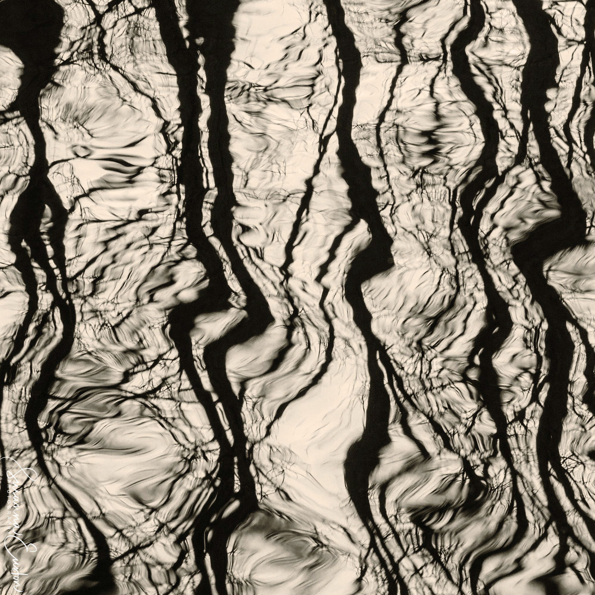
Hi! I’ve been working on a project (which will be posted soon) for a couple of months, of which this image is a part. As I’ve worked, the project has become more and more abstract. I’ll be interested to know if you can identify what this is!
Specific Feedback
Does it work? Is it engaging? I’ll appreciate any feedback.
Hi Susanna. I’m not at all sure what it is, though my guess would be reflections on rippled water. The tonality is really interesting as are the patterns. The dark, almost parallel lines make this really cool for my taste.
Susanna, at first glance on the thumbnail, I thought of some sort of rock formation. Once I opened it up, the tree reflections on water hit me. I find it very engaging and I really like the fact that there are variable amounts of distortion throughout the image. The level of contrast seems just right too. Very unique! Looking forward to your project post.
Susanna, your image has a fantastic visual design with the dark horizontal lines that get warped by the disturbance in the water. The sepia works nicely too as does the square format. I look forward to seeing your finished project.
I like the abstract. From the thumbnail, I also initially thought it was a metamorphic rock, however, the larger image is definitely a reflection of tree branches in water.
My immediate impression was branches reflected in water, but it felt like the image had been rotated 90 CW. I pulled it into PS and rotated it 90 CCW and liked it better. I wonder how 45 degrees would look, but didn’t try it. Somehow, the sepia toning doesn’t feel optimal for the subject. A cooler tone or B/W would feel better to me.
I also noticed the profile is a monitor profile. That could be affecting the sepia tone.
Hello @Dennis_Plank, @Ron_Meeker, @Bill_Pelzmann, @Alfredo_Mora, @Bonnie_Lampley, and @Diane_Miller — thanks so much for your feedback! Yes, it’s reflections of branches on moving water. Here are two more versions of it, one turned clockwise, the other counterclockwise. I prefer the horizontal version since it feels less predictable to me, but I will definitely meditate on it.
And, for @Diane_Miller, here is the image in the sRGB color space. Please tell me how it looks to you. I’m still fiddling around with the toning. What’s going to be important for me is how it looks in print since I have to hang these and others at the end of the month.
I don’t see a difference – a little surprisingly. But maybe the difference would be more noticeable in close to saturated colors. What will matter for you is to make sure the printer gets the file in whatever color space they want. These days, there may be a box to check to specify the color space it is in. And make sure you converted it to shat space (and of secondary importance, that the profile is embedded/tagged) – just as you should do for any web post. Note: convert, NOT assign! Two very different things.
Interesting difference, Susanna. To me there’s a distinct difference in feel between the vertical and horizontal. The horizontal feels more contained, whereas either of the verticals let my eye leave at the top. Not better or worse, just different. Of the two verticals, I prefer the second as it lets my eye move through the frame more easily.
Thanks, @Diane_Miller! I’m pretty familiar with printing procedures, whether I’m printing myself or sending out for sizes beyond my Epson P900. I already did a set of test prints (which were in the correct color space!), but I wasn’t totally happy with them, so I will have a go at it tomorrow. I appreciate your input!
Thanks, @Dennis_Plank! I personally prefer the horizontal for the reason you cite — that the eye leaves the frame at the top. My goal is always to keep the viewer in the frame. I know this image is a little controversial (that’s why I named it “Conundrum”!), but I find it interesting. I’m going to print it for my gallery to see what visitors think!
I didn’t realize how you were printing – you’re in good hands with the P900! Subtle toning is difficult with any printer. It’s just a matter of test and adjust – as you will know!
A little late, but wanted to comment. Love this! Before any comments, I too saw this as reflecting trees and branches in water… yet this is still mysterious and very dynamic. In the end I prefer the horizontal because it quite literally changes the impression. I think the vertical is a bit more predictable (trees being the vertical creatures they are…).
I’m pretty sure I’m not qualified to advise on printing and toning… but my own observation initially is thinking what this would be like in a more pure black, and pure white tone? But since we’re not privy the selection of prints for a gallery showing, I’m guessing the slightly toned whites are directly in line with the rest of the images you’ll be hanging. As a stand alone image, I could see this being more graphic by simply having pure white. but that’s just me and of course subjective and probably not relevent to your Project. And btw, good luck with that project and gallery hanging!
@Lon_Overacker, thanks so much for your feedback. I agree about the direction of the image — the verticals also seem predictable to me. About the pure black & white — I’m going to look at that. I’m still trying to decide if I want to go with the toning (on all of the images in the project to be displayed) or just stick to B&W. Actually, B&W would be a lot easier! It’s been a challenge to get the toning consistent across the images.
How did this one slip by me? I think it’s excellent. Reflected branches came to mind immediately. I prefer the vertical orientation but what do my taste buds know? it’s good either way.