Image Description
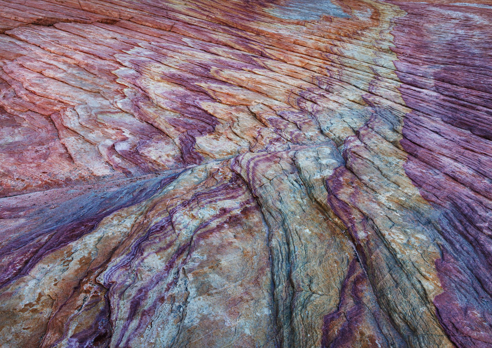
I had about a half an hour of good light before the sun hit this formation and I moved on.
Type of Critique Requested
-
Aesthetic: Feedback on the overall visual appeal of the image, including its color, lighting, cropping, and composition.
-
Emotional: Feedback on the emotional impact and artistic value of the image.
-
Technical: Feedback on the technical aspects of the image, such as exposure, color, focus and reproduction of colors and details, post-processing, and print quality.
Specific Feedback and Self-Critique
The colors were very dramatic and I increased the contrast a little. Is it over the top?
Technical Details
Canon R5, 24-105mm at 24mm, 1/20 sec, f/18, ISO 200, Manfrotto tripod
3 Likes
This is a great abstract, Don - it could go in the Abstract category perhaps. I particularly like the absence of any indicator of scale (though I’m guessing it is a close-up). That striking line leading from the left could also be a road leading off to the far right. Then the colours are magnificent; I see no problem with the contrast. I bet you had fun looking for the best crop. It could also have some cropped off the bottom so that the line is less central horizontally, but then you’d lose those colours at the bottom. Bravo!
I love this, Don. I would definitely call this an abstract. Yes, I knew it was stone but because I have no idea of the scale, it feels very much like a pure abstract. I say this, because, in the context of an abstract, it doesn’t have to be “natural” - the colour is completely up to you, the artist. The leading line from the lower left portion of the frame is just terrific and draws the eye . As I said, you could do anything you want with the colour or even black and white. It might be interesting to a series using this image with different colour palettes and I think you could do that because, dynamically, the image itself is so strong.
Hi Don, this is cool. It looks like Zion National Park to me. I’ve photographed similar scenes there. Wonderful. As an abstract, the colors and contrast don’t bother me at all. If you were going for realism though, I would dial back the contrast, which would likely reduce the saturation as well. Either way, it’s the artist’s choice. The composition is very strong and appealing, leading my eye into the distance.
I think @Kerry_Gordon’s suggestion of a series with different color palettes would be very interesting.
Well done, Don.
Thank you for your comments. It was taken in Valley of Fire State Park, NV