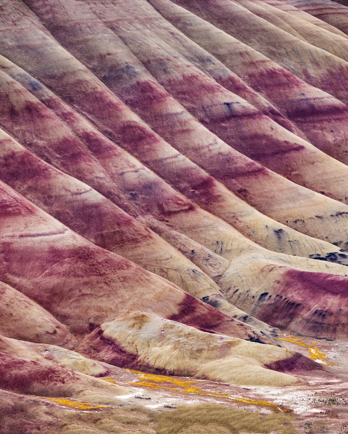
I had a lot of fun trying to find “non iconic” photos from the Painted Hills. This one may be semi non iconic.
Specific Feedback Requested
Any comments are appreciated
Technical Details
Canon R5, Canon 100-400mm @ 400mm, 1/320 sec, f/11, iso 400
I had a lot of fun trying to find “non iconic” photos from the Painted Hills. This one may be semi non iconic.
Any comments are appreciated
Canon R5, Canon 100-400mm @ 400mm, 1/320 sec, f/11, iso 400
The ravines sweeping one direction, with the red lines sweeping the other direction works very well Don. I could see a horizontal composition of just the upper 2/3rds as another nice image as well.
I’m conflicted about the very bottom. It seems somewhat incongruous with the rest of the image to my eye and I’d consider cropping it twas mine.
I’d recommend shifting the Magenta tone in this image to be more red and slightly desaturating it. It feels slightly off and nuclear in comparison to the other colors. I’d also play with darkening the top edge a little to nestle the eye more in the center of the frame and also slightly darkening those bright, almost white patches in the ground below. Color is always the toughest part of these kinds of badland scenes. You are close though! Everything else looks great.
Hi Don,
Playing around in this landscape is so much fun to create some really cool images. This is great, the repeating lines, both of the ravines as well as the red bands.
I’d agree with the earlier poster about the bottom of the image being a little incongruous with the rest of the image. I love the upper 2/3’s of the image.
To my eye, there is something a bit funky with the red/magenta color. Perhaps pulling back some magenta might shift it a bit.
I’d definitely add a vignette to this to create a bit more visual depth in the image.
Overall, great shot. Lots of things you could do with this.
My initial thought as also to crop off some of the bottom but I’ve changed my mind and like your composition. I do agree about the nature of the red color. I think you get this type of red when you use the daylight white balance. Still, it does come close to what is actually out there if that’s what you’re striving for.
I agree with @John_Pedersen here… there is a lot to like about this image!
Don,
Excellent take and image from this place. I’ve never been personally, but no doubt very recognizable as an iconic location. I think you’ve done an excellent job isolating what has come to be one of the most classic features.
I like the inclusion at the bottom - for one thing it grounds and offers a sense of location, and a little bit of scale. If anything, I wish there was a tad more included; but short of that, I actually see two viable square crops. The lower half and the colors in textures of the vegetation are a bigger part of the story without so much of the vertical. And then a square off the top ventures more towards the abstract with no reference to scale, etc.
Alternatively since my personal preference does not include full length digial formats… I think a 4x5 crop would be balanced quite nicely. No doubt you have a wonderful image to work with. (Can’t comment on the colors too much since I’m not familiar with the in person experience of the location.)
Lon
