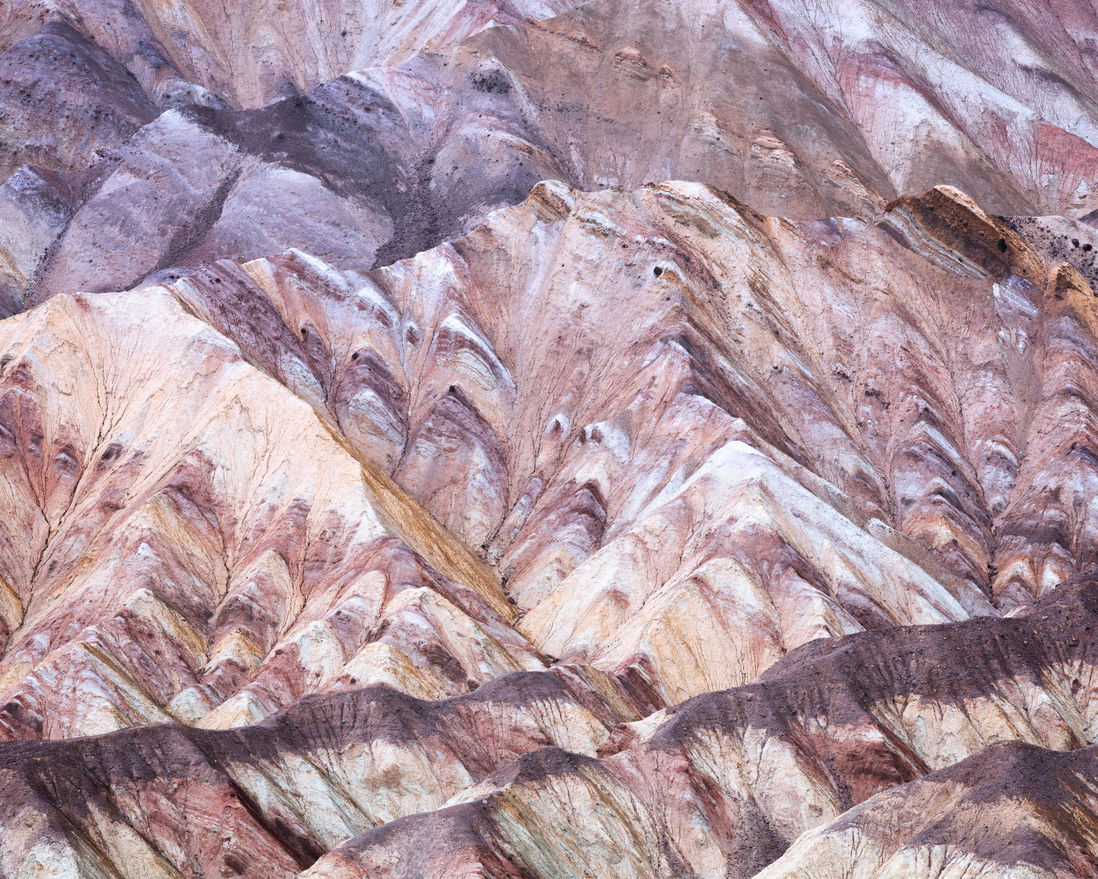
This is a small scene I shot, within the Badlands of Death Valley National Park, after hiking on a ledge of the canyon just before sunrise. I was captivated by these colorful, jagged lines and tried a few different compositions. This one spoke to me.
What technical feedback would you like if any?
Given this was shot at 200mm, the image was compressed quite a bit. In post, I tried to separate the foreground, mid-ground, and background, using luminosity and saturation-based contrast. I’m looking for feedback on the depth, separation, and contrast; especially when it comes to the background (top 1/3 of the image). Any suggestions for further emphasizing the depth or does this work?
What artistic feedback would you like if any?
Any and all feedback welcome
Pertinent technical details or techniques:
Canon 6D MK1
Canon EF 70-200mm f/2.8L IS II USM
Single Shot
200mm - f/11 - ISO 200 - 1/20 sec
If you would like your image to be eligible for a feature on the NPN Instagram
@jimmyarcade
FYI to moderators, for some reason the IG tag was not available when I went to choose tags for the image. Not sure what happened.
This looks like the Artists Palette area. The composition is pretty sophisticated to the point where it’s almost an abstract of lines and shapes. I would probably work with the colors a bit, modifying them and even giving an overall warm cast to the image. I might also raise some of the darker darks and generally reduce the contrast.
This works quite well as an abstract - I love the angles, lines, texture, and colors. With the compression of the 200mm, I don’t get a sense of depth, though, even with your edits. If you want that sense of depth, perhaps using temperature to accentuate the foreground and make the background recede would work. I took a crack at that. In ACR I did two gradients - one on the background (upper +/- 1/4 of the frame) to make it cooler (more blue) and less contrasty (decreased clarity, texture, and dehaze) and one on the foreground, doing just the opposite (warmer, increase clarity, texture, dehaze).
Hi @Igor_Doncov, thank you for taking the time to check out my image and offer your helpful feedback. While it’s possible this is part of the Artist Palette area, I don’t believe it is. This is actually the inner section of Zabriskie Point, standing on a ledge that faces the Zabriskie Point lookout.
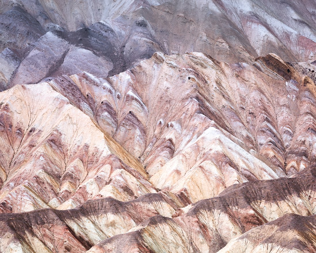
I agree with your suggestion to add warmer tones to the image, but in a slight manner, as I actually like the cooler tones for this and since it was so early in the morning, it didn’t have the extreme warm tones to begin with. I am doing a minor re-work, based, in part, on the suggestions from you and Bonnie. I played around with the layers and masks I had already created, adding curves adjustments, and did a little dodging/burning. I’ll be posting the re-work, shortly.
Hi @Bonnie_Lampley, thank you for the positive feedback, suggestions for improvement, and the example of a potential re-work. I do agree that your rendering creates more separation and I’ve used that as inspiration in a re-work I’ll be. posting. I didn’t go as cool with the top 1/4 of the image, but added more warmth to the bottom 3/4, in order to create the contrast and transition between the cooler and warmer tones. I used a quick selection mask, rather than a gradient, but it gives me similar results. I’ll post the re-worked image, shortly. Cheers!