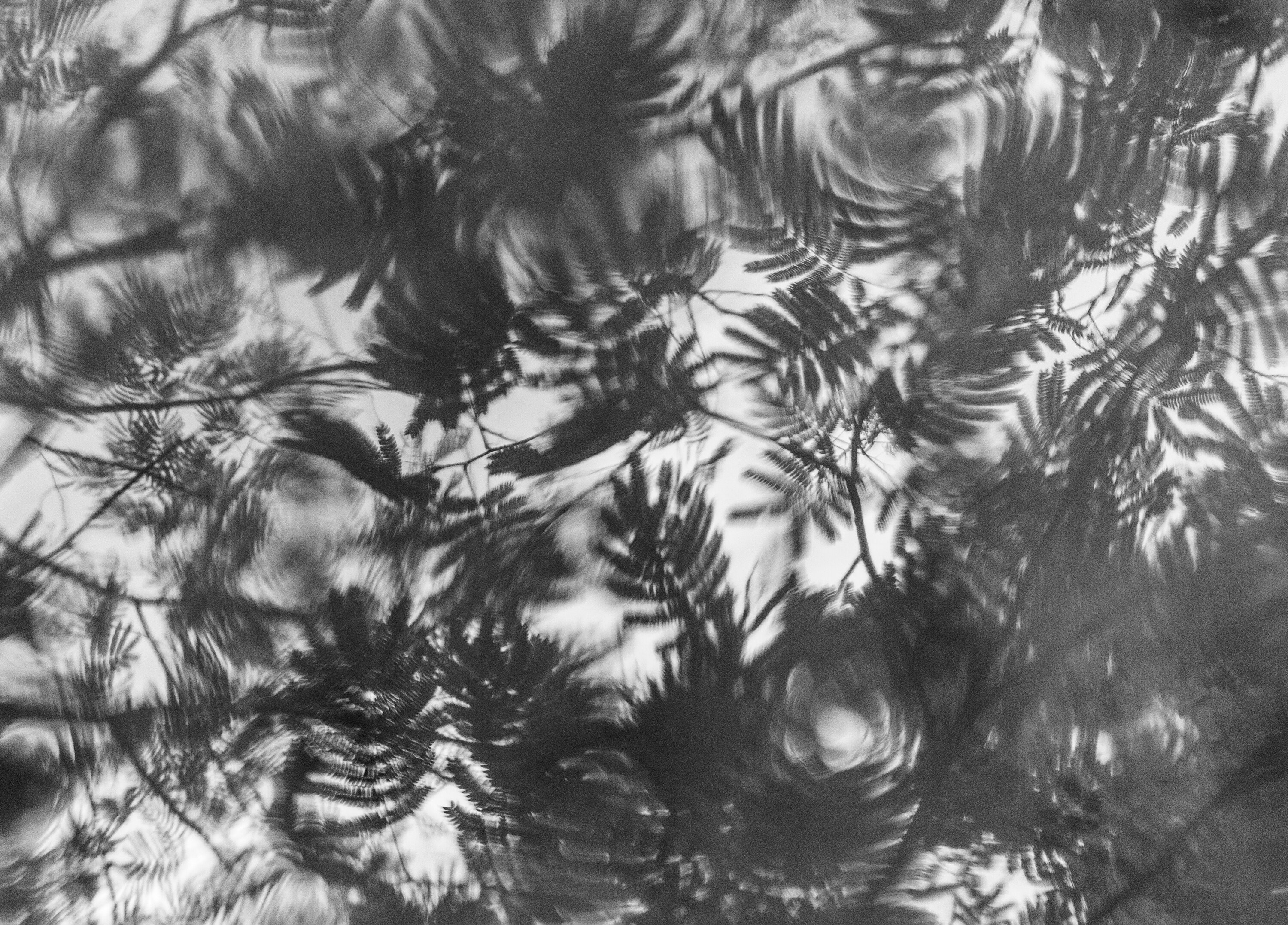
I’ve always been a little unsure of the processing on this one. The color version has some blue and green tones, but it seems muddier and less cohesive. I usually prefer more contrast in my black and white images, but this seemed to be the best balance I could get. I’d love to hear any feedback on that, or anything else related to the photo!
Welcome to NPN, Amy! This is a great image. I love the soft contrast you chose in your black and white. I love how even though it’s a reflection, the circular motion of the ripples could also make you think you’re looking up through the leaves and they are blowing in the wind. Nice find!
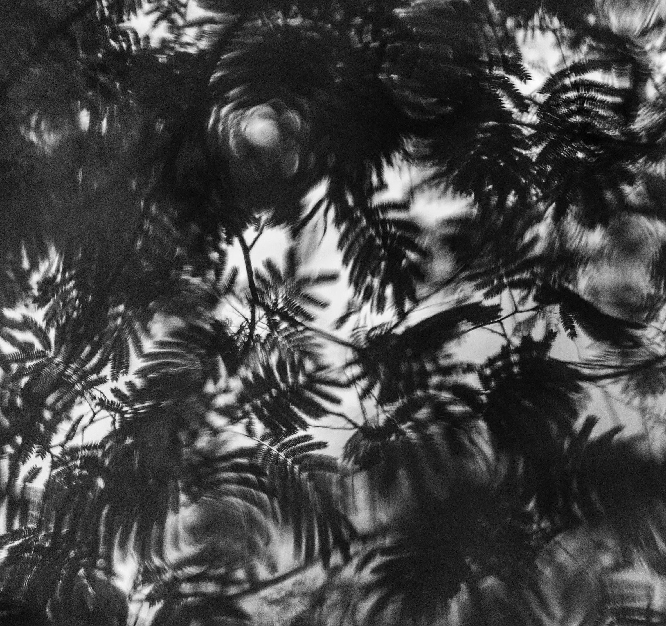
Welcome to NPN, Amy. I like the light ethereal look you are going for. The spot at the bottom that looks like a pine cone is beautiful. I think this could benefit from a tighter crop to showcase that area.
Hi Amy – Welcome to NPN! This is such a fun abstract. I have tried similar things myself and they have never worked out in the end so it is great to see a more successful version of this concept from you. I think the photo works nicely in terms of the subject and processing. I also like the experimental feel that obscures the subject somewhat.
You could consider a tighter crop that includes all of the best frilly leaves in motion and excludes some of the emptier spots along the edges. I like the flow of the leaves with a flip, as well. with regard to processing, the softer back and white processing works well although I did enjoy a much darker version when I was playing around with the crop in Photoshop. This seems like a versatile scene, as it would work well as is, brighter/lighter or darker/more contrasty. The example below applies a few of these ideas for a different interpretation. I do think the crop makes the composition stronger. The processing and flip are more just for fun rather than specific suggestions.