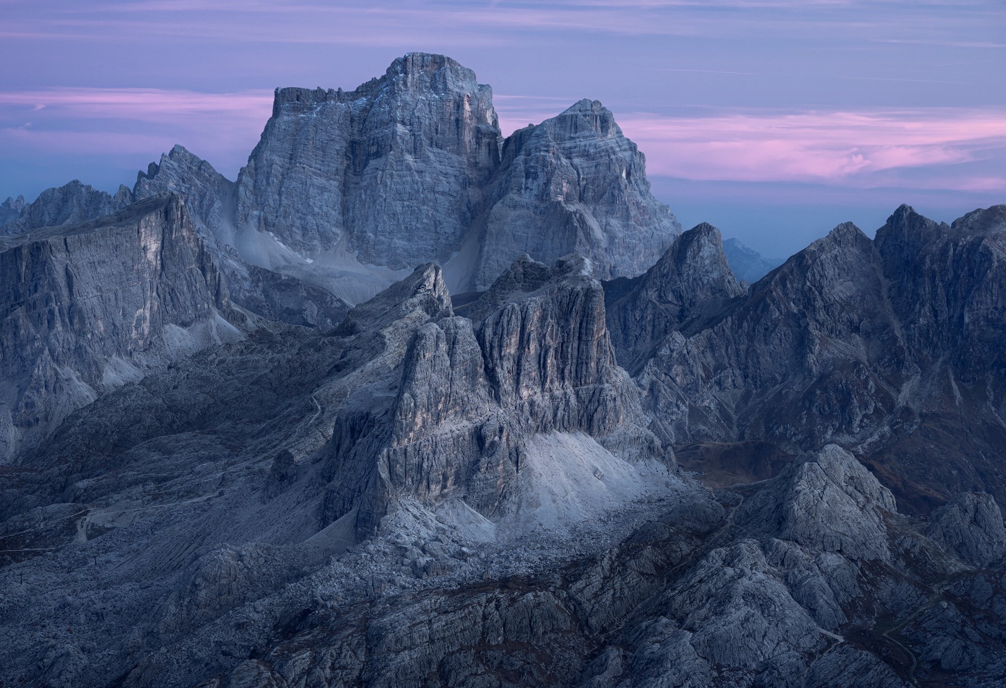
I’ve just come back from a week in the Dolomites, the autumnal colour were amazing, but nevertheless I found myself drawn to the raw rock formations. This shot was taking about 20min after a rather boring sunset, but blue hour was amazing. I used my 70-200 lens zoomed in all the way to 200mm to capture these mountains.
I’m actually quite stoked with how it came out, but I can’t make my mind up about the blue and composition. Is it too blue? I haven’t really added any and toning it down makes the image less powerfull in my opinion but I would really love what you think of it.
Same goes for composition/crop, I originally shot this as 1:1 ratio, but now I think this ratio looks better. What would you say?
(If this is a composite, etc. please be honest with your techniques to help others learn)
Fairly basic edits in LR, then some dodging and burning in photoshop using luminosity masks.
If you would like your image to be eligible for a feature on the NPN Instagram (@NaturePhotoNet), add the tag ‘ig’ and leave your Instagram username below.
@dewit_photo
You may only download this image to demonstrate post-processing techniques.
This is certainly a beautiful scene with majestic formations that hold a viewers attention. The choice of a longer lens was nice to simplify the scene.
I think the blue is a bit overwhelming in the image. I understand the time of day and why you would want to keep some of the blue. I played with the image a bit to reduce the effect overall. I ended up selectively leaving a bit more blue in the distant mountains, and a bit less in the closer mountains. A tiny contrast adjustment was added as well. See if you like this option. Clearly, many right answers for this image.
What a scene! This is lovely, and I’ll be the contrarian here: I love the colors in your original post. It conveys the feeling of blue hour better to me. Also, if you have a little more up top in your original frame, I think that might balance the image a little better. It feels just a little too cramped up there to me.
@Keith_Bauer
First of all, thanks for the kind words, especially like that you think it’s an image that holds the viewers attention!
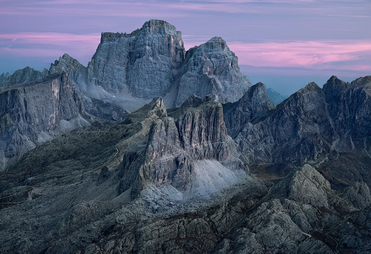
I really like your thoughts on playing with the blues and removing them from certain locations in the photo. I have been thinking about it a lot and just re-edited the image.
It’s not as clear to see as your edit, but I did remove some of the blues from the very dark areas and maintained them in the lighters ones, they reflect the blue colour in the end.
@Tom_Nevesely
Thank you, good to hear that I am heading into the right direction!
@Eva_McDermott
I’ve reduced some of the blue tones in some areas of the photo now, see re-edit above. It is subtle, but I think noticeable.
Thanks for the comment and compliment as well!
@Craig_Moreau
Hi Craig, thanks a lot for the comment. By now, a lot of hours later after posting the initial post I kind of like the blues as well. But as I’ve explained before I kind of reduced them a bit in the darker areas.
I’ve also added a bit of sky, you were right I think about how tight it was on top.