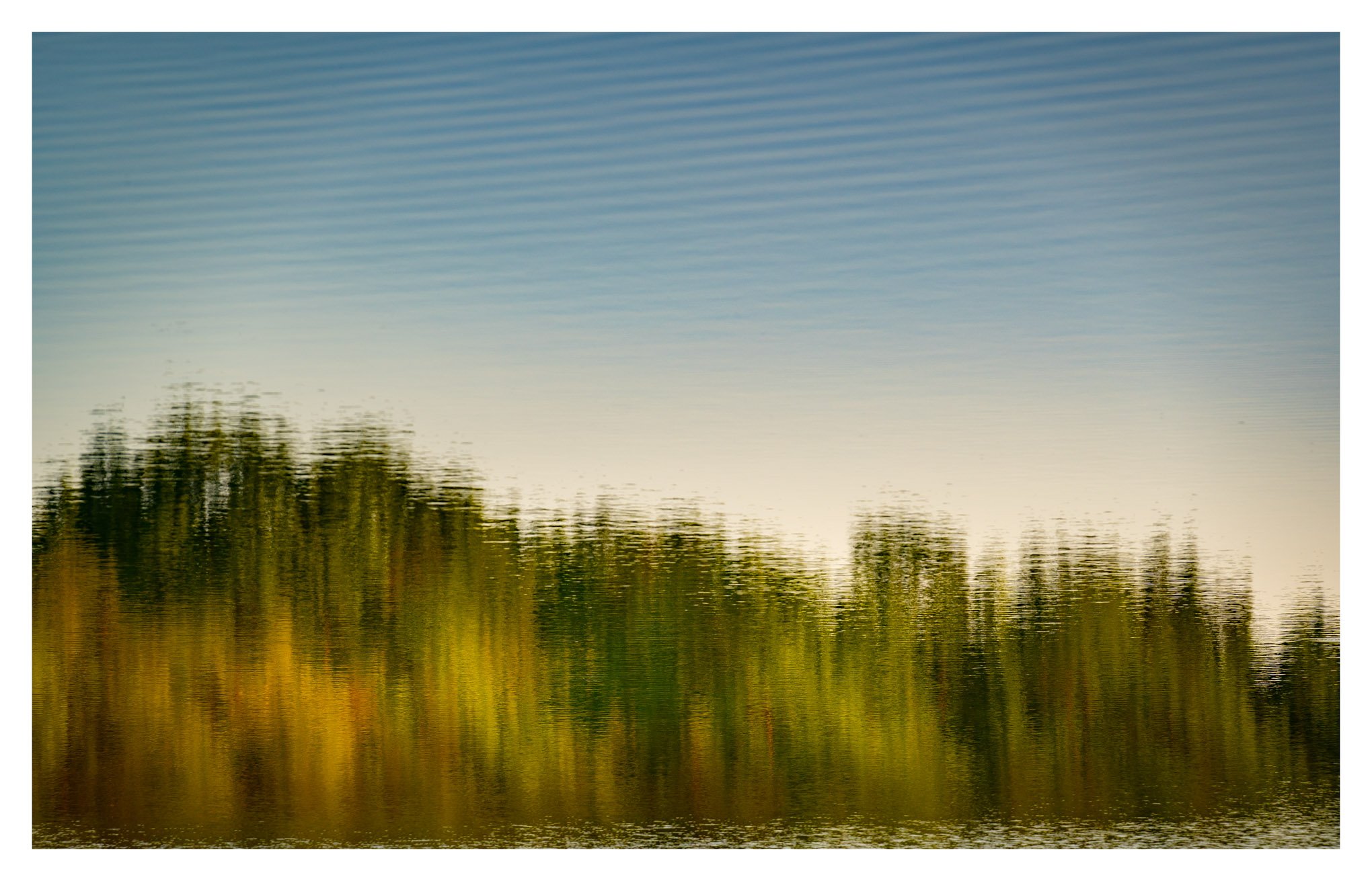
Well…I am out of ferns! THe other am I went down to the lake and at sunrise captured some reflections which I have not done before. I vertically fliped this image to make it upright. I have a couple more from that am.
Specific Feedback Requested
What about the vertical flip?? Processing and com , any and all.
Technical Details
Is this a composite: No
200mm f/5.6 1/100 sec iso 200
I like it and have done it myself now and then. The colors look like it was taken in the fall, not high summer. Interesting. I like the natural progression in the sky from treeline to the top. The bottom ripples make it look like the horizon is tilted.
I love the soft/cool ripples and gradient at the top of the frame, the colors in the reflection! Have you taken a look at it without the more harsh ripples at the bottom of the frame. They do give the eye somewhere to rest but does it do so with a negative impact on the ripples above and the reflection…not sure I’m right, but maybe something to think about.
Interesting. Pixel-peeping destroys this. As long as I’m about 10 feet away from the monitor this looks great. It doesn’t work nearly as well at a normal viewing distance of about 2 feet. You’ve balanced the light and saturation well.
Bravo! You’ve turned the world pside down, or is this taken in the Southern Hemisphere?
I like this very much. I can be lazy with this image, I have to work a little to bring the parts together because they aren’t what it eye expects, and it needs to read the parts and think differently.
The technical elements are good, but I can’t help think what this would be in the fall. You could force the saturation, but that would cheapen the overall presentation.
Ben fatto amico mio, non vedo l’ora di saperne di più in cui la mente è fatta funzionare.
Thank you all @Kris_Smith@David_Wallace@paul_g_wiegman@Tony_Kuyper for your time and comments. Kris, sunrise brought quite a warm tone to those trees on the left but I also tweaked the tone up just a bit to emphasize it, maybe to much. Dave I include a rework cropping the bottom and it does simplify the image but not sure I like it better. Paul grazie mille. I actually like that I myself have to spend time looking at the perspective to not be confused but enjoy…
I’m just saying that from a distance, this all comes together nicely. When I’m close to it, it doesn’t work as well. Many photographers like to get close to images to analyze everything (pixel peeping). However, this is one where if you back up, you’ll enjoy it more.
I don’t think it was too much, Mario. The colors work well together. The crop isn’t adding anything, the original version works better. Good to see them to compare though.