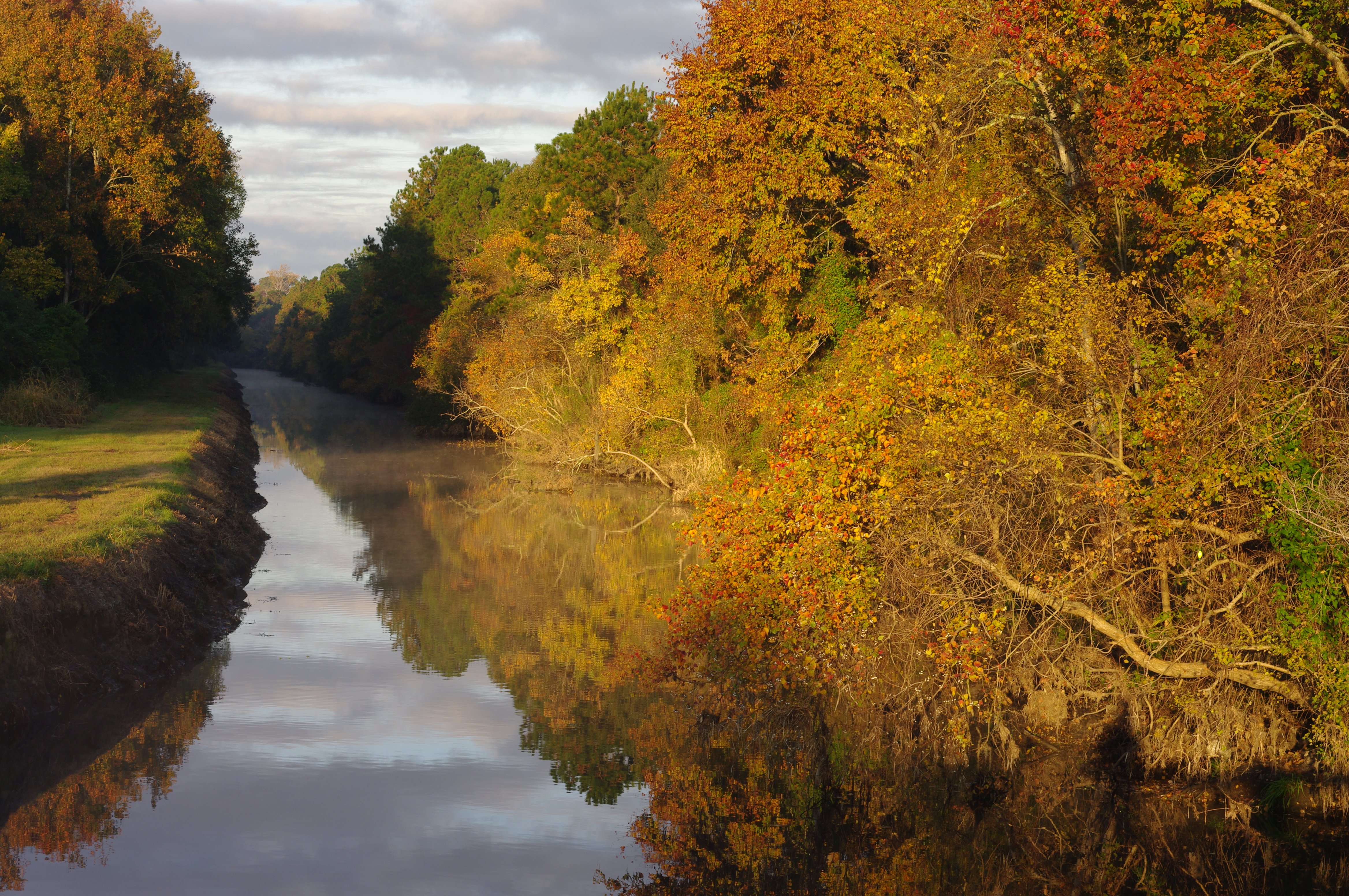
This was taken the morning of November 30 at 20 minutes after sunrise, I used a tripod mounted Pentax K20D with a Pentad 50mm f/1.8 at f/8
All comments are welcome
Pertinent technical details or techniques:
(If this is a composite, etc. please be honest with your techniques to help others learn)
If you would like your image to be eligible for a feature on the NPN Instagram (@NaturePhotoNet), add the tag ‘ig’ and leave your Instagram username below.
You may only download this image to demonstrate post-processing techniques.
Timothy, you certainly had some wonderful light and fall color to work with in these images. I think your processing in both images is very well handled. In terms of composition, I prefer the horizontal over the vertical, because I think the composition is better balanced in the horizontal. In the vertical, I think it is a bit awkward to have just a small slice of the bank on the left, it looks too cut off, and I would prefer to see more of it. The light on the left bank is very nice, and the horizontal allows us to see more of it.
I have two suggestions to improve the horizontal. First, I think that when you use a strong leading line in an image, it needs to take the viewer to something that’s interesting, rather than just be a line that leads to nothing. Does the leading line of the river lead us from left to right and draw the viewers eye to the sunlit tree in the lower right corner? Or does it lead from right to left to the clouds in the sky? I think viewers could look at it either way.
This is subjective, but my personal preference is to want to look down the river into the distance, which leads my eye from the center/right to the left. Some people who are native English speakers have a bias to want to look at images from left to right (the way we read). If this image were mine I might consider flipping it horizontal, so that when you look down the river you are looking left to right. Then the river would lead your eye to the clouds in the sky. I would then add some contrast in the sky, to make it a more dramatic ending point of the leading line. I did a rework to illustrate my comments.
I really like the warmth of the early light as well as the clear reflection on the canal, pulling the viewer in to the scene. I know what Ed is saying about “leading to something…” but I think there’s an argument that says that the eye can move freely around the scene to explore all the interesting elements - I don’t think you always need a specific destination for the eye to reach (often times that is preferred, but not always, IMHO.)
Also agree with Ed that the left bank is cut off too much in the vertical crop. I prefer the horizontal as well. Are we seeing your shadow from a viewing platform? The shadows in the LRC? Not a huge deal, just an observation.
I could also go with Ed’s orientation, but I think both versions work. Easier for someone not familiar with the area to accept a reversed image, less so for the person who stood there and knows it’s backwards…
While I’m enjoying the warmth, just thought I would comment also on the front lighting. Of course you have no control over the direction of the light in this scene… the front light pretty much flattens/dulls the colors in that regard. Not a biggie - we all can’t have vibrant, backlit autumn scenes all the time… in fact, the light and colors work very well for this scene.