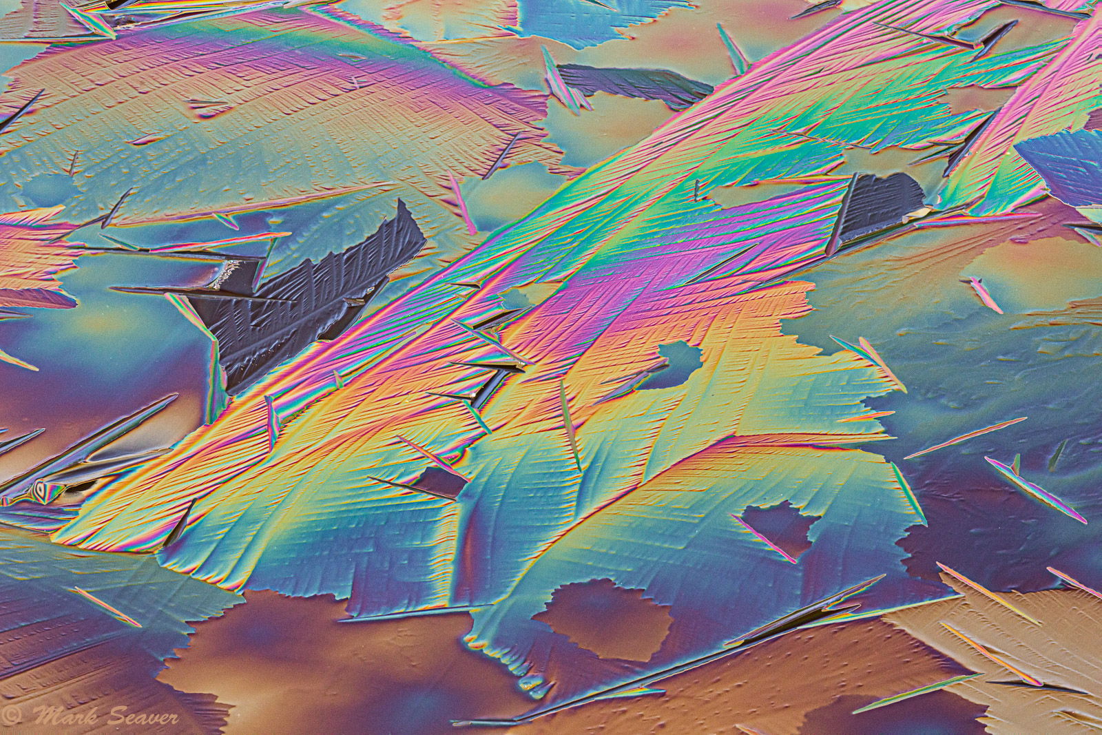
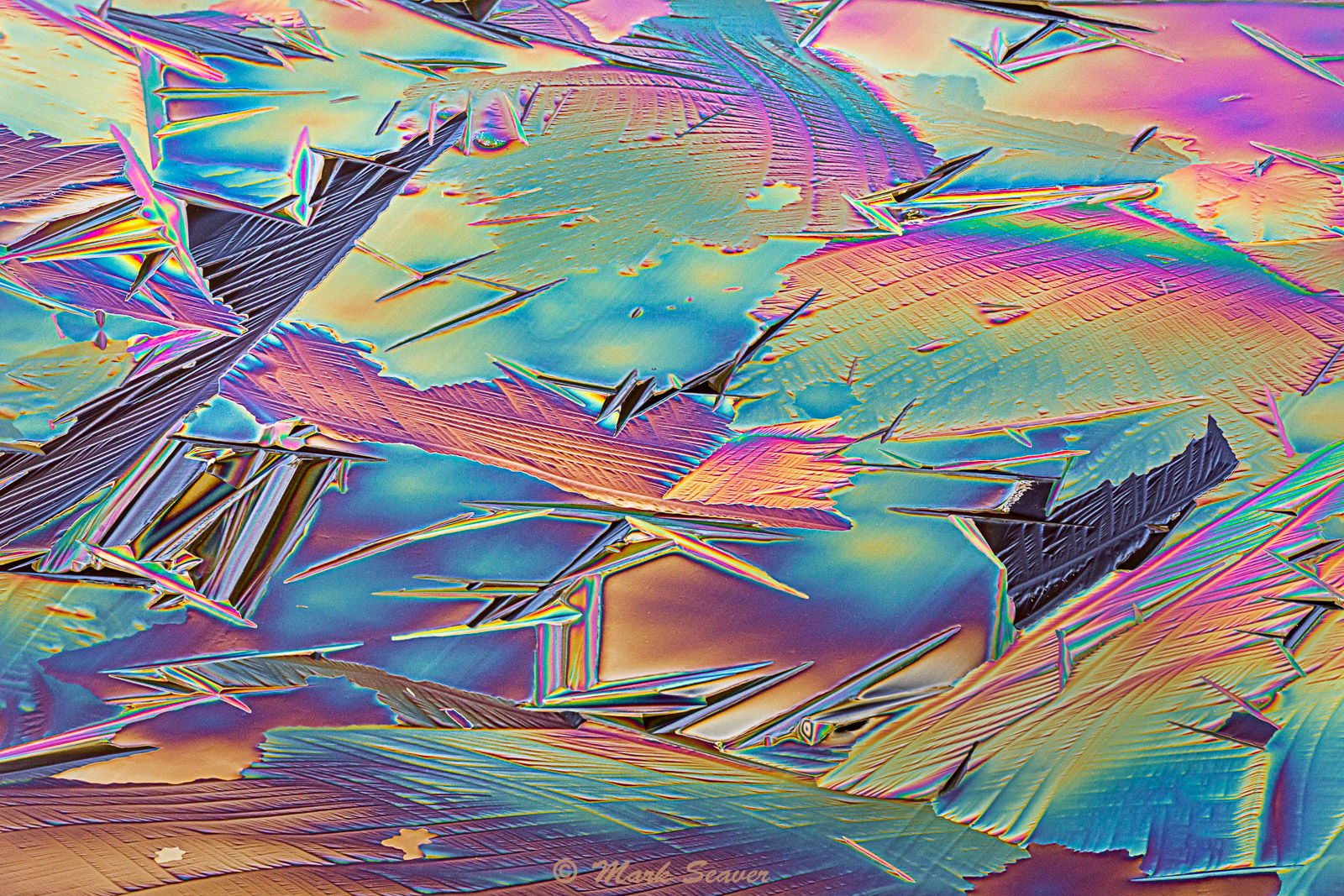
Here are three more ice abstracts where the colors arise from the optical property of Birefringence and require a polarizer on your lens (or polarized sun glasses) to be seen. The specific colors show how thick the ice at that specific location is, so while the overall thickness is roughly similar across the frame, there’s a lot of local thickness variation. All are 5 shot stacks for full frame dof looking at different portions of the ice surface formed overnight on a quiet pond.
Wow, Mark, these are incredible. Amazing that you can capture so much color in ice. The lines and shapes along with the variations in colors makes for wonderful abstract images. I think if I were to pick one from the three, it would probably be number two. All are excellent images, and I would be thrilled if I had taken either of them!
Love them all, Mark. There is so much to see in each of them; colors, texture and lines. If I could only pick one it would be the second one. Really am enjoying your process and the results. Very nicely done.
More outstanding ice images, Mark. All are quite fascinating, but I like the comp on 312 (#2) the best. Wonderful shapes, lines and colors in all of them.
As others have noted, all are incredible. I,too, like the first one a tiny bit more than the others. It looks like the total area covered by the first and second might be the subject of a pano covering that total area. Is that a possibility?
Very nice and very psychedelic. I find it very difficult to come up with a good composition in such pictures. You succeeded well. Especially in no 1 imho. This one has some strong lines and shapes. Moreover with some imagination the dark patches can be connected by a closed curve which provides visual grip/organisation. The colour gradients nicely match the lines in the ice. Great.
Another beauty Mark. All three have positive points but if I had to pick just one I think it would be number 1 @ 349mm but I have to say that I like #3 @ 286mm just about as much. The colors are just tremendous and make for very artistic work. Beautiful finds Mark.
Tony, while I did let Adobe add some saturation to the colors (see my previous post), these colors were initially seen through my polarized sunglasses by cocking my head back and forth. On an earlier exploration, I was chatting with another walker and showed her the effect by loaning her my sunglasses. There are times when the viewing angle between you, the ice and the sun matters.
All are choice, but the first one is especially nice. I love the colors and I may have to visit some freshly frozen vernal pools with some polarizing shades. Thank you for pointing out Birefringence and posting this impressive series…Jim