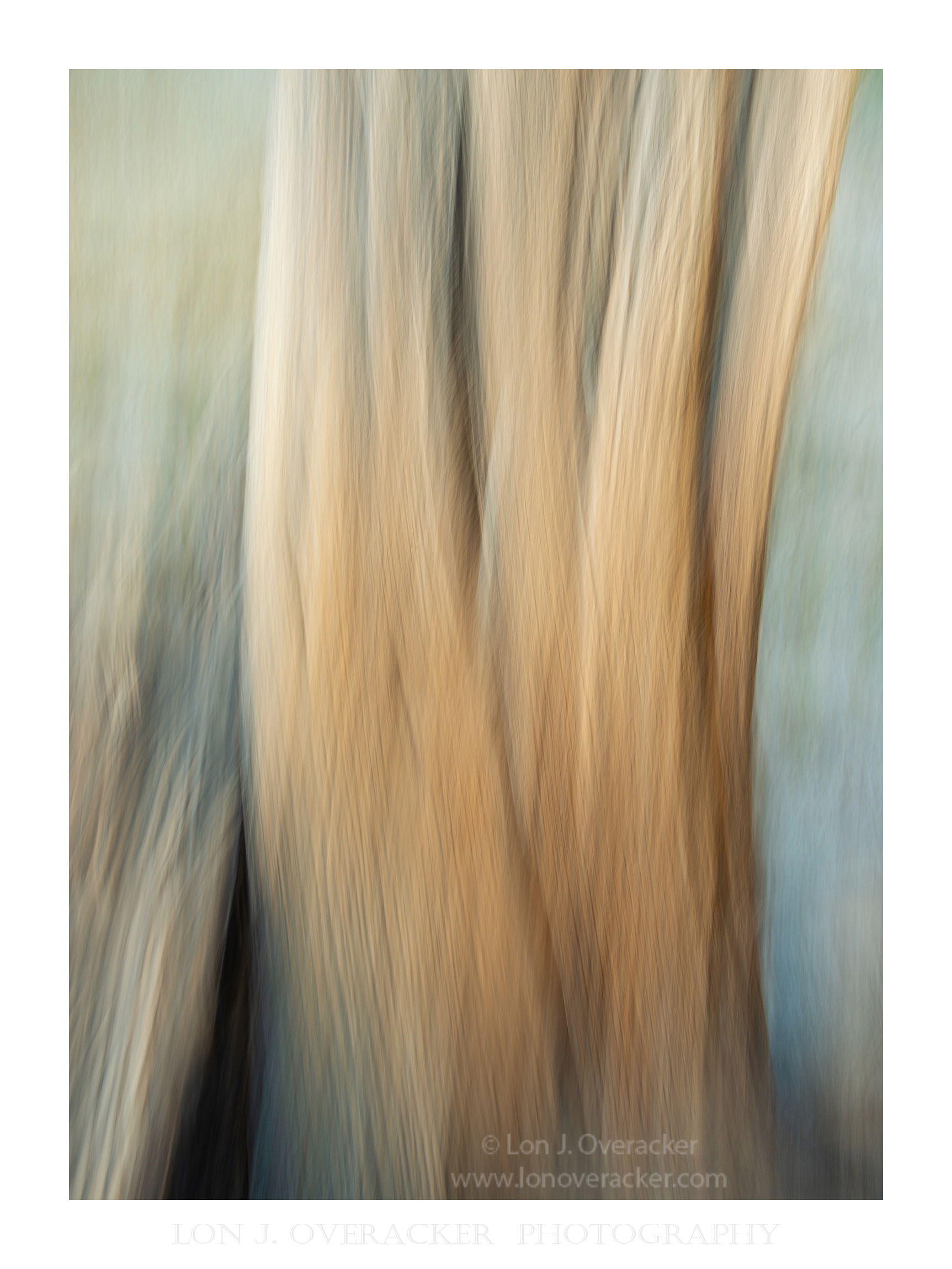
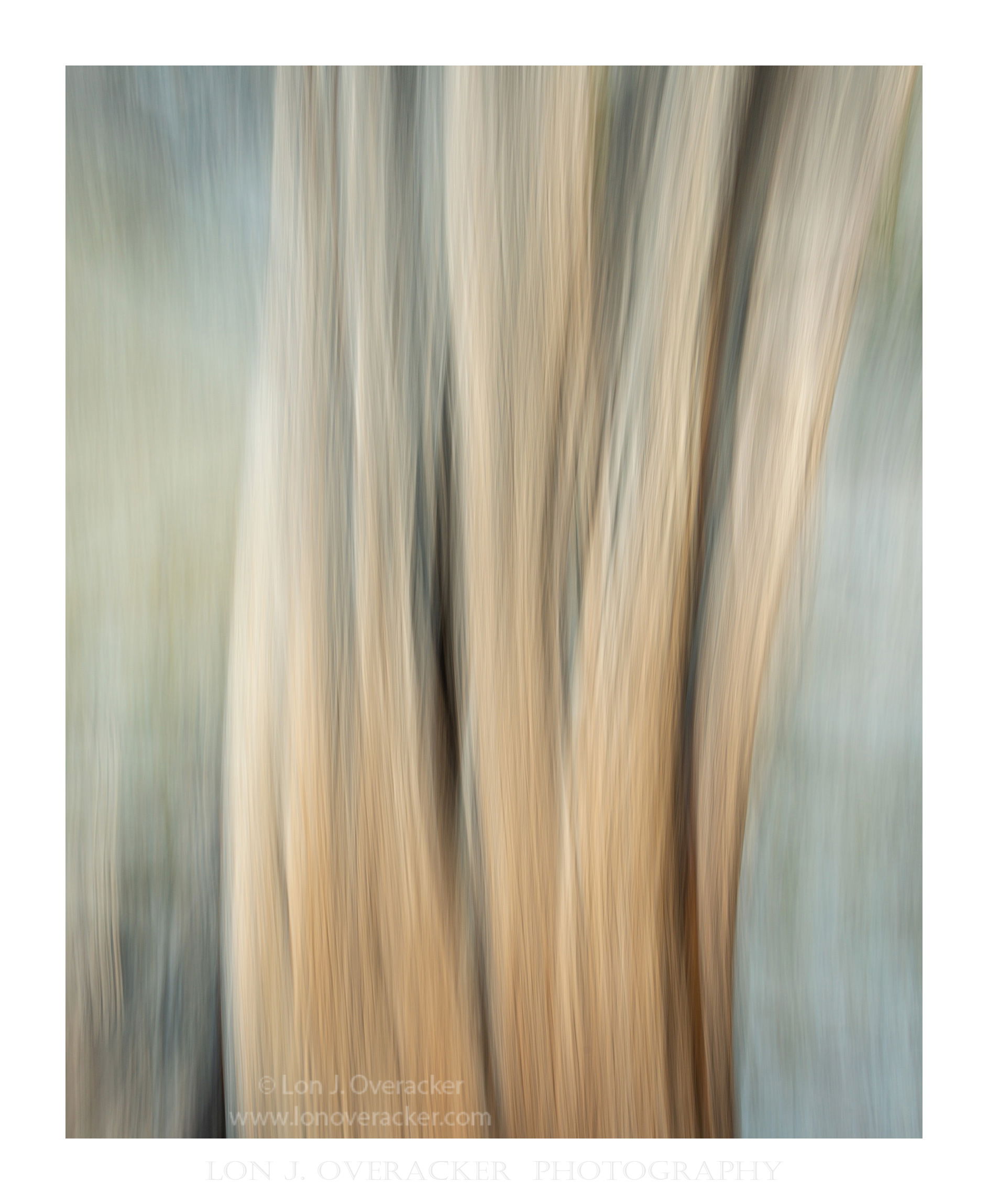
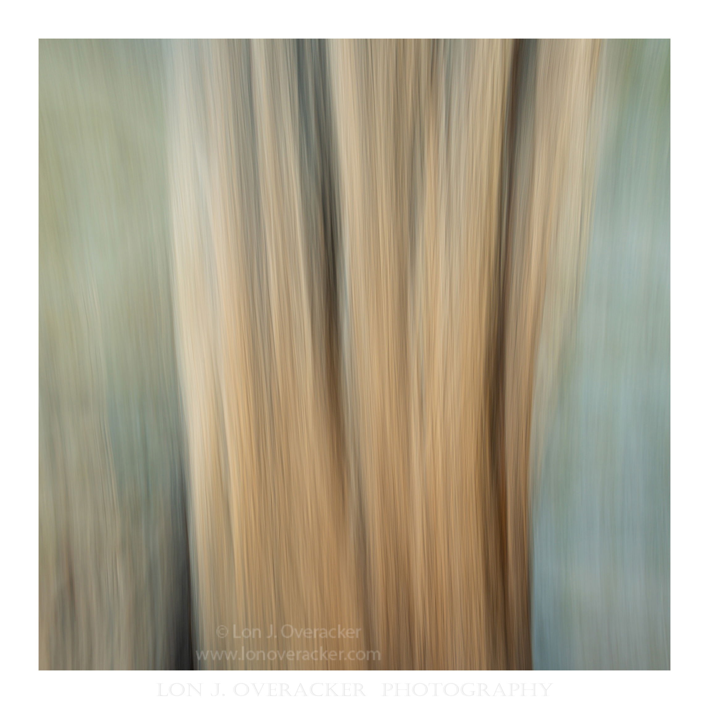
At least for me, this is an ICM example that shows one of the things that I’m most attracted to with the technique - but at the same time is an example why this might not hold any great value for others - including me.
I titled this “Father Time.” And the title has everything to do with the original subject; a very old and weathered Western Juniper stump. I has great character; I’ve watched it age over 15+ years and have any number of images I’ve come away with. HOWEVER, you as the viewer have zero reference to that simply by viewing this image. It has no meaning and as such the only appealing features have to do with color, texture, patterns, etc. “Father Time” has no reference, really.
So… I focus on one of those things that I enjoy with the ICM technique - and that is the abstract nature of the colors, patterns and textures that can be produced.
I’ve included 3 different frames (not crops, but 3 different ICM’s) for your opinion and reaction.
Specific Feedback Requested
Any and all feedback always welcome. I’m especially curious as to what you think about the dark crevice in the LL in the original post. I know the source, and that dark crevice and colors on the left are from another weathered fallen tree next to the main stump. But from a purely composition, balance point of view, I could see it as somewhat distracting. It’s presence much in the other 2 versions.
Technical Details
Nikon D800E, 28-300mm @34mm f/13 1/2s, iso 140 pretty much the same for each.
Texture and Clarity boosted ever so slightly in ACR for effect
Beautiful series, Lon. I am enjoying all three as you said, the textures, colors and patterns. But also I love the softness of them. They feel like watercolor paintings with lovely movement and energy. I also like that you’ve included some history and background on your subject. As for the crevice in the LL, it is, at least for me, somewhat distracting, however, it is also intriguing and pulling me in. I keep going back a forth on it, I’ll be interested to see how others respond.
Amazing!!! I love all 3 but I prefer the first image for it’s richness in tones, particularly the orange/red tones. I love the shadowing, the vertical lines throughout and the green and blue tones. I actually LOVE the dark section in the LLC. Yes, it pulls the eye but it also gives this piece of art a depth and boldness that are lacking in the other two images. I also find the composition to be better balanced in the first image.
I’m not sure you really need to know much about the subject here as this is so painterly and artistic that the knowing of the subject isn’t what pulls you into this image. You’ve posted some brilliant ICM images lately Lon, but I think this is your best yet. Bravo!! This needs to printed huge and hung on a wall.
I think all are wonderful, and my preference is in the order presented. I really like the dark area in the first but it does feel just a bit crowded in the frame – but that is understandable with the lack of control with ICM. I really like the curving lines from the wide-angle lens, and how the darker brown area gives weight to the lower part of the image.
Lon, these are great images you shared with us. The statement I quote above from your note is a key ICM element for me. For me, it is what we create with ICM that appeals to me, even when it is an abstract to those of us who don’t know where the original non-ICM image came from. I appreciate the art of ICM for its result.
Out of these three images, the last one is my favorite. I like the balanced flow in the photo – colors and symmetry, especially – and I absolutely love the glimpse of dark on the LC continuing with the dark to its right (somewhat in the center of the image). It may be an old stump, but the composition with the trunk widening towards the top symbolizes hope for my eyes. It is as if life is spreading and widening before our eyes.
Lon, these abstract images are well done. Isn’t interesting how we can come away with variations of an image just based on the rate of camera movement and timing? My order of preference is exactly how you presented your images. The one numbered “2nd” has a wonderful weaving pattern in the tree trunk and some nice texture in it too. I don’t mind the dark crevice in that image as it helps to anchor the frame but I could see how some folks would find it distracting. I also liked the colors in all three examples. Great work!
Truly beautiful. I get the impression that beautiful non ICM subjects become beautiful ICM images using this technique. To me this is still recognizable as a tree but presented in a way that is enjoyable to see. Like water shot at slow motion to show movement.