Critique Style Requested: Standard
The photographer is looking for generalized feedback about the aesthetic and technical qualities of their image.
Description
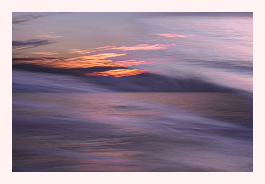
I have been spending a good amount of time in Fenwick Island, DE and this has increased my opportunities for new creative work. Really has reignited my passion for photography which has become somewhat muted at times.
A smidgen of ICM here but so little this could simply be a slower speed image so I posted it in landscape. Really wanted to capture the mood
Specific Feedback
Does it capture the post-storm mood? Processing?
Technical Details
f/18, 1/3 sec, iso 320
Critique Template
Use of the template is optional, but it can help spark ideas.
- Vision and Purpose:
- Conceptual:
- Emotional Impact and Mood:
- Composition:
- Balance and Visual Weight:
- Depth and Dimension:
- Color:
- Lighting:
- Processing:
- Technical:
1 Like
Ah, splendid abstract, with a beautiful color palette. I also like the angles between the different lines which cross the image… Very nice!
I love the color s in this one Mario! The texture in the water isn’t bad either. Sumptuous! The angled wisps crossing the scene was initially throwing me for a loop but once I figured out what I was looking at, I saw your creativity with this shot. The reflected light bouncing across the water intersecting those clouds??? is eye candy. There is one area that is bothering me though. That is the flat gray area just above the fiery sunset/sunrise. It looks like it may have been blown out and recovered but with no detail or color…or maybe not. I’m not sure what’s going on there but it’s at odds with the rest of the image both in color and in texture. I’m also drawn to the upper right corner where there is a sliver of a dark band running across the scene there. I would either dodge it or perhaps crop it out. You’ve been killing it lately with your ICM’s and your abstracts and this one is no different. This one was well thought out. I would love to see a much larger file though.
Hi Mario
I love the light, colours and soft textures in this image. You could try cropping down from the top of the image to remove the thin upper dark area on the right side and the area in the top that has little colour or detail. A lovely ICM abstract.
Cheers
Diny
Thank You Antonello @Antonello_Provenzale , David @David_Haynes and Diny @Diny_Jones for your thoughtful comments.
David, “That is the [flat] gray area just above the fiery sunset/sunrise. It looks like it may have been blown out and recovered but with no detail or color…or maybe not.” Actually I never touched that area so it is native to the image.
Antonello/David, I also was wondering about the dark streak and considered cropping it out. I/ll give it a go.
My vote is to keep the dark band. It really does not detract from the image. Works either way for me.