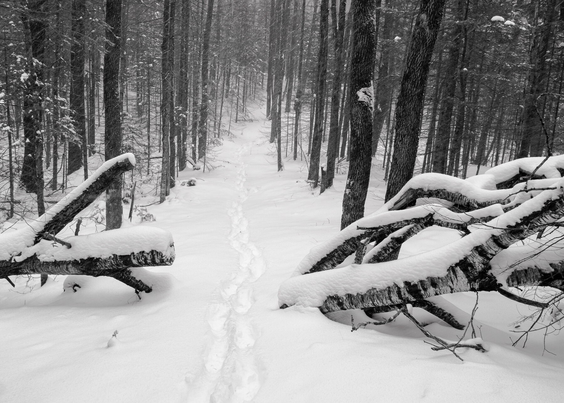
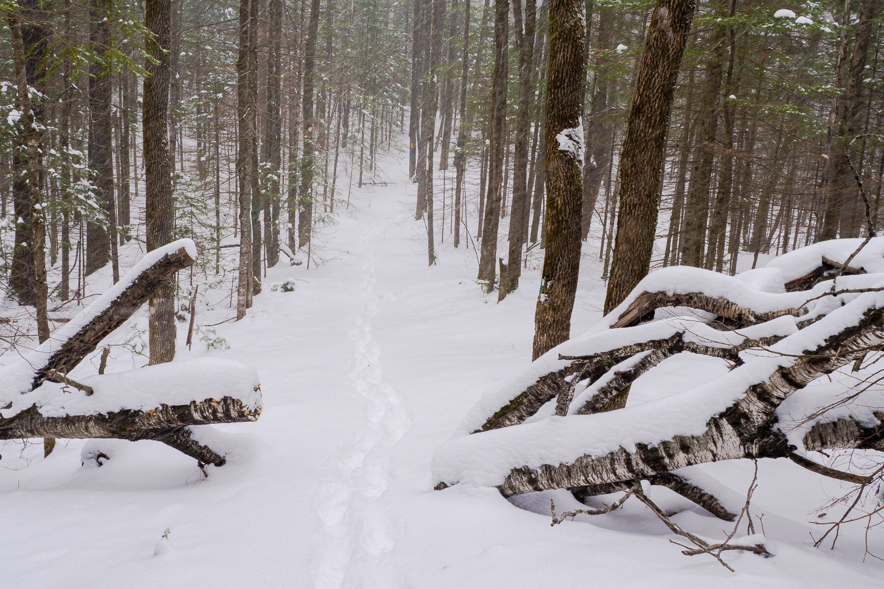
Trail shots are my jam, but if there isn’t an anchor or a definitive end point, they can end up looking vague and uninteresting. This tree with the cut through made for a great anchor and I hope the bending trail provides some visual appeal. It was snowing steadily when I took this and I was on my way back to the Jeep.
Specific Feedback Requested
Which do you prefer, B&W or color? Why?
Technical Details
Is this a composite: No
Handheld
Lr for B&W conversion and some adjustments to exposure, white & black points and lens correction, but mostly the built-in does what I need. Did a little clean up with the healing/cloning brush (a timber harvest must be coming because many of the trees are marked with paint). There are some slight differences in perspective and processing, I added some contrast to the B&W and some saturation to the color.
Lucky you! You have snow! We just have rain, rain, and more rain! I really like the color image the best because I love the little bits of feathery evergreen needles through the forest.
Lovely comp @Kris_Smith … I prefer the B&W … love the tones and contrast of the snow with the trunks in the foreground. The image draws me in and I want to walk along the path towards the more muted tones. Very nice!
Another vote for the B&W version Kris. It has a nice range of tones and I am enjoying the way the path along with the footprints draws me into the frame. Very nicely done.
It’s a bit of a trick question because they really aren’t quite the same picture. The B&W has some added foreground, which for me, works to draw me in more. Plus I prefer the crisper contrast. The cut through is a great entrance and sets up the picture beautifully. In my opinion, the colour could work too but I think it needs more work regarding colour balance. As it is now, it is a sort of not-very-appealing sepia. It appears to have a magenta colour cast, especially in the darks and mid tones, which gives the image a muddy feel. If you wanted to play around, I would try split toning - shifting the magenta more to yellow in the mid tone darks and shifting more to blue in the mid tone lights.
Yes they are slightly different - I think it’s the crop. I thought a change would shift the emphasis to the trail and the obscuring snow in the color one which would allow me to take a softer approach with that one. I’ll tinker with it when I get home to the laptop again.
Thanks everyone who took the time and left some feedback.
I also prefer the black and white. I find the footprints have more contrast. And that draws me into the image better than the color comps. This is a well composed image with wonderful detail. We have an inch of snow on the ground here in Olympia today. Maybe another inch on the way.