The photographer is looking for generalized feedback about the aesthetic and technical qualities of their image.
Description
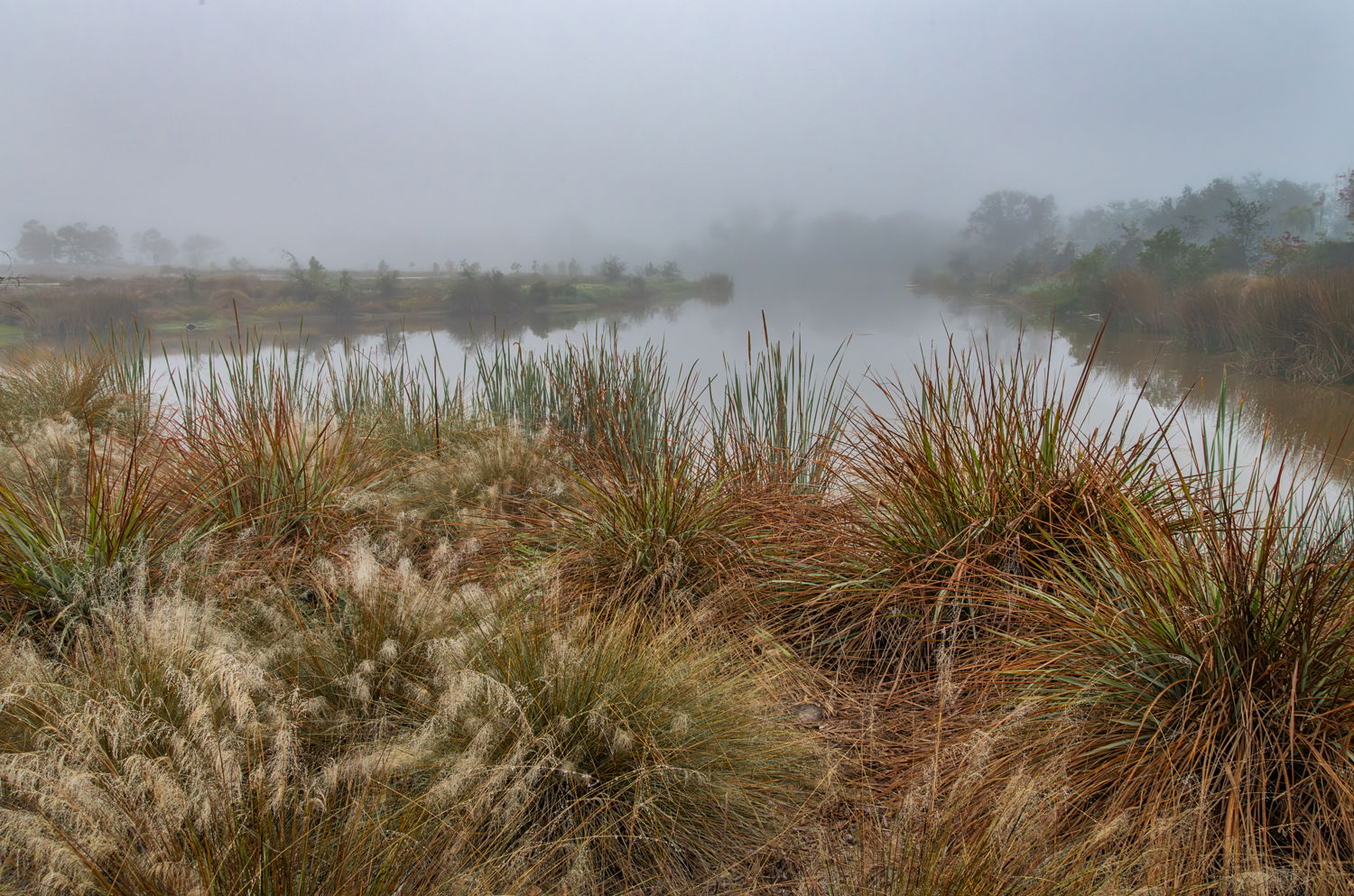
This from the west coast of Florida where we frequently get foggy mornings in the spring and early summer. I was struck by how the fog mutes the colors and shapes in this viewpoint. Somehow the sound of nearby traffic and bird calls seemed muted as well. It was an altogether eerie feeling that I tried to capture.
Specific Feedback
I’m unsure about the visual weight of the foreground left vs right. The subject was really the fog…does the background convey that?
Technical Details
1/250 f/16 iso 1250 @24 mm
Critique Template
Use of the template is optional, but it can help spark ideas.
I do think the weight of the foreground is left-heavy, but it appears that was not much you could have done to mitigate that. Too me, anyway, the image is really about the nice details and color in the foreground with the foggy background playing a major supporting role.
I think you could experiment with crops from the left to draw more attention to the fog. You could also look at a crop from the bottom for a more ‘pano’ look to put more focus on the background and the fog.
-P
What a lovely scene. The tonalities and color in the water and background are wonderful and mysterious. I do agree with Preston, though, that the foreground feels heavy. To my mind, there’s a few reasons for that - the amount of space it takes in the frame relative to the background, the warm colors relative to the background, the darker luminosity, and the clarity of the textures (love the water drops on those grasses!).
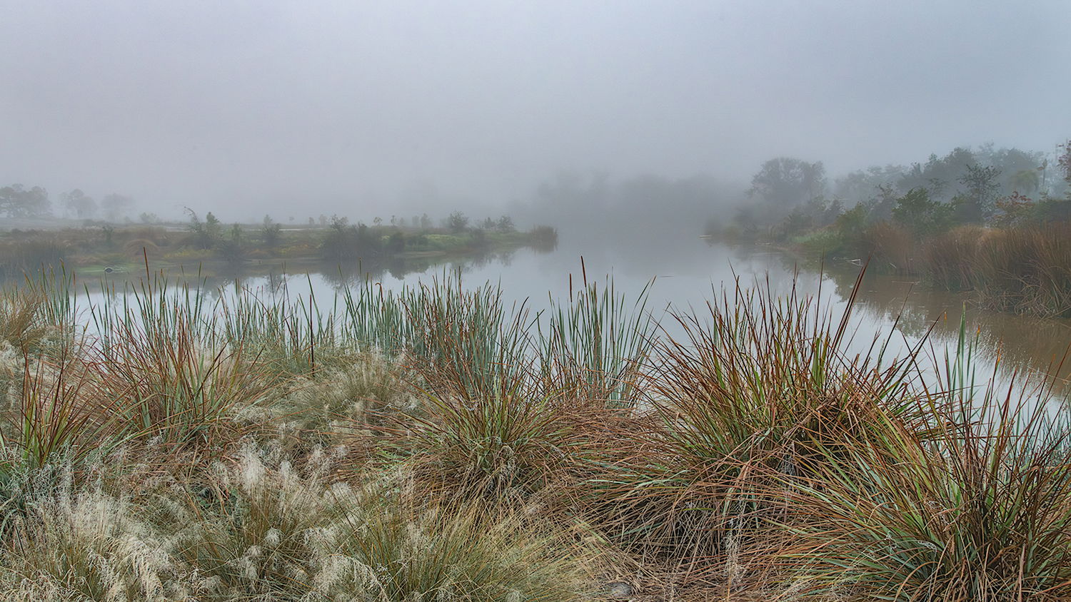
You say that you wanted to capture the eerie feeling of the scene (which is well represented by the fading-away background). The foreground rather belies that, however, for the above reasons. So, I wondered what this would be like if all those things were “backed off”. Here’s my idea and what I did:
Cropped to 16:9, as Preston suggested, to eliminate some of that foreground real estate.
Brought up the shadows (both in ACR and by dodging in PS) in the foreground.
Slightly cooled and desaturated the foreground, especially the reds.
@Preston_Birdwell@Bonnie_Lampley Thank you both for your insightful suggestions. This exactly what the photo needed. In retrospect, I could have raised the camera a little higher as well.
For me this image is about the spiky bushes against the foggy background. The light brush in the lower left quadrant doesn’t work for me as it pulls you into that corner and hurts the balance. I don’t think the crops work because it cuts into the roundness of the spiky bush on the right which acts as anchor.
Hi Richard,
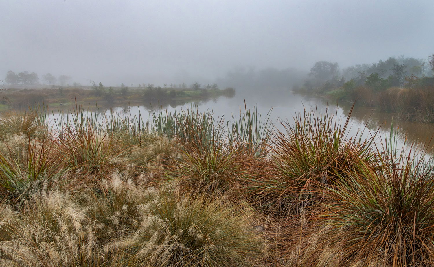
This is quite the lovely scene with some wonderful atmospherics. I am enjoying the FG grasses as well as the diagonal lines of the waterway as they draw me into this wonderful scene. I myself like the bit of warmth in the grasses; although I could see a small crop from the bottom. I think that would balance out the FG with the BG fog a little better. I hope you do not mind, but here is a rework with what I was thinking. For my tastes the shoreline on the right balances out the slightly heavier FG grasses on the left. Just my opinion of course. I hope that does not muddy the waters for you. Very nicely done!
I don’t have any issues w/ composition or visual weight of the image. There are several “triangles” in the frame that all point back toward the fog, giving it emphasis. The subtle warm/cool contrasts are nice, too. Lots of texture. Honestly, nothing I’d change here. Bravo!