The photographer is looking for generalized feedback about the aesthetic and technical qualities of their image.
Description
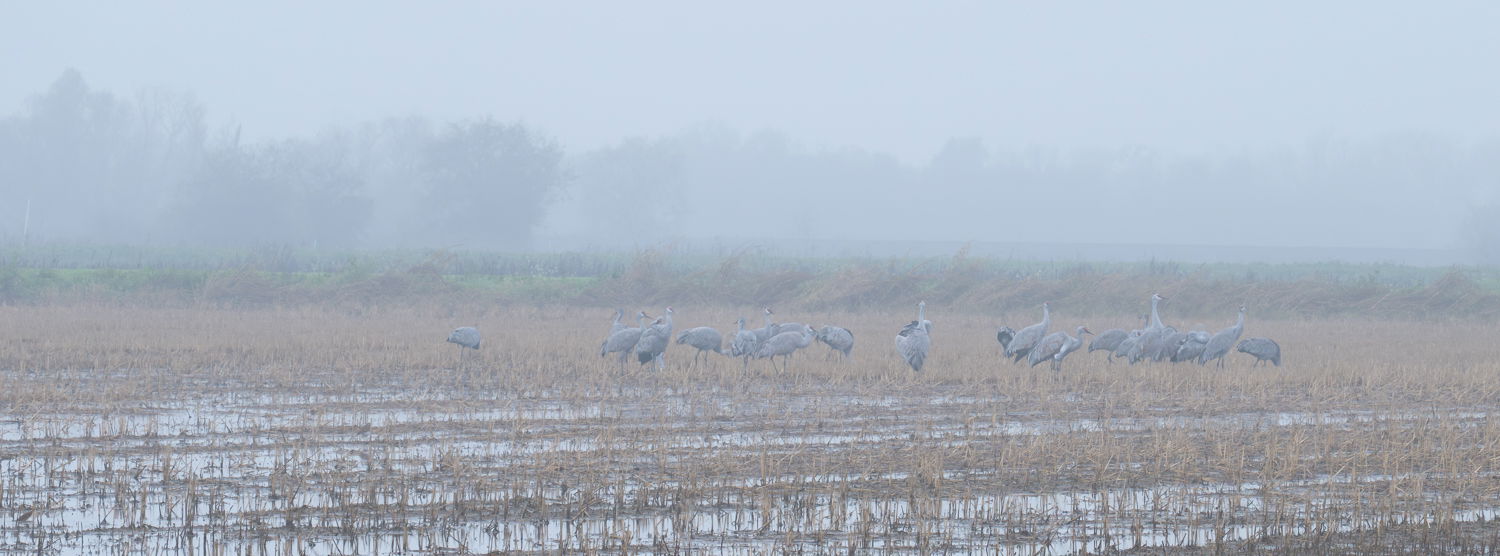
The fog was beginning to lift so I packed up and started heading home. Less than a minute after I started driving away, I spied a small flock of sand hill cranes settling down for the day in a nearby field. [That’s all it took!!]
Specific Feedback
I’m less interested in a critique - quite happy with the larger (not so tight) XPan crop and high-key low-contrast rendition.
However, I have a hunch that this image has potential for a lot of other renditions and styles. For example, I am so not a B&W guy. But I am curious to see what an expert in B&W can do with this image. Ditto for all the other styles that this image would look good in.
All suggestions and comments sincerly appreciated.
Cheers,
Franz
Technical Details
1/350 sec at f/9.5, ISO 1000, 400 mm
It was pretty dark, and the sandhill cranes were still settling down. So I opted for a faster shutter speed augmented with a higher ISO - with Lightroom denoise coming to the rescue in post.
Critique Template
Use of the template is optional, but it can help spark ideas.
Vision and Purpose:
Conceptual:
Emotional Impact and Mood:
Composition:
Balance and Visual Weight:
Depth and Dimension:
Color:
Lighting:
Processing:
Technical:
I don’t really have any critiques to offer cause I like the image as is. You’re out of like with processing suggestions also from me. Hopefully, if that’s what you’re after, more skilled people at that than me will chime in and help you out.
Continuous looking even after you thought you were finished paid dividends. You have created a wonderful pastel, soft mood. I don’t have any improvements to suggest either. Yet, I wonder how a slight blur in the foreground might look. It might move the eye away from the water and grasses to feature the cranes even more. As for B&W, in Photoshop you might duplicate the image and then try out Tony kuyper’s TK9 gray scale and magic mixer plugins to test different B&W looks. I favor the color look you have here though.
Hi Franz,
I am enjoying this as presented as I quite like the subtle combination of warm and cool tones in the scene. I am no B&W expert, but I tried a bunch of the B&W filters in Nik 6 Silver Efex and still very much preferred your color version. My only suggestion would be to crop some from the left side since there are no cranes there and it feels empty without them. I do like the choice of the pano format.
Don’t you just love it when your ready to pack it in after a shoot and suddenly something changes that catches your eye and you’re back to shooting again? Glad those cranes caught your eye and made you compose. I echo what @Larry_Greenbaum has said about doing something to the water in the foreground so it doesn’t catch the eye so much. I’m not actually sure what to do but may, as Larry suggests, a blur could work or a burning of the water a little bit. Everything in the scene is so soft and painterly and the brightness of the water certainly catches the eye. I love the very muted colors and my black and white attempt didn’t work at all. I have nothing else to offer you as a way to improve this. Sorry.
Sorry, it’s been a while and I haven’t responded about the blur in this image. If I can figure out a way to download it, I’ll take a stab at it. Viewing the image has no download option. So here’s what I would do. Go to Lightroom Classic and click on the “Lens Blur” panel. Then click apply at the top of the panel. And click on blur at the bottom. Then you should be able to blur as much as you want with the brush. And, you can adjust the amount of blur you want in the panel as well.