The photographer is looking for thoughtful feedback on the image as a whole, especially around the areas noted below.
Feedback Focus: Artistic / Expressive
About This Image
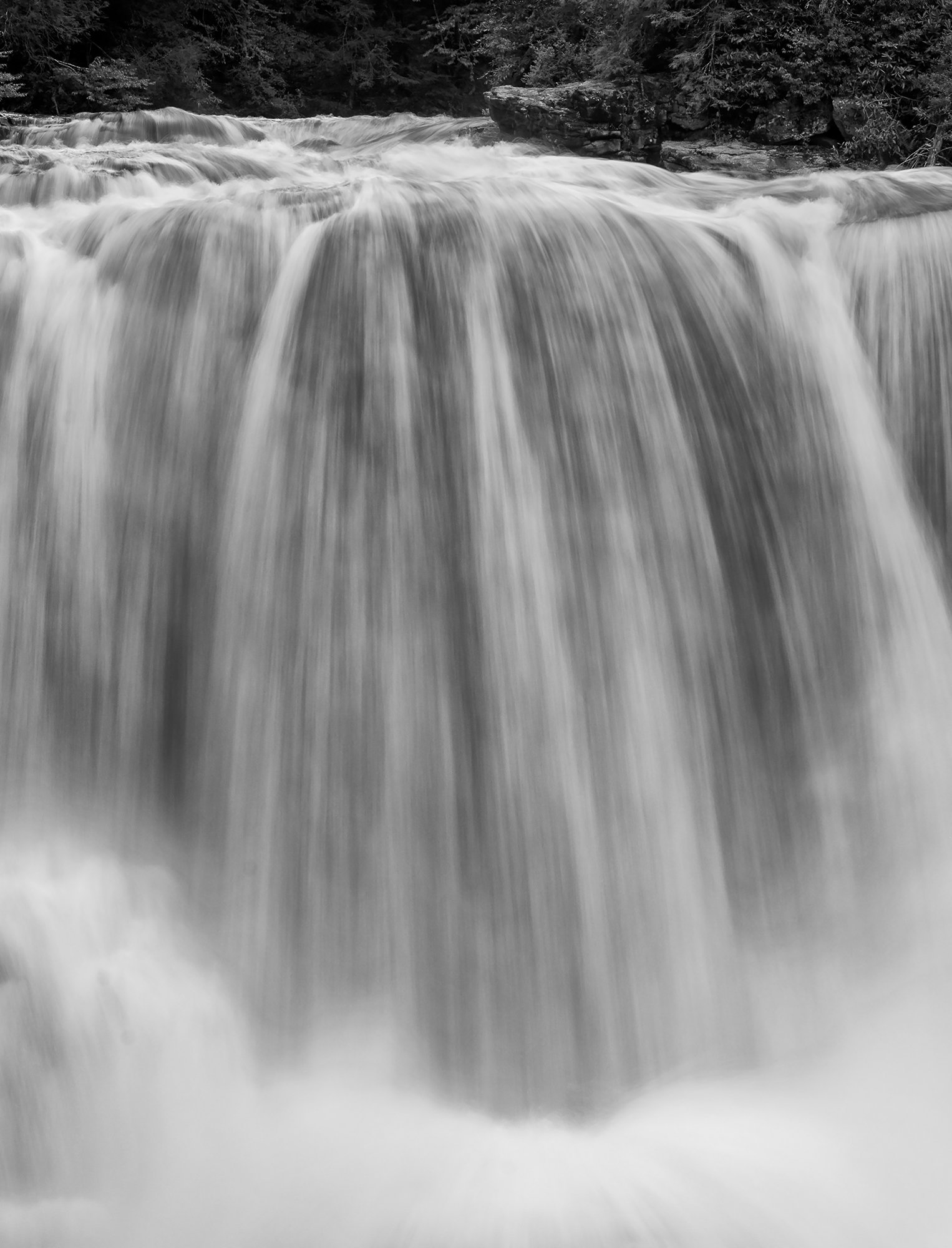
This is another tighter view of the impressive volume of water rolling over the 35’ Blackwater Falls. The spray was quite impressive as well as I was constantly wiping the front of the lens even though I am sure we were back a couple of hundred feet. Still so worth it! This is a crop from the original frame as I was in a hurry to get on the road for the four and a half hour drive home in the dark and the rain. I thought this crop helped to emphasize the plumes of water at the base of the falls. I also thought I would convert this to B&W using Nik 6 Silver Efex just for a change of pace.
Feedback Requested
A few folks mentioned that framing being a little tight on the last one. I was wondering if everyone feels the same of this even tighter crop? Does the B&W conversion work for you? Anything else you notice please feel free to mention it.
Technical Details
Camera: NIKON Z 7
Lens: NIKKOR Z 24-200mm f/4-6.3 VR
Focal length: 59mm
Shutter speed: 1/3s
Aperture: f/11
ISO: 100
Wow! Love this! Perhaps my favorite of you renditions from this spot and time.
Now I was one of those who was wishing for a tad more space - and perhaps on those specific images I might still feel that way. However, NOT with this one! Awesome job with this tight crop. the bonus here is the wild and powerful top; the “setup” to the 35ft drop. There’s enough of the landscape, river shore to provide context and it’s amazing how such a small area (15%? of the vertical) can mean so much to the overall impact.
The waterfall itself, wonderful texture and detail. I’m also really enjoying the “mist” and spray at the bottom. I think you’ve captured this and presented just like one might be if they were there (ok, minus the roar and drenching…)
Well, I was one of the folks that wanted a touch more room around the frame on the last waterfall image but I have to say that the intimacy provides everything we need to see from this frame. We know where the bottom is and the spray says powerful but yet it does a beautiful job at framing the bottom of the image. The darker waterfall is beautifully rendered with just enough texture, no blown highlights, and ribbons of white and shadow creating terrific contrast. I am wondering though about the angled light coming in from the left edge near the top of the waterfall and angling down to the middle of the right edge of the frame. I’m not sure what that is? It’s not a frame wrecker but it’s interesting. The top of the frame shows just enough of the forest and no more is needed. I do find that the left half of the vegetation is quite a bit darker than the right half. I understand that it’s natural but I’m wondering if maybe you could either darken the right half or lighten the left half for better balance.
Gorgeous image, Ed!
This was my initial impression too. That sliver of land gives such context to the falls, and the effect is to emphasize the drama and power that you saw. Well done.
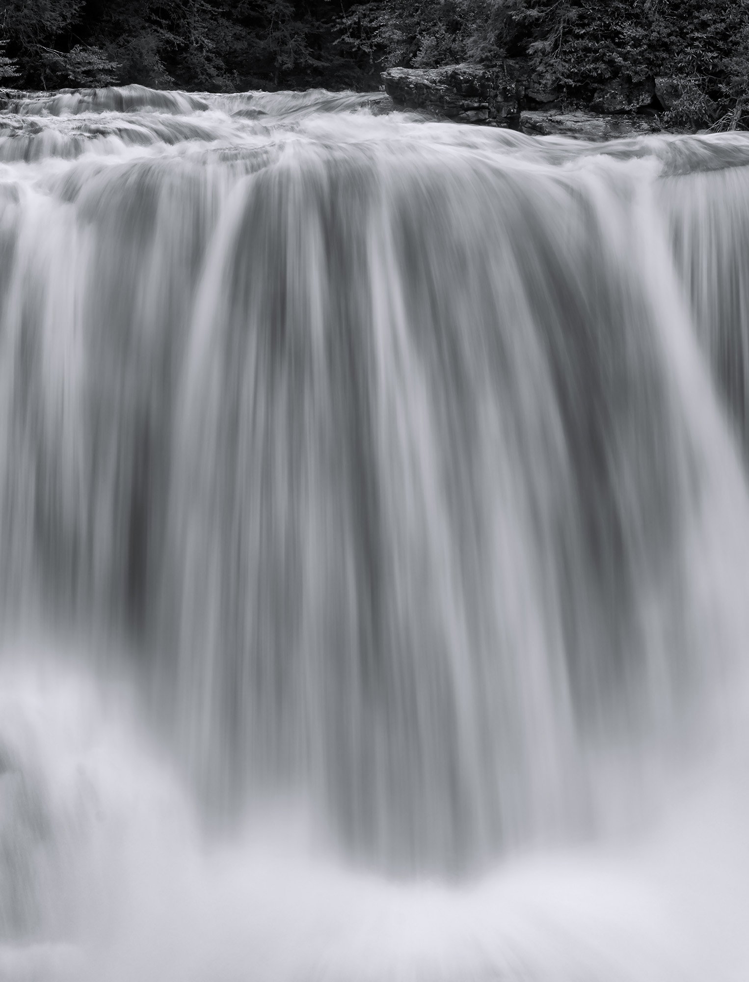
I should emphasize that this is wonderful as is Ed, but banging ideas around in my head I wondered what this would look like with slightly less detail in the main falls. I also wondered if a slight tint might make the whites pop out a bit more. Probably a dud on both counts, but here’s a visual representation of the lunacy:
Ed, I like this one the best. It really shows off the power of the falls, especially with the splash curving along the bottom. As others have said, that little strip of land along the top sets the stage for the water very well. I also like the small steps leading to the large drop
Many thanks everyone @Lon_Overacker, @David_Haynes, @John_Williams and @Mark_Seaver for taking the time to leave your thoughts on this image; always appreciated. I was going to post a revision, but I like John’s lunacy so much I think I will go with that. John, if you don’t mind sharing, how did you achieve the end result?
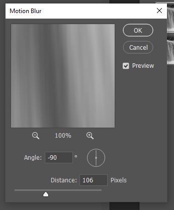
I then masked it to the vertical waterflow and adjusted the opacity to taste.
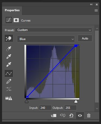
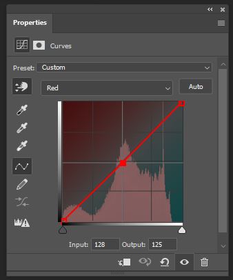
For tinting, I commonly play with various curves to warm or cool images. It’s fun to see how the mood changes. For water and snow black and white images, I often find that slightly cooling the image can make the whites pop. The most common way I cool (and it’s what I did here) is to use two curves, one that moves the highlights a little blue and the midtones a little cyan. Here’s the curves I used:
Ed, I quite like this closeup, intimate shot of the falls. It really shows off the power and I really like how the splashing water at the bottom adds a nice framing element. I like what @John_Williams did. It smooths out the water more and somewhat reduces the light area that @David_Haynes commented on. I think it’s just areas behind the main flow where water is creating small cascades on the rocks. You’ve added just enough of the river and trees at the top. Great work. I see what looks like a diagonal shaped dust bunny in the lower left.