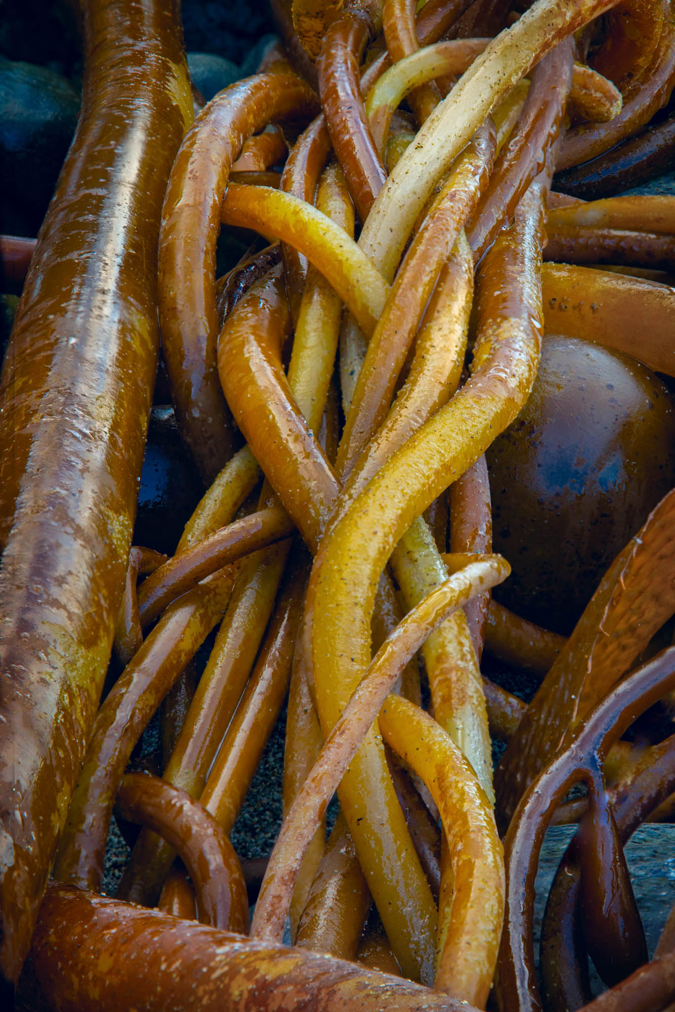

Looking for driftwood abstracts last week, and this knot of bull kelp caught my eye, and I finally decided to try an end-on image, focus stacking 6 exposures. The result looks quite vibrant and seems to convey the hopelessness of the knot, so it was pretty much what I wanted to end up with.
But I wondered if black/white would convey a different feeling from the same image. The second post is my current version. It seems to emphasize the finality of the knot and play down the vitality of the kelp, even with some warm toning.
Specific Feedback Requested
This is a learning experiment for me, so hearing how this exercise strikes you will be quite valuable.
Technical Details
Is this a composite: No
5DIII Ef24-105 @105 1/60 F/10, iso 640
6 exposures (chosen looking through the viewfinder ) blended with Helicon Focus. Applied Topaz Sharpen AI, and LAB curve to add color range.
Monochrome conversion with Silver Efex Pro using manual settings, inclusing my first experiment with Paper effect (Agfa APX Pro 100)