The photographer is looking for generalized feedback about the aesthetic and technical qualities of their image.
Description
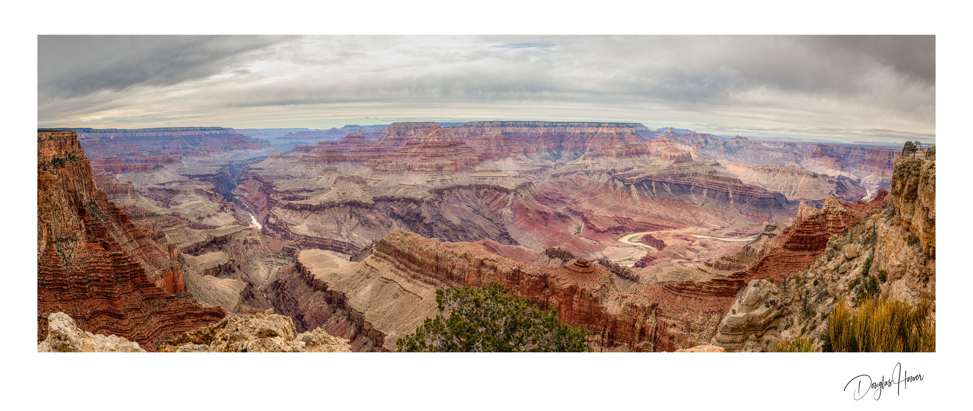
The objective of the photo is to display the “Grandeur” created by the expansive nature of the Canyon. I used a Panorama purposely to try and create an impactful Image.
Specific Feedback
I’m seeking general feed back for both the technical aspects of the photo and the composition .
Technical Details
The Panorama was created by blending 5 exposures for each frame creating an HD image that was then stitched together to form a Panorama photo.
Critique Template
Use of the template is optional, but it can help spark ideas.
Vision and Purpose:
Conceptual:
Emotional Impact and Mood:
Composition:
Balance and Visual Weight:
Depth and Dimension:
Color:
Lighting:
Processing:
Technical:
Welcome back, Doug. I’m liking this. I’m usually not a fan of 180 panos ( I’m just assuming this is 180 cause it looks wide enough) because of the distorted bowl effect. But you’ve kept that to a minimum here with just a little curvature of the horizon. I really like the composition and the subdued colors. My only suggestion would be to back the blue offa tad. Just
Hi Doug,
First off, welcome back to NPN. That is quite the expansive view! My thoughts and suggestions pretty much align with what my brother has suggested. IMO reducing the blue lets those warm tones of the canyon walls really shine. Very nicely done.
Majestic!! The work (make that skill) that went into it shows in the result, which looks like it could make a huge print. I would be inclined to distort it to unbow the horizon, but that’s only 2c worth for about a $1000 image.
Beautiful pano of the Grand Canyon. You have accomplished your objective. The image demonstrates the grandeur of the canyon, and the pano presentation accomplishes your intent to create an impactful image. I agree with backing off the blue a bit as in Michael’s redo, but would like to se a slight bit more saturation.
Welcome back, Doug! This is a heckuva image to come back with and I love it. I’m especially fond of the way the two cliffs on either side of the image sort of frame the frest of the canyon. You had a nice sky to work with, too. I agree with Michael’s assessment re: the blue and Diane’s recommendation to try to level or unbow the horizon. Either way, even as-is, it’s a beauty.
I think I like the tree at the bottom of the image … and that its saturation is so low. It adds to the image and doesn’t distract. It would have been good without it as well though.