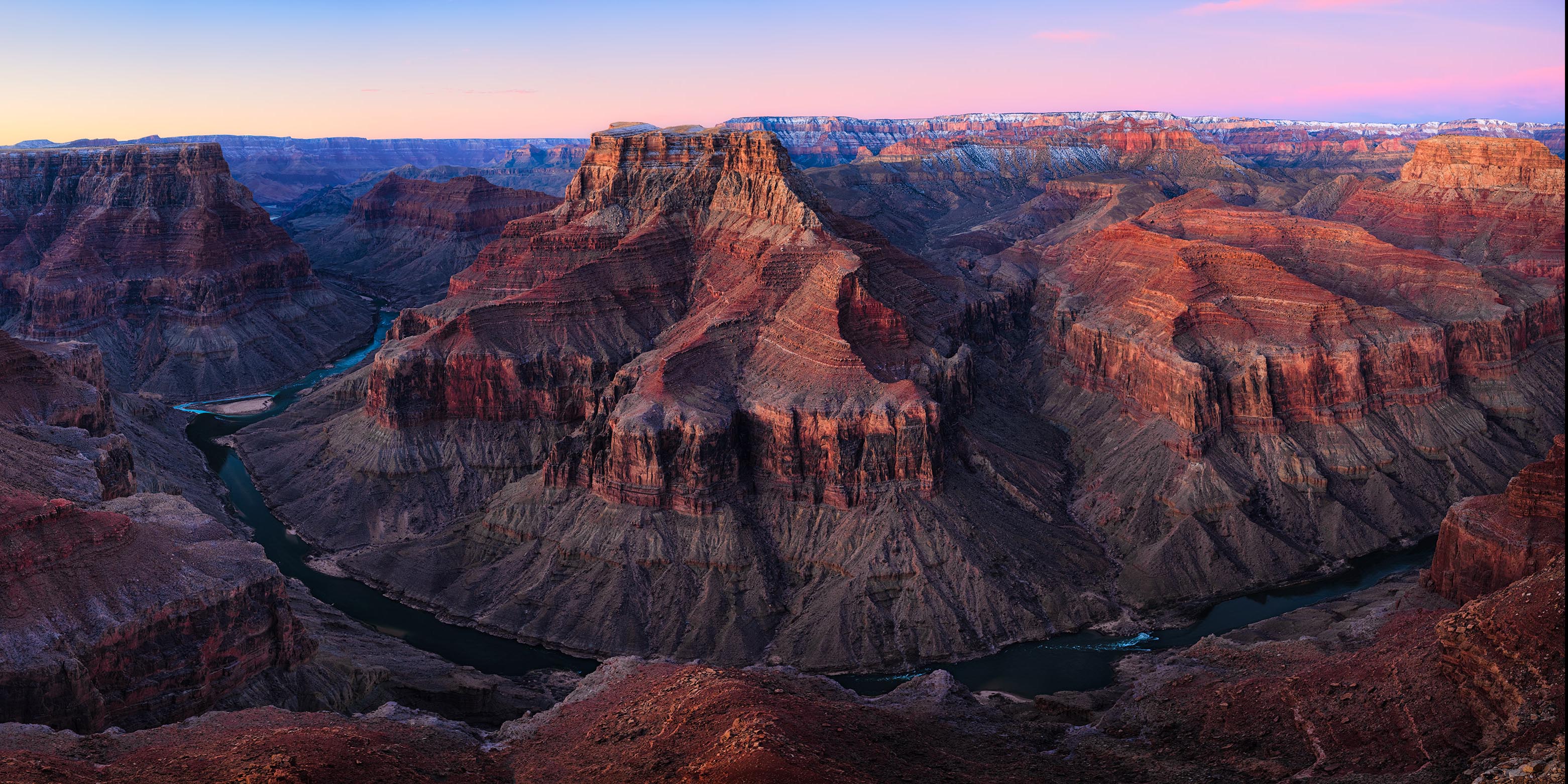
I think I really like how this image is progressing. However, would like critique on any & all improvements you notice. Certain it has obvious issues I can’t see, like too much saturation and amount of dark reds.
Decided to keep it long because I didn’t want to lose the only colors in the sky at both ends.
Michael, the details in the eroded forms look great. I also like the sky reflection in the river. I think the pano format works well. I think all the reds are a bit oversaturated, an easy fix of a fine photo.
I really like this shot, Michael. The pano format is perfect for this scene. I agree with Mark that the reds do look a bit oversaturated. Otherwise, and fine image. I could see this on a wall.
I like the bend and I like the color rendition (I don’t think it’s overly saturated), but I get a slight feeling of imbalance when I view the image. Perhaps it’s the “v” coming in from the LL corner that gives weight to the side? I am not sure if I will crop it though, keeping it long seems to work well with the river.
Michael, I think you have a really nice image here, and I like the idea of using a panoramic format, it helps communicate a sense of vastness. I do not think your reds are too saturated here, they are well within the realm of personal taste. In fact, I think the image overall is very well processed for exposure/color/ contrast.
I agree with @Adhika_Lie that the image feels unbalanced, and the composition is too left heavy. I think the V shape Adhika mentions is part of it, but I also think the darker luminosity of the left side is not as appealing as the wonderful light in the right 2/3’s of the image. If this were mine, I would consider a crop more like this…
I think that’s it Ed…I kept trying to work on that darker area to try to make it more appealing, but just seeing it all cropped off - I’m really diggin it. Thanks!!
I really like what Ed did with this. Maybe it was that dark LLC that made some of us feel the reds were a bit over saturated, because now, to me, anyway, it doesn’t feel that way. I would be looking for some wall space for this.