The photographer is looking for generalized feedback about the aesthetic and technical qualities of their image.
Description
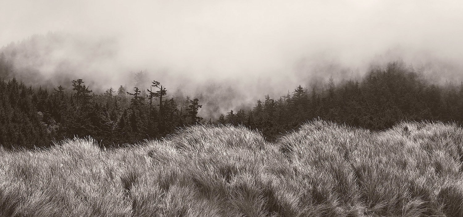
On a recent trip up through Oregon and Washington, we stopped at a few beaches in southern and central Oregon. I don’t remember which one this was. The beach was lovely, but when I turned around, I was immediately taken by the visual layers of grasses, trees, and lifting fog.
Specific Feedback
I converted this to b&w as it was about the texture and light for me, not the colors. I’m wondering about the line of trees - do they look too muddy? I tried various ways to bring out some detail, but it still looks a bit muddy to me.
Technical Details
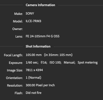
Hand held, with a polarizer. Processed in ACR & PS
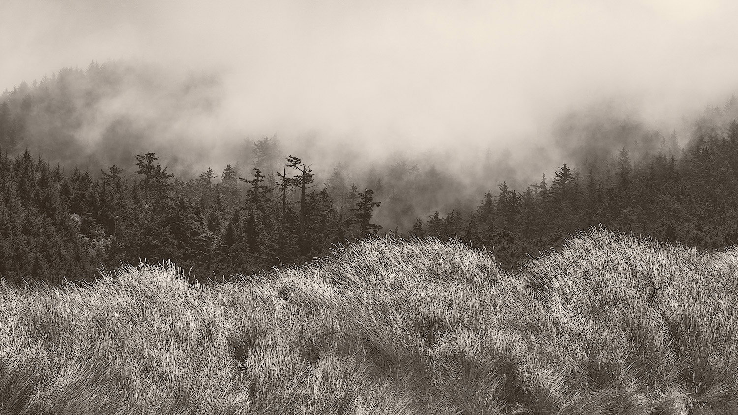
For me, the grass is the star of the show. You can almost feel its movement. It’s alive. You also can sense the wind that’s the cause of all this. So the grass is the main element. I don’t feel the trees look, as you say, muddy. I’m not sure if raising the exposure on the tree would be good or bad. Usually foggy conditions are pale but how would the grass look if the trees were paler? Probably confusing. The issue I have the most is the sky. There’s too much of it. Fog that discloses object is intriguing, but homogeneous fog is not. I suppose you could put a tonal gradient or even a circular gradient to that fog to make it interesting. I did a crop and I like it better but playing with gradients could I think take it to the next level. Not that I’m very good at that sort of think. But basically that would be changing it from what it was to something you imagine. That what all the big boys in b&w do anyway.
Hi Bonnie,
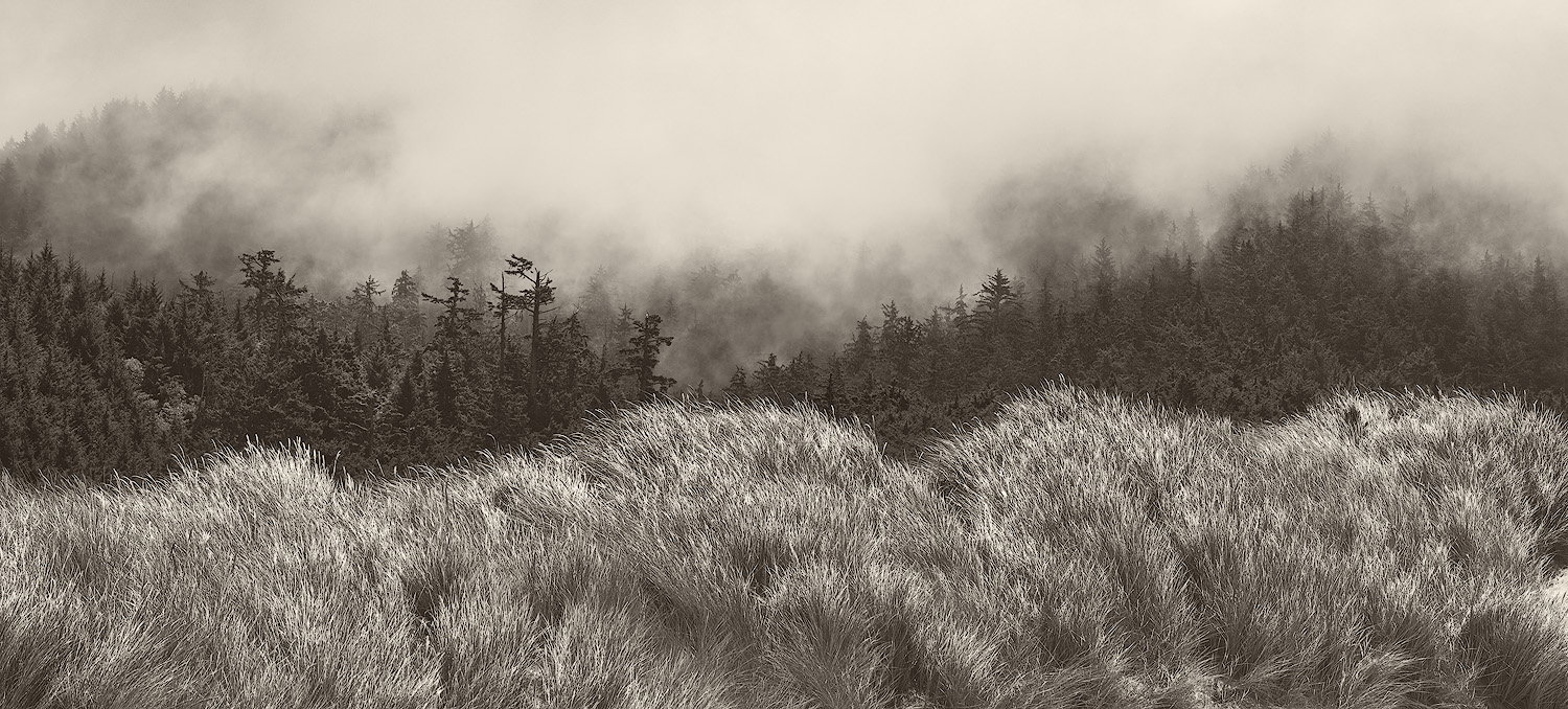
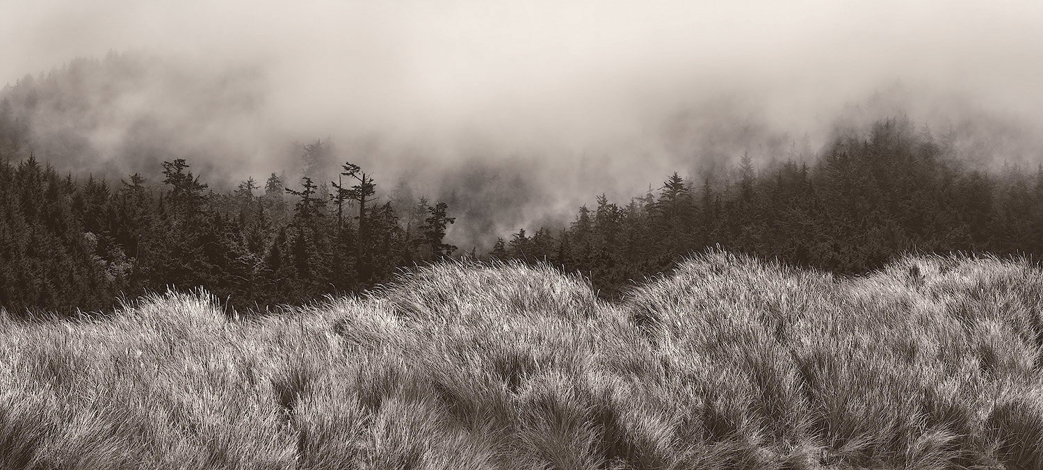
This is flat out gorgeous! I am loving the three distinct layers; with the grasses followed by the trees and capped off with the fog; that you have in this scene. I particularly like the tones and textures of those FG grasses as well as the subtle fading of the trees as they disappear into the fog. I also think the atmospherics add a sense of mystery to the image. I too think the trees look a little muddy so I think a little contrast would help with that. I could also see a crop from the top making this more of a pano and giving all three of those wonderful elements equal billing. I hope you do not mind, but here is a rework with what I was thinking. Just my opinion of course. Beautifully done!
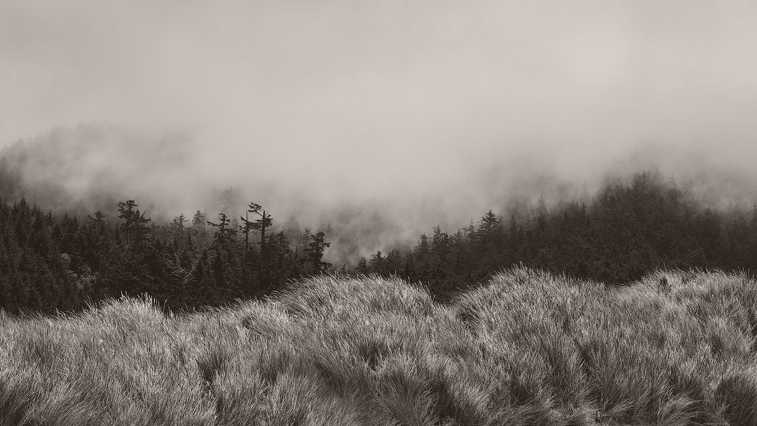
Thank you @Igor_Doncov and @Ed_Lowe. I take your critique on the amount of sky. I didn’t really want to crop more, but I went back and gave it a try. I actually started over again, to try to bring out more detail in the sky. Ed - I do like your crop and contrast adjustment. Rework posted.
Wonderful and different! Very lovely layers, and the RP works for me! The layers say to me, from bottom to top, coastal wind, rigged survival trees and ephemeral fog. Total winner!
I tried a rework of your image earlier but didn’t have time to post it, so don’t know if it differs any from yours or @Ed_Lowe. I tried to bring out a little more of the fog enshrouded trees and added a little contrast to brighten the beautiful FG grasses. There’s nice mood and layers in the image. Don’t know what was behind the grasses and you probably didn’t have a higher vantage point, but I feel the grasses are a little too dominant. they’re almost like a wall keeping me from entering the image. That aside still a wonderful image.
Lovely image. The texture in the grass is wonderful and you can almost feel it moving in the wind. I like the original composition as it is wider and feels more relaxed, but I like the tone and treatment in the redo. Can you keep the same composition as the first and just adjust for tone? I can see how the crop reduced the amount of blank fog, but why crop off from the right? Are you trying to keep that same ration for a reason?
Yes, I was trying to keep it to a 16:9 ratio, but upon reviewing all the reworks, I’m liking the more extreme pano version. I posted a 2nd rework with this crop.