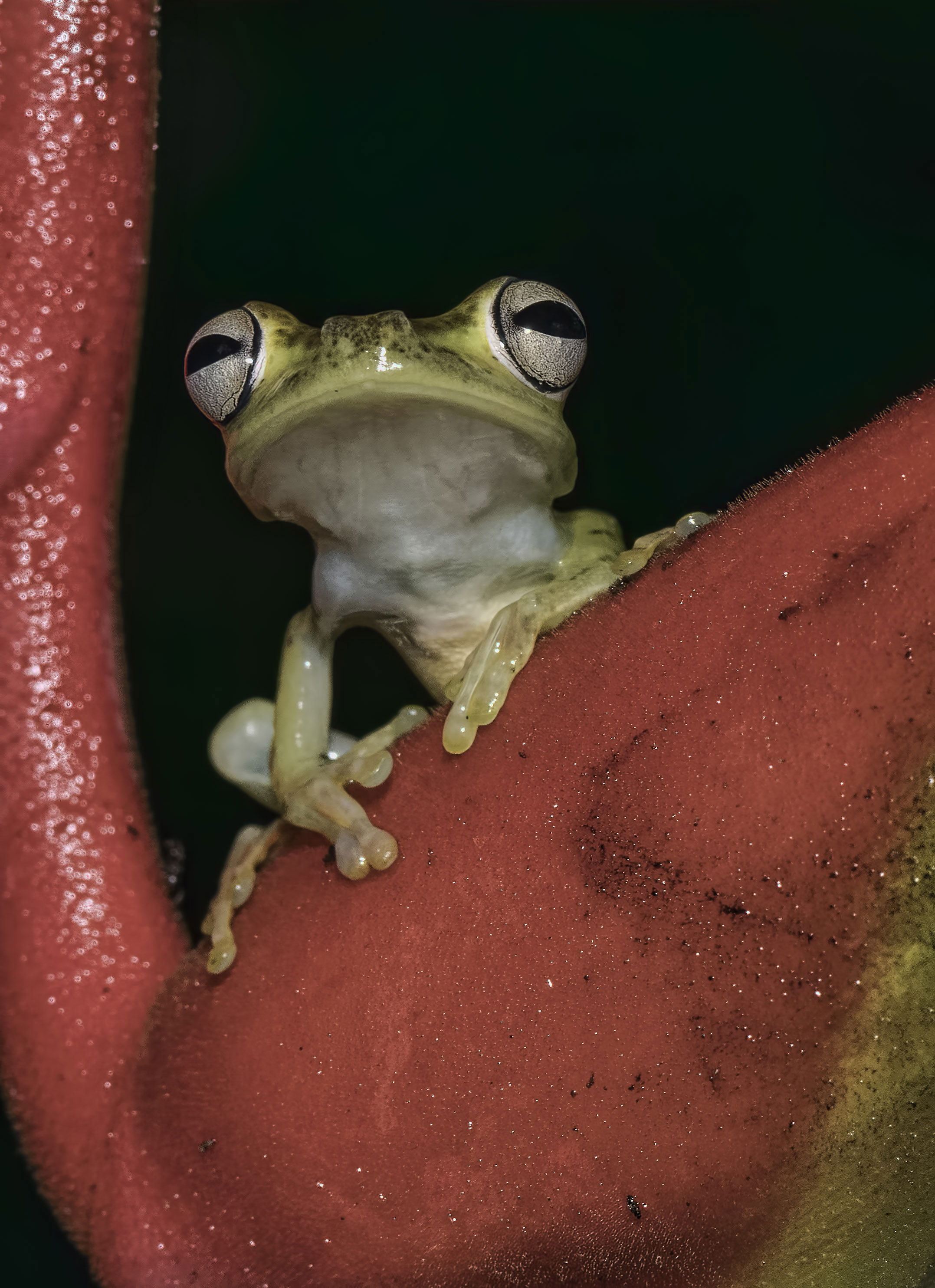
This is a really nice image for probably more reasons than I can think of. The things that I find really interesting are the interesting subject, the overall sharpness and depth of field, the framing by the red plant?, the perfect black background, and the perspective which seems like you are at eye level with the frog. The one very minor suggestion I would have would be to darken the bright sparkles in the red on the left side of the screen. To me they are a very slight distraction.
I like the exposure and focus on this green tree frog. I find the colour of the foliage to be very saturated. Perhaps this could be toned down or perhaps crop it in closer. The frog has a transparent, slimy feel to it:)
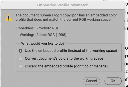
This is a wonderful pose, well captured! Saturation of the reds looks a little subdued to me so I downloaded it to see if the profile was correct. It is ProPhoto RGB, which will not show properly on the web. Always convert to sRGB for web posting.
I was pretty sure the color profile was SRGB but apparently you have seen otherwise and I’m not sure where you are finding the pro RGB as opposed to the SRGB
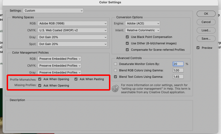
I have PS set (as it should be for everyone) to warn me if an image I open is in a color space different from my working space. Here’s what I see when I download and open this image, and the right answer is to convert to my working space.
That’s very strange. I did set up my page to look like yours where it checks for the profile mismatches. Identical to what you posted.
I’m going back-and-forth between Photoshop 2025, Photoshop 2026, and Photoshop beta. Sometimes I don’t have a choice in one of them pops up and I just use it. But as far as I can tell, it’s all set to the sRGB collar space and I have no idea how you are getting those unusual color profiles. Maybe I need to tell you about my workflow. Most of these images are processed on my ASUS pro art laptop, which I believe has 64 GB RAM and nvidia RTX 3000 graphics card with at least 8 GB of memory.
So basically, I do all my processing from the Raw files, using Photoshop, DxO, topaz, and I’m just learning how to use ON 1 photo raw. so I have a lot of choice’s. and yes, it does get confusing at times.
Only one thing matters – that whatever you are using to export the JPEGs to post (there are a number of export options in various software) should have a setting to convert to sRGB and to embed or tag the profile. It is your export settings that are giving the profiles. If the export dialog doesn’t have that option, use one that does.
If you are just saving the JPEGs and posting them without any kind of export dialog, it is simple: From Photoshop, go to Edit > Convert to Profile. (On a PC it may not be in the Edit menu…) Tell it to convert to sRGB. I don’t see that that gives you an option to embed the profile, but converting is the important part. In the other software, I don’t know how to convert but a web search will tell you.
Hi David,
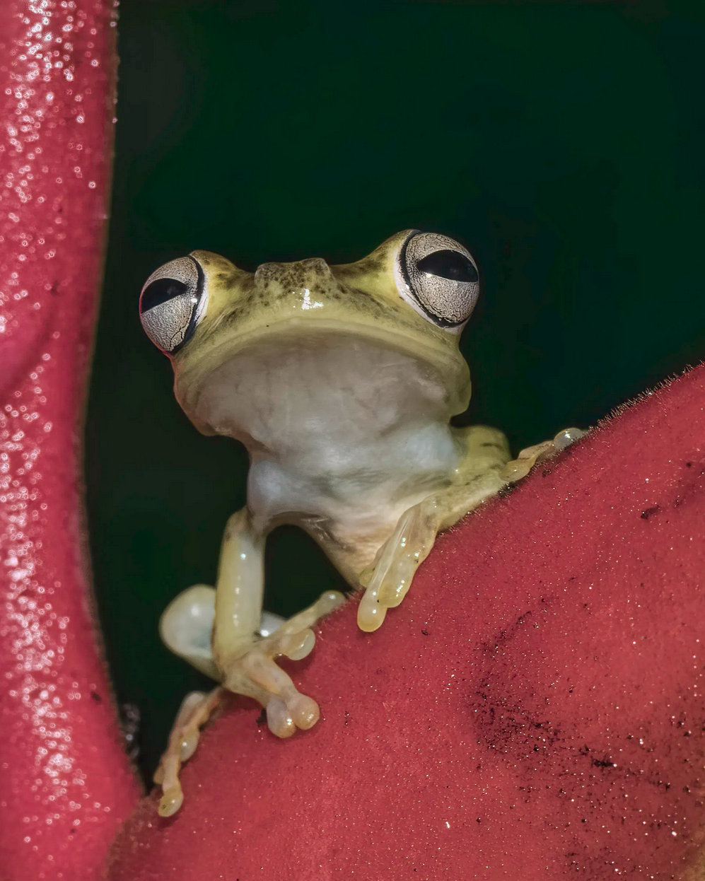
I’ll let others chime in on the color and export settings. I think the image would benefit from a crop, perhaps and 8x10 ratio. I took a quick stab at it (just used a screenshot, so the color might be different), and you can see the greater simplicity: less green lower left, no yellow to the right. I didn’t do edge patrol, so some of the highlights on the left could be toned down, spots removed. Could even been almost square, but I like giving the frog an escape route up top.
Thanks so much for your contributions and your ideas on this image. I guess it was my thinking that the golden part of the plant in the right lower corner, mirrored the frog. But your approach is also good. Nice to see a different point of view.
I sent you a long reply about color space and sRGB
And then had problems sending it. I’ve been having some issues with this one email box that I’ve used for years. It seems that Comcast has been preventing me from using it because I think I’m a spammer.
I’m about to call Comcast and complain.
Thanks for all your help again and hopefully you’ll get the email. I tried to send you.
So this particular example of the color space issue is one where it definitely says Adobe RGB.
I’m now using your method and it seems to catch the mismatches.
Please let me know if anything else comes your way that seems unusual. I did post an image today of an iguana and I know that one had the wrong color space. But I changed it to. sRGB.