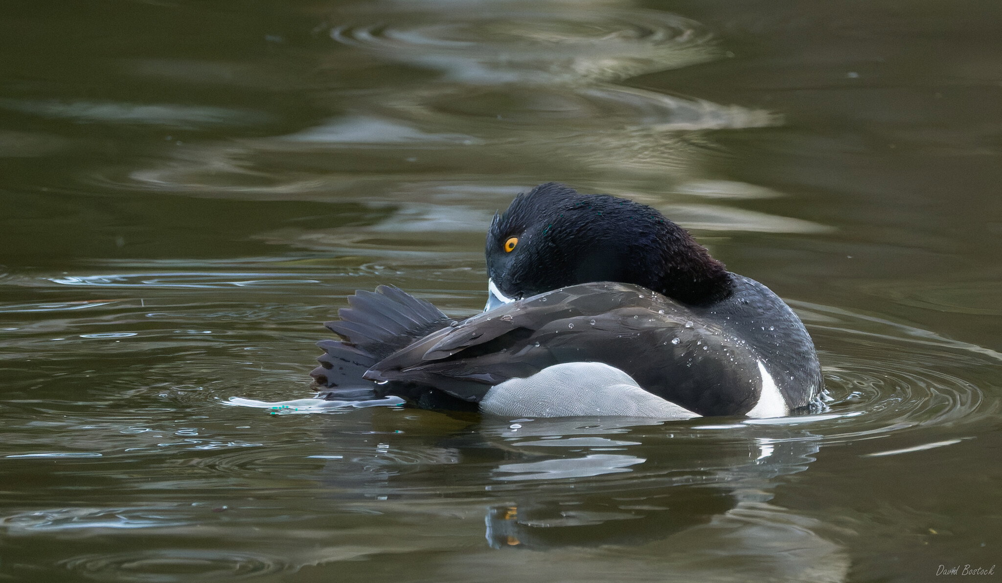
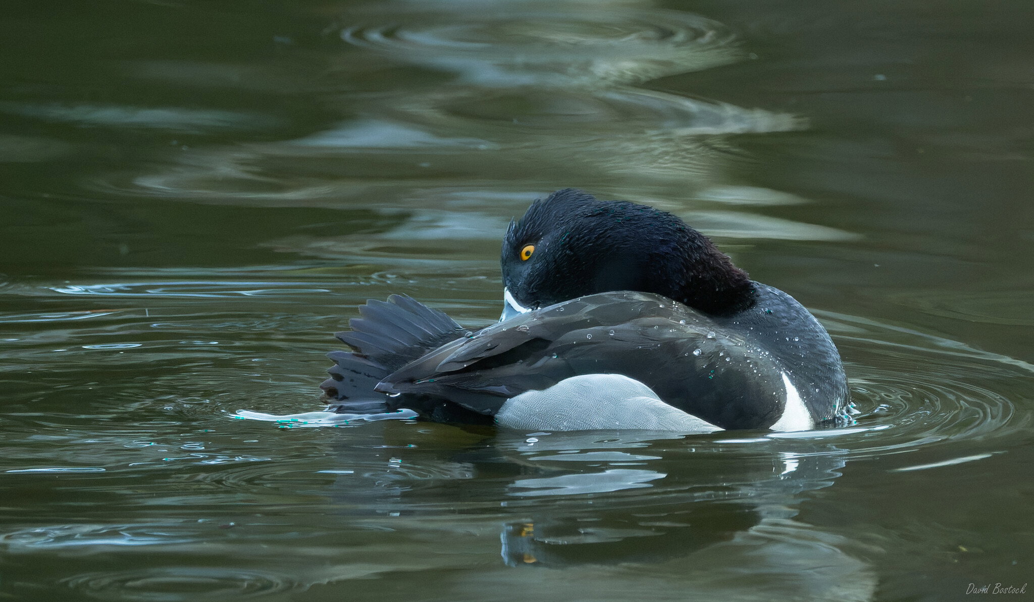
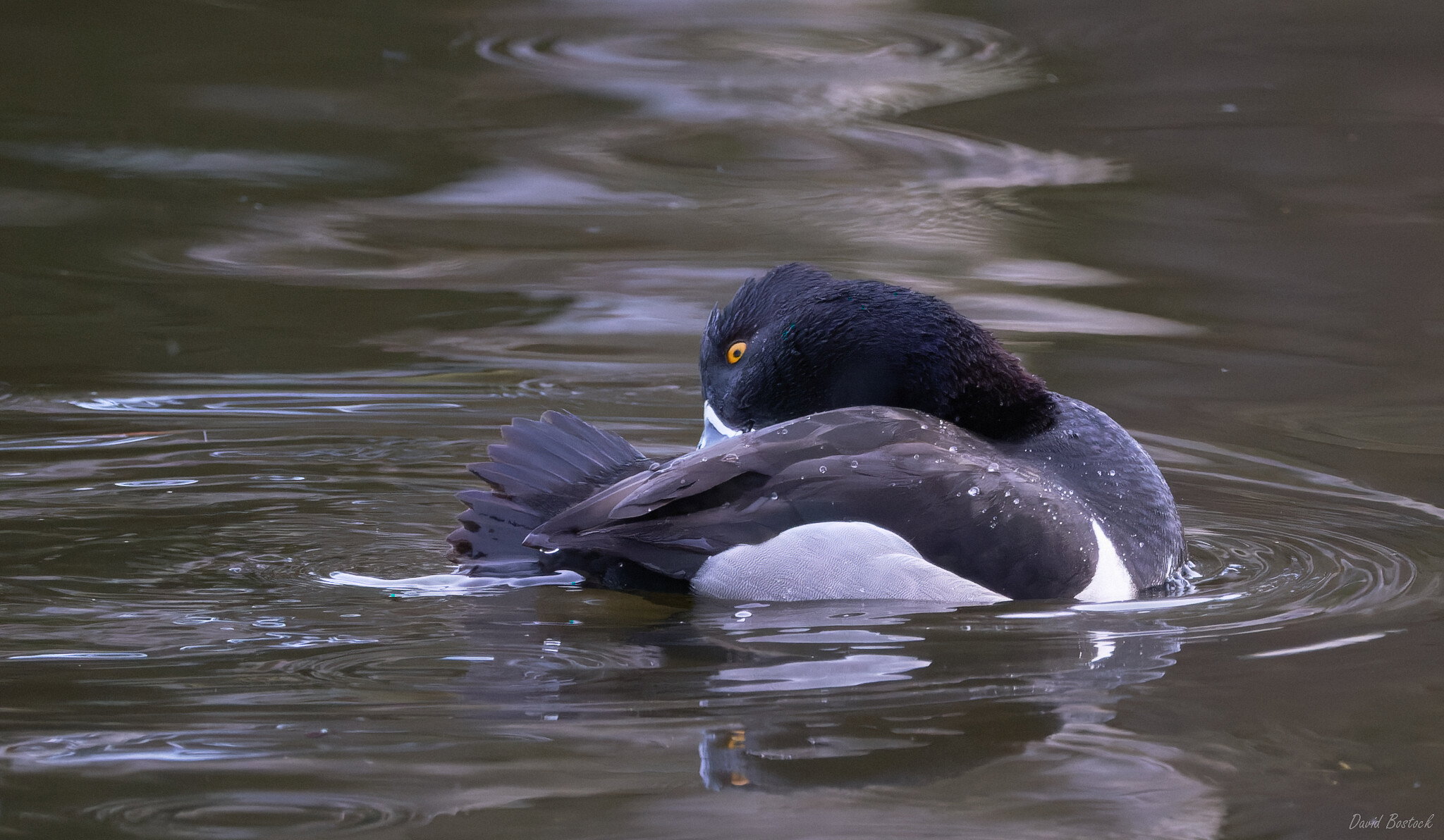
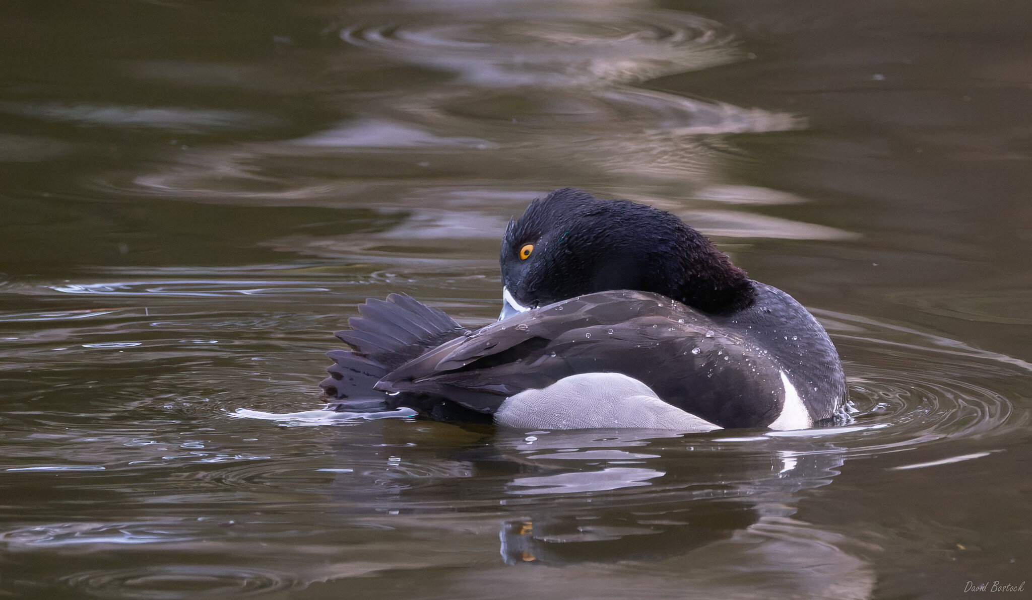
Nice sheeting and droplet action on display as well as some nibbly grooming. Ducks are funny. None here yet, but the trumpeters are back on the river now so they probably won’t be long. In the low 40s today so lots of melting going on. It won’t last, but it’s the start. Overall the color looks a tad cyan here, especially in the whites of the feathers. I really like all the water ripples and the action they convey.
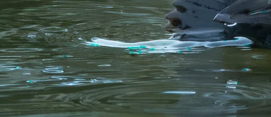
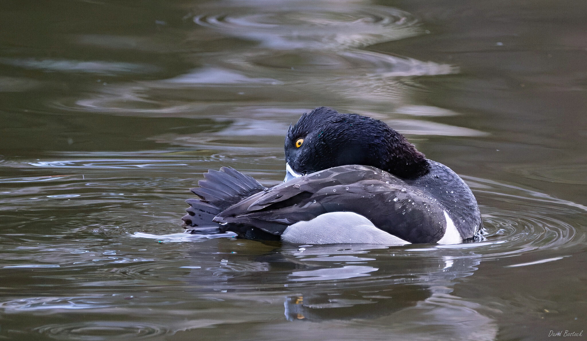
Much better, but there are still bits of bright green in the bird’s head and in some of the water reflections. Hm. I’d be curious to see an unedited version to see what’s embedded and what’s processing.
I think a useful technique for wb is to use an eyedropper on a neutral or gray area of the photo if you have them. Auto wb is also hit or miss, especially under cloudy or shady conditions in my experience. It’s a start, but can be fooled which happened here and was quite magenta out of camera, but still oddly had bits of intense green/cyan in the bird’s head and in the water highlights. Wb can be really hard to correct in post if it’s really wrong in camera. I know it’s not that useful for you, but auto wb is probably better to start with.
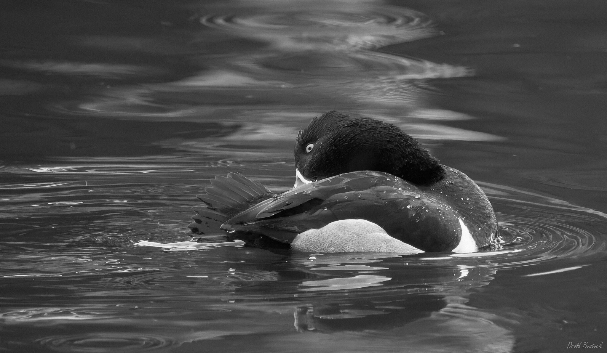
This is a tricky one because of the subtle colors, but I think they are special in this case, and something is lost in going to B/W. This image is subtle, but its definitely not drab.
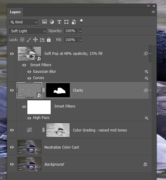
I pulled the last one into PS and made a curves layer to let me poke around with the neutral eyedropper. I clicked on several points in the darkish feathers above the white side and all gave a close variation of your first revision, at the top of the thread. I’m sure there is a similar tool in your raw converter, and that may be all you need, but it could be fun to play with a slightly different balance in the bird and the water.
If there are neutral tones in an image, that’s usually the best way to get a good color balance to start with.
A lot to take in with all the revisions and comments, but I like the first revision. The colors of the bird and water look good to my eye. I like the detail and agree there is an intimate feel with the composition you have. I like to try my bird images in black and white-sometimes it works, sometimes not-but for your shot, I’d go with the color, with the yellow eye, a bit of blue in the beak, and the nice water color.