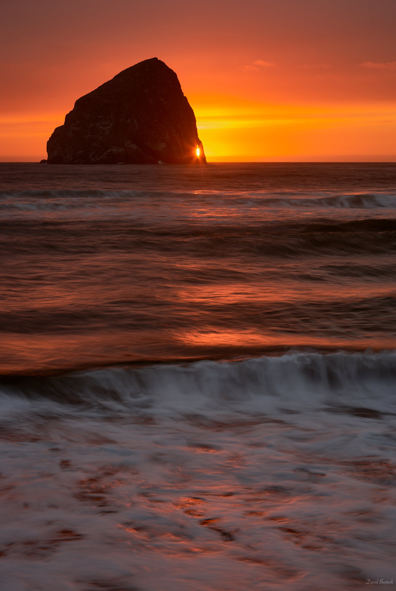
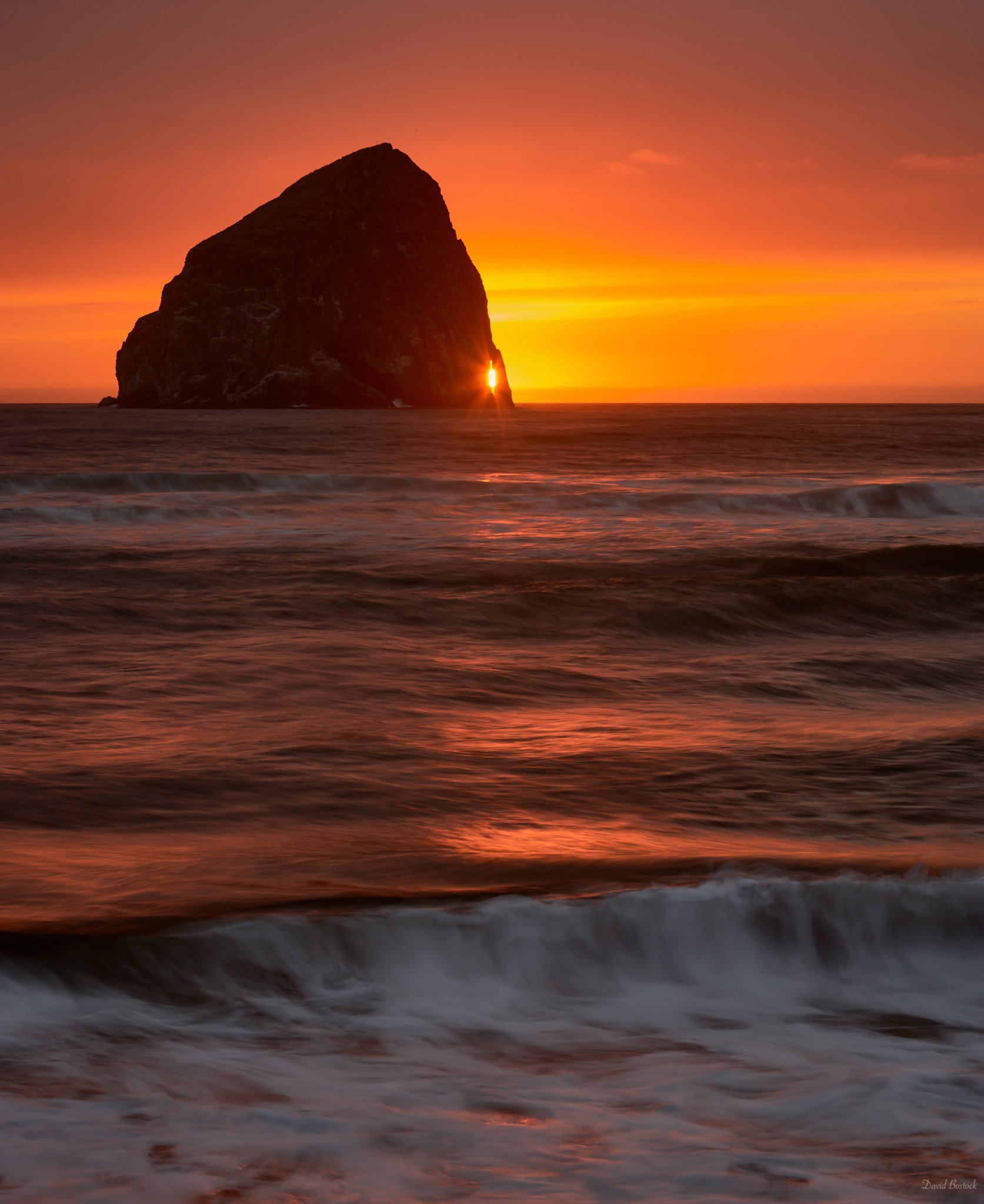
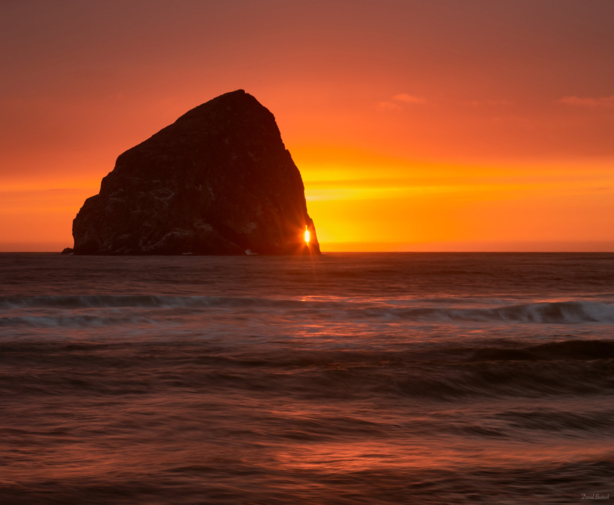
This image was taken in 2006, Haystack Rock in Pacific City, Oregon. I reprocessed it with new tools that were able to handle the wide range much better than in 2006.
Now to decide which crop is better? What do you think? Any preferences?
Specific Feedback Requested
Crop choice.
Technical Details
Is this a composite: No
Canon 1DSII, 70-200mm f/2.8 @ 70mm, 0.5 Sec @ f/16, ISO 100.
I think I really like the middle one the best, # 2 because it gives a slightly wider view and there’s more of the shoreline breaker waves in the foreground which I really like. Love the colors and the bit of sun coming from behind the rock. Beautiful!
First of all, beautiful image(s) David. I really like the strong colour and of course the placement of the sun behind the rock and I can definitely understand with your struggle to choose a crop because they all have something to them and it’s so hard to choose. That said after thinking it through, my top choice is #3, followed by #2 and finally #1, but they’re very close, and so it’s really just splitting hairs…
I really like the simplicity in #3 and simplicity is generally something that really resonates with me. Also, the forms of the waves at the bottom of the frame look very sensuous.
Image #2 is a very close second. It still has much of the simplicity that I like, but also introduces another nice element of the breaking waves.
Finally, I like that image #1 has more of the reflecting light in the sand which to me is another strong (secondary) subject, but at the same time, that same secondary subject takes some of my attention away from the fantastic rock and the sun.
Number 3 for me. Horizontal lines look their best with a landscape format. That’s a simple rule I usually follow. The reason #2 comes a close second is because haystack is not horizontal.
To me the most exciting thing about this image is the orange/yellow glow in the sky, and how that color/glow is echoed in the water. White waves often add some energy to seascapes, but in this case I think the color glow in the water outshines the white waves, and the colored water is far more interesting .
Thus the I prefer the relative simplicity of Crop # 3 , because it distills it down to the things I like most about the image.
My only suggestion for Crop 3 is that I think you could very slightly dodge the orange highlights in the water, to bring out a bit more of that color.
Good to see others digging through the archives! Nice one.
I prefer the third version since it eliminates the immediate foamy foreground that competes with the stack for my attention. The second composition emphasizes the tension between earth and sea, so for that I like it. The statement is an eternal one as is the relationship, but visually it’s not as strong as the third.
For reasons given above, #3 was my immediate choice before reading the other views. I love that the frame rests on that lovely reflection which echoes the sky color. I like the darker vignette right at the bottom. Gorgeous image!!!
I am going to cheat and pick #2 and #3. To me, they convey very different moods and points of emphasis. 3 obviously highlights the sea stack and sunstar effect. But the layering and path through the image in 2 I really like. So I will take both.
Another vote for #3 David. All versions are quite lovely, but I think #3 distills the scene down to it’s essence which is the orange glow of the sunset in both the sky and the surf along with that fantastic sunstar peaking out through that opening in the seastack. This was definitely worth revisiting!