The photographer has shared comprehensive information about their intent and creative vision for this image. Please examine the details and offer feedback on how they can most effectively realize their vision.
Self Critique
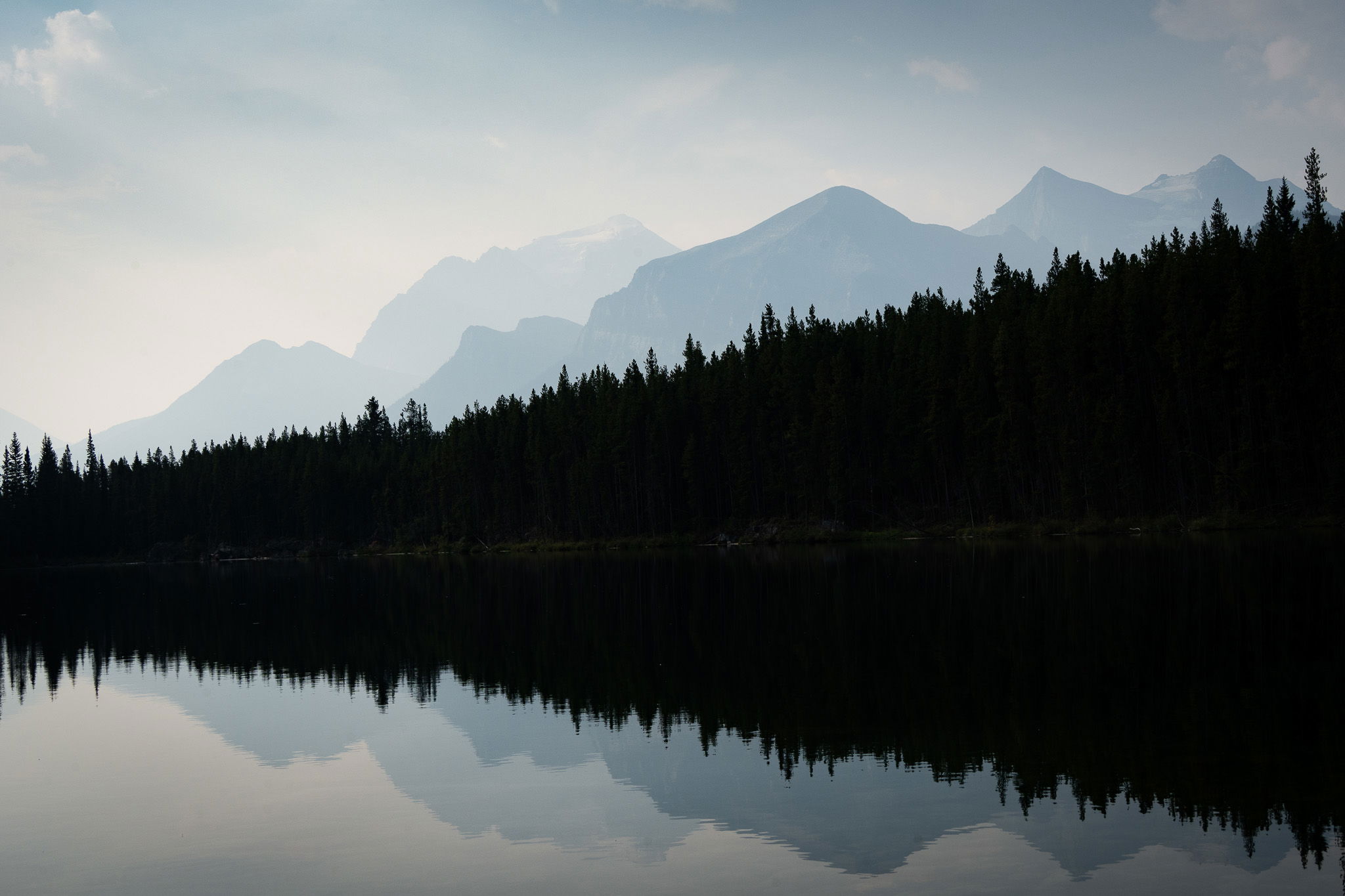
I really like the layers of mountains in the background. It was first thing in the morning and the smoke had come in from the wildfires. The blue was there, I just enhanced it a bit. I am wondering about the trees. I printed this picture on fine art texture paper and it actually looked like a water colour painting. However, online, I am not sure about the “silhouette” feel I am trying to get.
Creative direction
I would like this photo to feel more like a painting then something “in real life”…eventhough it is real life haha
Specific Feedback
I would love some feedback on the forest…is it too dark? Should I show more of the trees or does the silhouette work?
Technical Details
I pretty much played with the exposure, contrast and highlights and dehazed this photo. Focal length was 50mm, f14, 1/400, ISO 320. I just go with the flow with my settings.
Description
As the sun rose this day I realized that the smoke had come in from the wildfires in the north. It was early morning and I was trying to figure out where to go in Banff National Park. I headed to Herbert Lake because it is one of my favourite places in the park to catch beautiful reflections of the mountains. I came upon this hazy scene with the layers of colour the outlined the mountains and I knew I had caught something different. I had my 50mm-400mm lens on and decided to just go with that. There was a blue tinge that I knew I wanted to work with. This is kind of the idea I had in my head, but does it work? Thank you!
Critique Template
Use of the template is optional, but it can help spark ideas.
Ricki, I like the painterly feel to the image and while the tree line is very dark, it accentuates the layers in the mountains and their reflection on the water. Perhaps a small crop across the top to even up the image?
That’s a wonderful use of diagonals Rikki; I’ve always enjoyed reflections that make a nice “arrowhead” like this. The receding layers with the clarity and the pastel coloring also work very well.
I hate to pile on, but I too would love to see a bit more at the bottom; it’s just a little tight, and I think the tension would relax a little if it could breath just a bit more so the eye can flow through the image.
For the forest, I would either bring up more detail, or just go crazy and make it all black. (I’d have to see, but I’m guessing I would prefer the latter.)
Hi Rikki,
I am loving the blue pastels of the sky and those of the mountains. The diagonals with the trees and shoreline also work very nicely as they add a little visual tension to the scene. I too think a little more canvas along the bottom would give the reflections of the mountains peaks a little more breathing room. I could also see the shadows of the treeline brought up just a little; but not to much as that would destroy this wonderful mood you captured here. Very nicely done.
Love this! I too love the layers in the mountains; the misty/hazy atmosphere and of course the reflection. More specifically, I think the symmetry top - bottom is wonderful. And too that, I’ll rinse and repeat the other comments about adding (stretching, or CA fill?) a little bit to actually complete the symmetrical composition. Yeah, most times folks don’t like to see a 50-50 or exact symmetry, but I think here it would certainly add to the graphical nature.
And… I’m reminded of the quote from the great human philosopher Forest Gump:
“I couldn’t tell where heaven stopped and the earth began… it was so beautiful.” (Sorry, but in my limited cultural knowledge, I often relate to lines in movies…)
I would also agree about a slight, very slight, boost in the treeline shadow. For sure, you don’t want to lose that graphical element and separation.
You have a great image working here. And from another, even more famous person here on NPN, I’ll quote the great Tony Kuyper: “Make the image the best it can be.” A couple of small tweaks and this will be an awesome print. I was even thinking metal or acrylic…
Thank you @Mark_Orchard@Ronald_Murphy@John_Williams@Ed_Lowe@Lon_Overacker for your feedback. Really nice to receive. I don’t have a lot of space to play with on the bottom but I will take the advice to try and balance the two and thank you…I was hoping that the majority would say make the tree line a bit darker. I am glad you saw my vision. Have a great weekend. Thanks again
I really like the bold layers here, the cool blueish tones, and of course the symmetry. I also do a bit of watercolour painting myself and I agree that this looks much like a watercolour painting and must have looked even more so on some nice textured paper.
If this were mine, I’d be inclined to open up the darks in the forest layer just a little bit. Not so much as to make it look “realistic” but just a hint of detail would help add another element of interest to the overall image.
Thank you Tom for your compliments and thoughts. I realized I didn’t reply. I am still torn between making the forest more of a silhouette or bring it up a bit.