Help Wanted - re-post

With heartfelt appreciation to all, this is the image I currently have.
Please see my detailed notes of appreciation below in my reply to Lon.


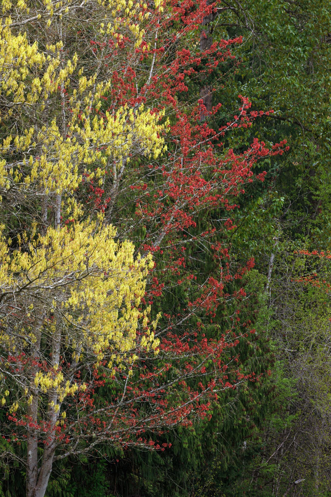
Unprocessed “Spring Tree Colors”

Critique Style Requested: Standard

The photographer is looking for generalized feedback about the aesthetic and technical qualities of their image.

Description

From across the meadow I was attracted by the red and yellow trees side-by-side. I decided on a position that overlapped them and the mostly cedars behind them. When processing the image, I never was satisfied that I had a clear feeling for what I wanted, and what I wanted to do with the image.

What I like about the unprocessed image includes the color contrast and the feathery yellow growth. What I really grapple with is the tangle of branches and the difficulty of working separately with the green background and the yellow growth - Photoshop is pretty sure they are pretty much the same hue. If I saturate the yellow growth using a mask, it pops, but I lose the feathery quality of the new growth.

I want to convey a sense of layered depth, so I darkened the background cedars, but not sure that this treatment conveys layered depth.

Bottom line … I am muddy about what I want to convey, and that shows.

Specific Feedback

So, where is Lucy with the sign “the Psychiatrist is in”. I am willing to pay the 5 cents.
How do I clarify my thinking and processing? I am pretty sure that there is an interesting photograph in here somewhere ( “there must be a pony in here …”).

Technical Details

Canon R5, 1/20 sec, f/16, ISO 250, EF100-400 IS II @234mm
Overcast lighting, very slight breeze.
Photoshop - lots of layers; Topaz Sharpen AI; TK8 color and luminosity masking

The play of color is what captures me. I see what you mean about losing the feathery quality of the new growth. The TK 8 color masking allows for a narrowing of the range of colors you are masking. I assume you played with that. Where do you want the focus of the image to be? My eye is drawn to the largest cluster of yellow leaves. I respond to the yellows and reds.

I feel like this scene must have been really compelling in-person, because the trees are very nice. Quoting yourself, it seems to me like this is a composition that does not quite match the memory you have with the place…? I have struggled with this myself many times where I see something great and chose to zero-in on it and ultimately what happens is I get back and I don’t see the same thing that I felt when I was there. That said, there is no amount of post-processing that can recompose an image. I actually favor the unprocessed image…it makes me want to see what else lies beyond the frame.

1 Like

This is a nice delicate scene and for that reason I think the colors should be restrained. The yellow on the left is especially prone to dominate because yellow is a strong color so I was very careful with that. I would not crop from the right because you have a layered composition going from left to right which is important to provide structure to the chaos. Since this is a fairly chaotic scene of colors and shapes I see no need for providing the trunks at the bottom. I therefore cropped the part that wasn’t leaves and branches. That’s my thinking on it.

1 Like

Hi Dick,
that is a really beautiful scene. You have captured some nice and vibrant foliage colors.
I love all those yellows, reds, and greens.

When I look at your edited image, I notice that it has a rather warm white balance. And that is the reason why the color separation is lost. Everything has some reddish/yellowish cast, even the tree trunk of that main tree.

I hope you don’t mind that I downloaded your image and played around with it. Here is the result of a quick edit:

I used your unedited version here:

  1. I dropped the temperature quite a bit in ACR (-15). When I adjust the white balance, I pay attention not only to the warmth that changes but also to the color separation.
  2. I opened the shadows quite a bit in ACR.
  3. I added some mid-tone contrast in PS.
  4. I burned the bright green leaves at the right edge using a lights luminosity mask.
  5. I added a levels adjustment layer with a reds mask (created with Lumenzia) and brightened the red leaves to let them pop.

I don’t know how the color masks in the TK8 Panel work. I use the Lumenzia Panel and with your image, the separation worked quite well:
Green:

Yellow:

Red:

Dick,

While not the most compelling of compositions, I think there is a subtle beauty to it in the layering of the colors. That is where I think its strength lies. While Jens did point out that you can successfully produce masks to target each individual color, I do think that is a little overboard and produces a somewhat harsh contrasty scene, which in my opinion, is counter to the softness you speak of that you want to retain. Again, I do think that this image benefits from the Orton Effect. Here is a rendition with the Orton Effect applied, however this time a little more aggressively. I think it accentuates the color layering from right to left and retains the feathery quality you want to highlight.

1 Like

This helps the image pop. Beautiful.

Dick,

I’m a little late here, but wanted to stop by and offer my .05 - before Lucy pulls one on me… ha ha.

I think it’s pretty clear that I see what I think you saw and wanted to convey. Yeah, the scene and framing doesn’t necessarily come out and grab you, but for sure I see the layering of color.

I like and appreciate each of the suggestions offered by the other members; in fact so much that I stole each of their ideas and combined in to my own plagerized version.

I certainly agree with Aaron that no amount of processing can “recompose” an image - but what we can do in post is choose what to include, or exclude. And with that, I agree with Igor’s suggestion to crop, which great simplifies and actually enhances what I think originally attracted you. Next, I did like Jens and dropped the WB temp a little (only -9) to help separate the yellows/greens. I tweaked the yellows a bit in luminosity and saturation. Then I thought, what the heck, Youssef went with the Orton, and so I added the effect as well, just maybe not as strong.

I noticed after that the reds went a little flat and I think could be boosted a bit, but thought I would post what I came up with.

This would have been great posted in the “Processing Challenge” gallery - but basically we did the same thing here - only we didn’t have the RAW to work from. I think the great exercise here is getting different perspectives - clearly we all had a slightly different take. And the hope is that you might get to see your own image in new ways also. thanks for posting!

What a terrific experience this has turned out to be! Lon, two things you wrote were especially spot on. The thoughts of every commentator about processing options and creative mentality were very valuable, and the result of seeing my image in new ways was really positive.
Like you, I could not say “No” to any of the suggestions offered, @Barbara_Djordjevic and @Jens_Ober nudged me to improve my work with masks. @Igor_Doncov cropping suggestion, along with his rationale is right on point. I could not bring myself to engage the restrained colors that Igor and @Aaron_Smith invited me to consider, particularly after seeing the versions from @Jens_Ober and @Youssef_Ismail . I wish I had Igor’s receptiveness to nuance.
The effect of WB on color separation offered by Jens was an eye-opener for me, and the details of his steps were useful (and used).
I owe a particular appreciation to the Youssef for showing the impact of Orton Effect. Whether imposed with a light hand or aggressively, the tool opens some wonderfully creative options. His version was wonderfully impressionistic and dreamy. I am going to pursue it, but cannot quite bring myself to do that as a current target … maybe as an alternative version. The re-post has a moderate Orton on yellows and reds.

1 Like

Dick, your post is generous and sensitive. Thank you for helping me understand the beauty of this site. You model a way of responding that is so very affirming. Thank you for teaching me a way of being here.