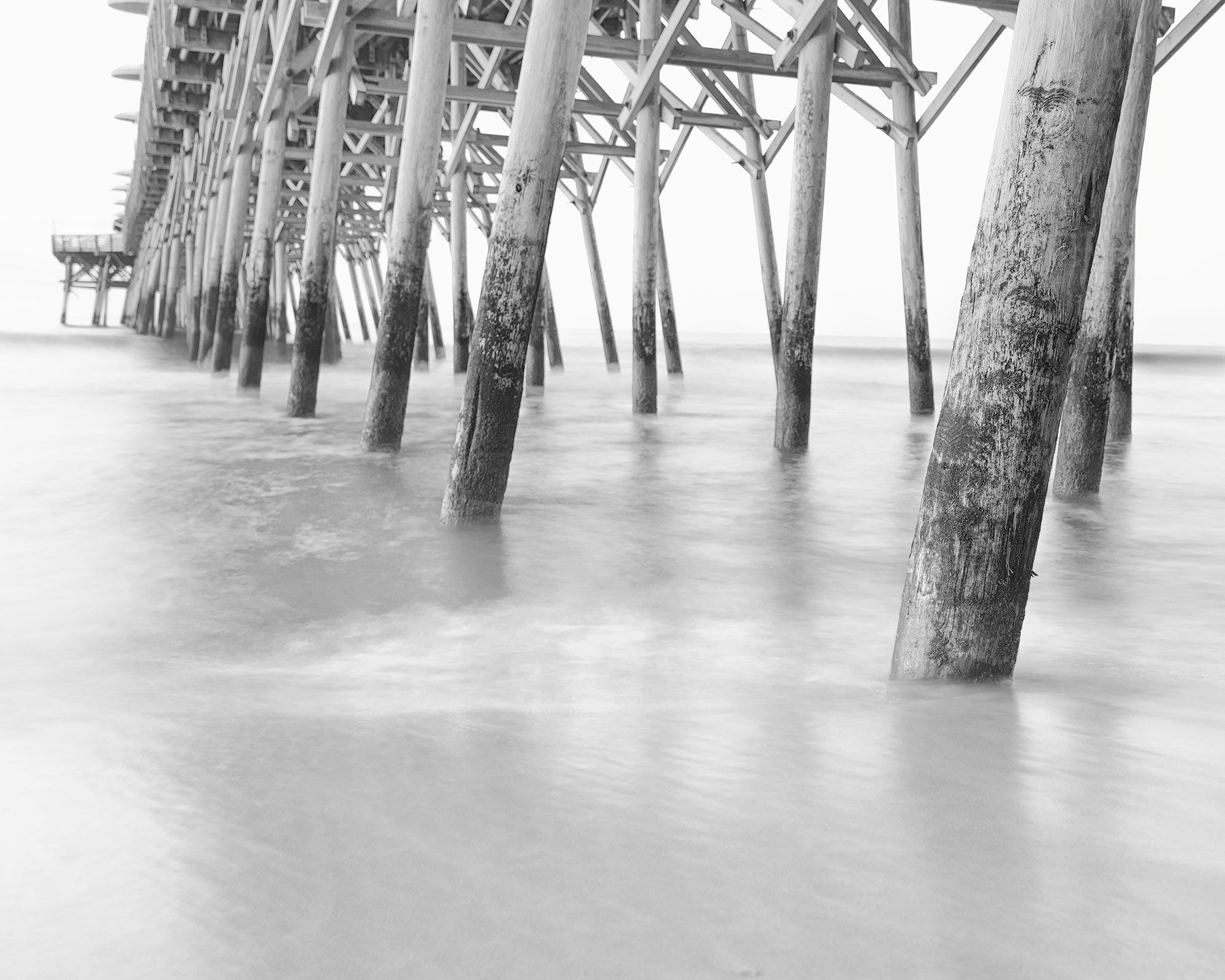
This is a shot I took early in the morning, just after sunrise while visiting South Carolina with my family. Initially, there were quite a number of things I didn’t like about the image, but recently I learned about “high-key” images. I thought of this image pretty quickly because I figured I may be able to deemphasize some of the things that bothered me while playing up the peacefulness of a morning at the beach before the crowds show up!
To do this, I made some minor tweaks to exposure, highlights and shadows with the intent of reducing contrast. I then went into Photoshop where I converted it to black and white using Silver Efex from the NIK collection. I used the second of two high key filters in that set. Long term, I would like to know how to manually do this so I don’t rely on a filter, but starting out I guess I don’t mind. From there I used a luminosity mask to darken the single wave in the distance that is approaching the shoreline. Then I used the Camera Raw filter to add some clarity and texture to just the posts. Finally, I created a layer to clean up some distractions in the foreground sand.
Open to any and all suggestions, also processing tips for making high key images without using the NIK filters.
Hi David,
I like the repeating patterns of the diagonal posts with the pier end visible in the distance. Well composed.
1 Like
Thank you, I appreciate that. I learned during this shoot just how much things move when the waves come up to your tripod
This is an ambitious piece of work. You have some strong lines, but wanted to convey peacefulness of the quiet water and scene. You dove into the realm of high key. Keep going!
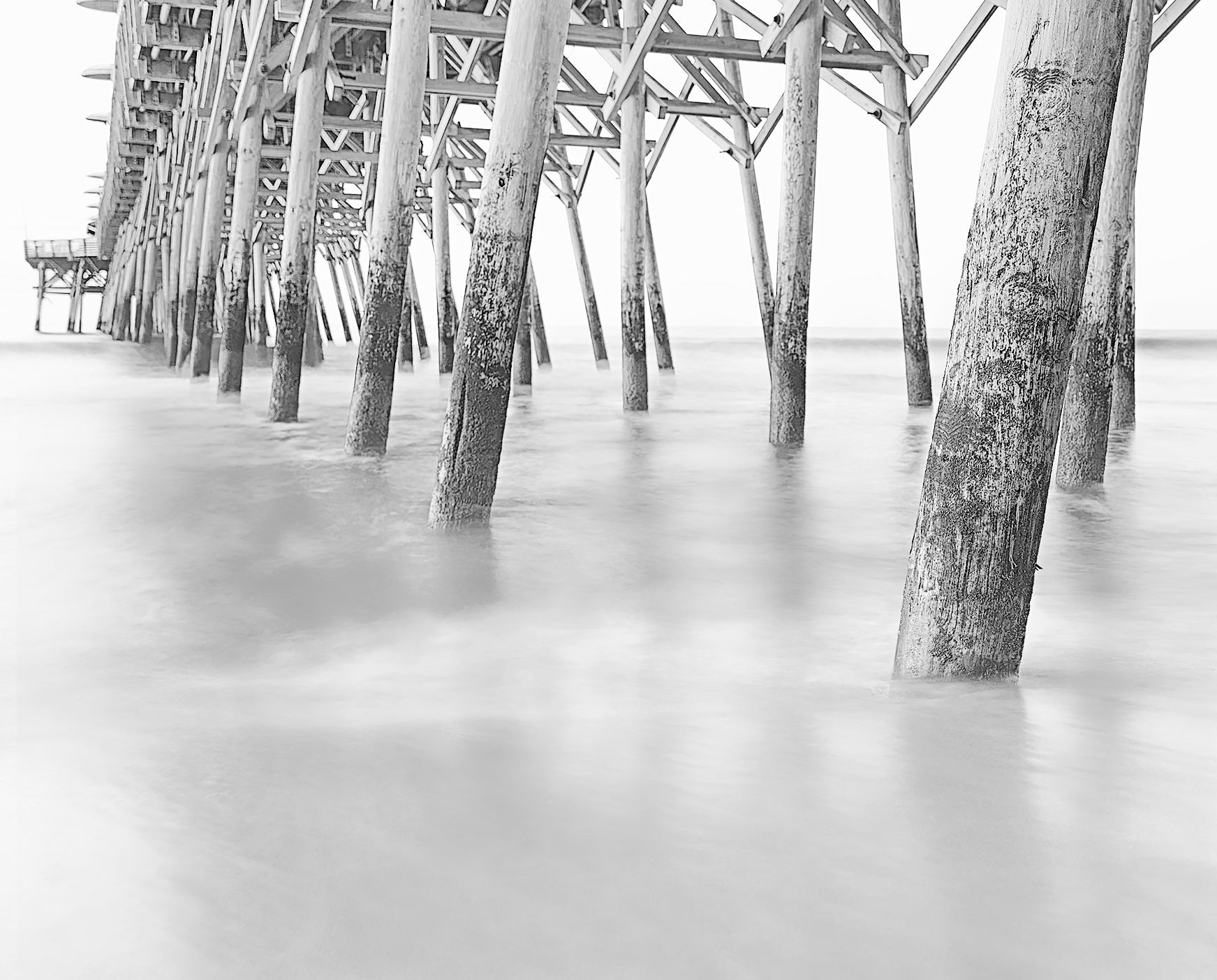
When I downloaded this, the first step was to level it a bit (and cropped a bit from the left) … it is down on the right, it seems. Overall, the image felt a bit gray, not persuasively high key. I ended up sharpening the posts with smart sharpen, and then blurring the water. To me the result conveys quietness of the water especially in contrast to the strength of the pier.
In the second revision, I used curves and a vignette to be more high key. Still kept texture in the posts. Perhaps this is more faithful to the direction you wanted to take the image.
This is great! The second image is really what I was looking for. I took the tips you provided and updated the image. The blur was a challenge to blend in cleanly but I think I did a decent job with some freehand painting.
Thanks!
I’m just curious as to why you decided that this was a good image to process in high key tones.
@Igor_Doncov that is a great question. It really came down to three things for me. First, I had never done anything I high key before so being new to all of this it was a chance to try something out. Second, there were a number of spots in the image where the colors were not working at all. There was a bank of clouds that came in right at sunrise that covered a large part of the sky in a really uninteresting way, this allowed me to essentially remove that issue. And most importantly, high key seems like a very calm, peaceful way to process an image which reminds me of early mornings spent on the beach before all the kids and families show up. The longer exposure to blur the water I believe adds to that feeling as well. Granted I did not shoot this with the intention of turning it into a high key image in fact with my limited experience a lot of what I do at this point is experimental trying to see what I can do and what happens if I do this vs that.
Hope that helps paint a picture of how I got here.