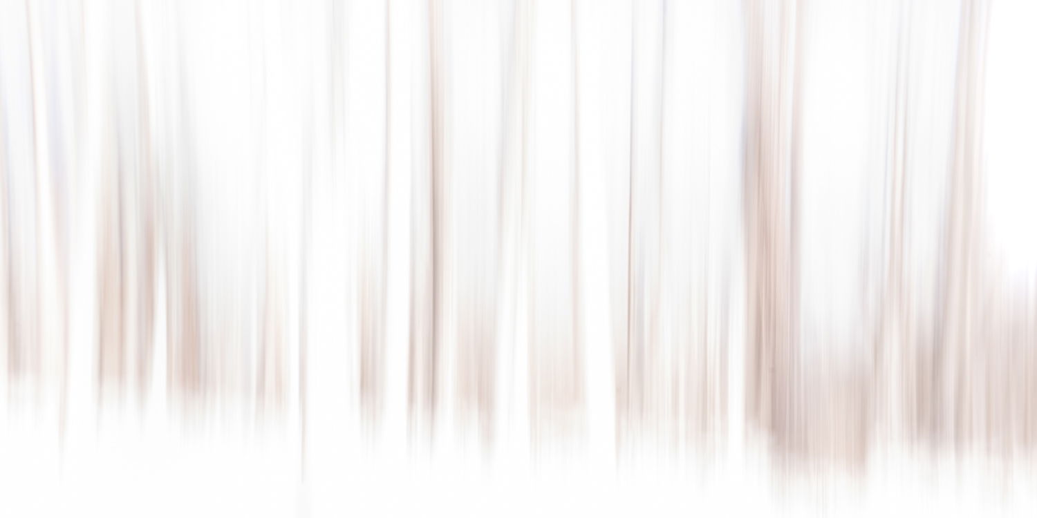
I’d seen a presentation re: high key photography a few days prior to us getting a few inches of snow in this part of the world.
Just for experimental purposes, I’ve found it fun on occasion in the past to see how little image data needs to be provided to make an interesting image. But I’ve always done so on the low key end of the spectrum.
I’d also toyed with ICM quite a bit over the course of a year or so, but realized I’d never tried to deliberately combined with high key. So, with a bit of snow on the ground and the high key presentation fresh in the mind, it seemed like the perfect opportunity to give it a go.
I was fortunate to have 3-4 images that will be interesting takes on the idea, but this one I think is my fave thus far.
Type of Critique Requested
Aesthetic: Feedback on the overall visual appeal of the image, including its color, lighting, cropping, and composition.
Conceptual: Feedback on the message and story conveyed by the image.
Specific Feedback and Self-Critique
I think this one gets as close to ‘critical minimalism’ as I’ve been able to accomplish in an ICM based image. There’s just enough visual data supplied that I think few people will have much trouble discerning the subject matter yet retain a bit of a mysterious quality.
Technical Details
1/5sec, iso31, f11. Nothing unusual in processing. Largely just dialing in desired contrast.
The tree trunks constitute a pleasing pattern along the image. I also like the brown and gray colors of the trunks, and that you have made the rest of the image white by high key processing. The ICM technique here create a similar mood and isolation of the trees as fog would have done.
IMO you have managed to achieve what you wanted! Looking forward to see more images using similar thinking and techniques.
Love this high key approach - a great use and example of the potential of the ICM. I haven’t checked myself, but I’m going to say that I think the color version would be more imactful than if you had converted to b&w. I like the brown tones here in the higher key presentation. Well done!
I also like the narrow format which give the extention or expance of the “forest.” Yes, you’re right that there is at least a sense that the viewer knows from where this was created. Yet, clearly an abstract interpretation.
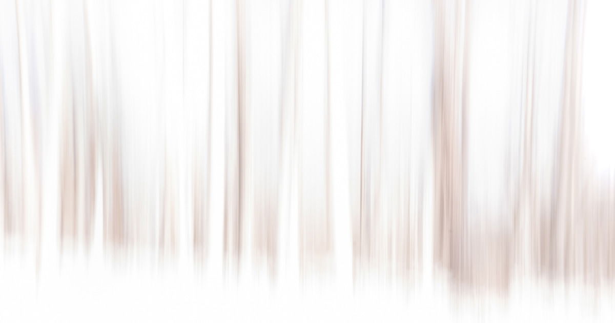
Even though I like the long format, there is one “gray” vertical about 1/3 from the left. I’m wondering if you cropped from the left to exclude that vertical, if that would change or alter the expression you’ve accomplished here? Just a thought.
Attached is (I think) the crop you were suggesting. I may well be missing something, but I’m not sure I see how it improves the image. Which isn’t to say it doesn’t…just that I’m not seeing it.
I was just wondering if the change would alter the original impact… apparently it does. Apologies, I should have included “alternate view” in my comments. I think one would be hard pressed to “improve” this. Thanks for taking the time and considering the suggestion.
NO worries. I respect your work and just wanted to be sure I wasn’t blind to something.
IMO, any time we change the aspect ratio of an image, we can’t help but change the impact in some way. And I think in this case, it kinda serves to add to the feeling of height of the individual trees. By contrast, I think the more pano original crop provides a sense of a more expansive environment.
I could absolutely see the crop idea being more appealing to some folks.
Thank you for your response! I’m in agreement the aspect ratio works well with your image. I took that into consideration with the below edit. Perhaps I’m the only one that picks up on the lone, grayish vertical, which is expected with such an abstract - like who cares? But to illustrate, here’s what I did.
I did a marquee selection of the left side, excluding the grayish tree. Then I simply used the move tool, and using the cursor just moved that section directly over the tree and enough so the blend looked good. And because of the whites and the high-key processing, no cloning or further adjustments needed to be made. Granted, the image is just a tad shorter now, but I think the impact minimal. Again, just an alternate view, YMMV.
RJ, this is really well done! The high key plus pano format works nicely to express an expansive forest. I love the minimalist qualities of the images.