Hey hope everyone is doing great.
So lately I’m trying to do more small and intimate scenes, i enjoy the reward of finding a composition on such small areas.
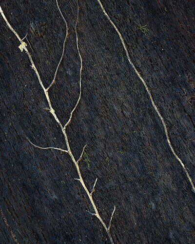
Not having a lot of opportunity’s but this was my last try. Walking around in the woods this vines (??) caught my attention, I liked the contrast they have against the oxidated trunk.
What technical feedback would you like if any?
Any as allways
What artistic feedback would you like if any?
Any, mainly does the composition work for you guys?
Pertinent technical details or techniques:
(If this is a composite, etc. please be honest with your techniques to help others learn)
Single exposure, post to dodge the yellows to add a bit morecolour and brightness.
Split tonning to cool the darks a bit.
If you would like your image to be eligible for a feature on the NPN Instagram (@NaturePhotoNet), add the tag ‘ig’ and leave your Instagram username below.
These smaller scenes are indeed very satisfying to see. In the original, I would only recommend burning the brighter part of the vine towards the UL corner and also cloning out the more exposed part of the trunk on the LL corner, but as I was playing with this on PS a little, I am wondering about a simpler composition… not necessarily better, just a different one I think.
1 Like
Thank you for the feedback @Adhika_Lie.
I can reduce the dodging on the ULC not to get to exposed as it is.
The LLC can be cloned indeed, I desaturated that part a bit to lower the attention on that area but still it looks it’s not enough.
I really like the crop you did. Ill have to rethink it too.
Thanks again,
Cheers
Nice abstract, but I think @Adhika_Lie 's changes raise the image a notch. Good eye and good stuff.
1 Like
Keep it up @João_Ferrão, this image is a great example of making something out of seemingly nothing. The yellow vine on the black bark creates a very graphic and dramatic look. I also think the rework by @Adhika_Lie takes this image up another notch.
Obviously the rework benefits from the simplification of “less is more”. Visually the diagonal line of the vine seems stronger when there is only one of them. But another thing about Adhika’s rework really struck me as a very effective, and that is how the lines of the vine intersect with the frame edges. In the original post, the vine leaves the frame directly in the UL corner, and lines that lead to corners usually don’t work well for me. And instead, Adhika’s crop has three lines that intersect with the top edge , and as a result they create two interesting triangle shapes (partially created by the frame edge itself).
Little things like this make a big difference, although they can be hard to see in the field while shooting . These triangles form V-shapes that repeat the other V’s coming off the vine below. The way Adhika cropped this rework makes the repetition of V-shapes much more pronounced.
Thanks you @Ed_McGuirk and @Harley_Goldman.
The main crop was done having the objective of including those two “parallel” vines but I now also agree the upper one add to few to the image.
Indeed @Adhika_Lie crop creates a new image with a lot more visual impact, I’ll have to do a little rework “stealing” is vision ahah ;).
Thank you all guys. Cheers

