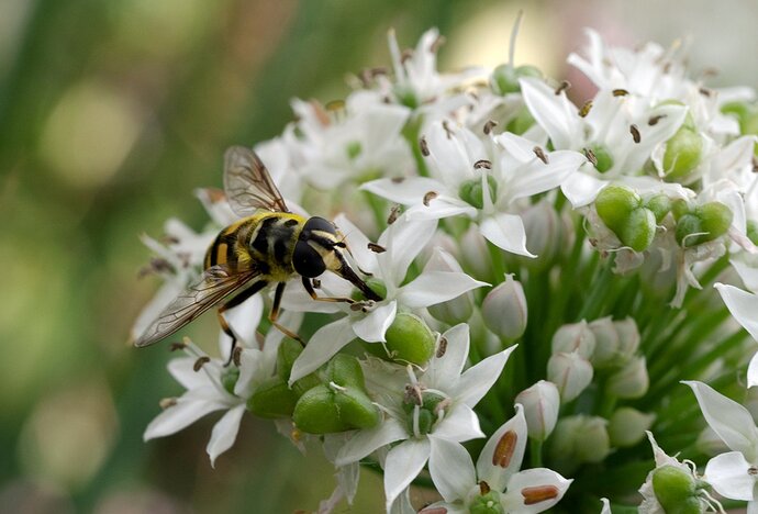
This was a reasonably easy capture just outside of our back door. I’m pleased with the detail on the face of the fly but it seems to lack the punch that many of the great photos have in this forum.
Any thoughts gratefully received.
Lumix GX8 Olympus 60mm f5.6 125/1 ISO 500 handheld
Ryan, this is a fine, very close, look at this hoverfly. The details in both the fly and the flower look great. I also like the colors and shapes in the out-of-focus area at the left. “Punch” is largely driven by contrast in luminosity and/or color. In this case, it looks like overcast (or maybe in-shadow) lighting. There are several things to try to overcome that. You can try to raise the color temperature slightly, that will both warm the image and put a bit more color in the fly’s body, the challenge is keeping those nice white flowers white. You can also process for more contrast using luminosity masks to dodge/burn. Dodging through a light, lights mask would brighten mostly the brightest tones. Similarly, burning through a dark darks masks will darken mostly the darkest tones. I’m thinking that most of what you see as lack of pop, is because the fly’s features are blending together. I would dodge the mid-level darks in the fly’s back and head, trying to get better distinction between the black and the yellow areas especially in the front part of the body and maybe a bit more detail in the lower eye.
A nice capture of the hoverfly, Ryan. The position of the hoverfly is really sweet, catching him in the middle of his sucking up the nectar from the tiny flower. I think Mark gave you some really good advice on putting a little more punch into the hoverfly. You might want to try to tone down that brighter spot in the background at the top, as I am finding it pulling my eye away from the subject. You could even tone down the lighter spots in the background to the left as well. This is certainly a nice shot as it is.
Very useful suggestions, thanks
Ryan: Good subject, good perch, good DOF/POF choice and a fine result. I did a quick and dirty adjustment in Camera Raw to increase the vibrance, clarity and sharpness a bit. Not sure if this is what you’re looking for but your raw material is excellent. >=))>
Hi Bill this looks great, thanks for the rework.
I’m currently travelling so cant log-on too often but I look forward to continuing the conversation and showing some new material when I’m back in a couple of weeks.
Ryan

