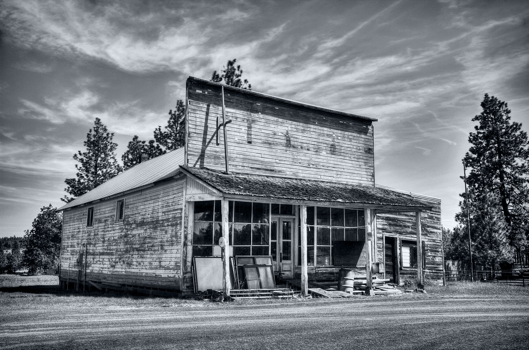
I had not heard of Friend before and had to look it up. The Wikipedia article is interesting, it even mentions the store. I can see the charm and why you captured this. It brings up so many thoughts of what it was like at the beginning, its prime, and its eventual abandonment. The black and white works well; for me it has an “old” feel to it.
Bumming around the back roads of Oregon and Washington, it’s fascinating to see these old structures and how the march of time has changed them. I’m probably not the guy to do it, but it would be a cool project to put together a number of images. (Likely not an original idea, but I haven’t come across such a project yet.)
I find color and toning to be quite personal, and as such I think your version is fine. I say go with what you love. With that said though, I have two ideas to play with for comparison.
First, I find at times my eye sticks to transitions in the toning where there are sharp contrasts in luminosity; my eye will notice the color more (usually a magenta/red contrasting with cyan/blue in the midtones). To compare, I sometimes will duplicate the image on a new layer in Photoshop, blur the new layer using “Average,” and then set the new layer to color mode. This spreads the toning more evenly across the luminosities. Sometimes I like the change, other times not. Here’s what I came up with by doing that with your image:
Second, I almost always prefer cool toning in images. At times though, I think that warm toning can emphasize desolation and can work with old buildings. Here’s an example of that to compare:
In the end though, when it comes to toning you be you.
As for the leaning, I think it adds to the character. I think you could fix that by slightly rotating and applying a Lens Correction filter, but I’m not sure I would; the tilted walls add to the aging appearance.
Finally, there’s a touch of haloing I’m picking up where the sky touches the darker trees that I’d go after if I was printing this beauty.