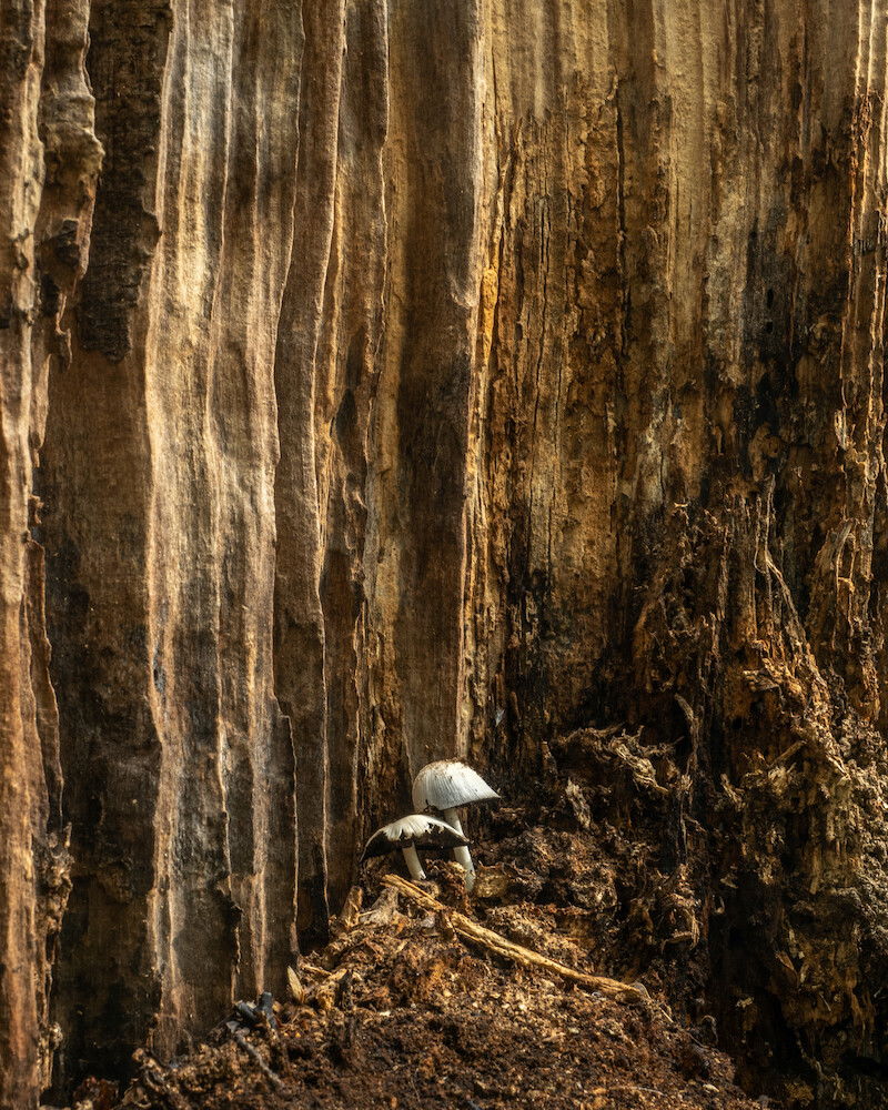
In decay, the trunk of the fallen tree was slowly disguising by insects and mushrooms, it looked like sand, what attracts me was actually the color, and then the repetitive pattern.
Specific Feedback Requested
Any comment U like to give in general
Technical Details
ISO 200
F/ 13
1/5 sec
Olympus E-M1 markIII with 12-40mm f/2.8 Pro
with tripod and Kase magnetic C+PL
I like this - you can feel the decay/regeneration and the log makes a great background. The positioning of the mushrooms is nice too. I might be tempted to try to sharpen the image some more and suggest a little more contrast to highlight the mushrooms and bring out the lines. Nice shot!
I love these two little mushrooms, doing their job in helping decompose this wood. I think this photo succeeds as a storytelling image. The strong lines in the background contribute some abstract elements to the composition (is the background wood or is it stone?) but I think the subject is too clear to be considered a full abstract photo by my own definition. (I add this to my feedback not to be critical but just to add context since I am doing these critiques through the lens of abstracts in nature. For my own work, I would consider this more of a really small intimate scene instead of an abstract in nature.)
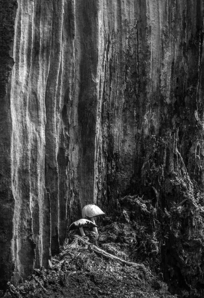
In terms of potential improvements, two things jump out at me. The first is a personal preference since I do see that you were attracted by the colors. I generally do not like warm-toned subjects and almost always try to tone down warm colors in my own photos. So, it this were mine and I loved the subject, I would take the photo but would likely present it in black and white, so that is what I did below.
The second thing is the left edge. It is heavy, different in terms of texture, and bright so it attracts a lot of attention (and it also looks like it is not sharp in terms of depth of field, which also brings attention to it). I would consider cropping it out or darkening it. In darkening it, the edge would serve as more of a frame in the margin instead of a compositional element that attracts attention. For my own work, I try to have things in the margin fade into the background and here, that edge stands out a lot to me. The right edge is also pretty bright but has less texture, so it isn’t quite as dominant. In that case, I would consider darkening the lighter tones. I have suggested some rough edits below.