In the Shadows of THE Tree with Re-post

Thanks @Igor_Doncov and @John_Williams for the feedback. I took another stab at a few aspects of it.

Something weird happened with the order of versions, so here they are, with a third added after @David’s feedback:
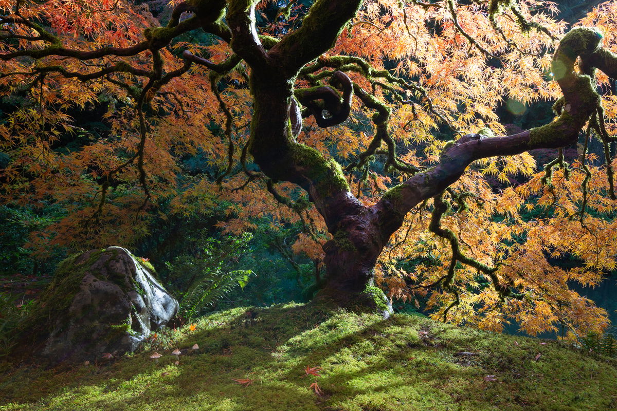
Third Version:
toned down the highlights in bark, removed lens flares, slight emphasis added to mushrooms, slight crop adjustment, CA removal and sharpening, which I didn’t do the first time, and now a slight change to the purple hue of the bark.

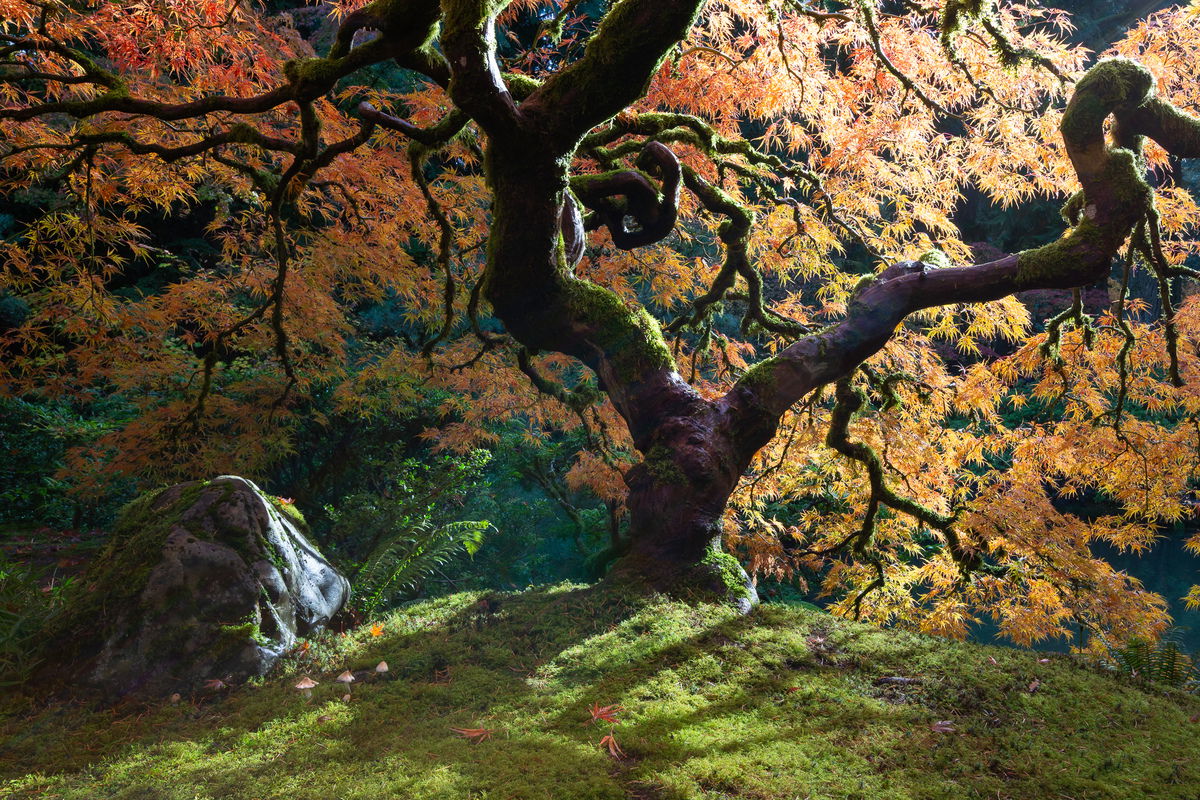
Second version (David responding to this one):
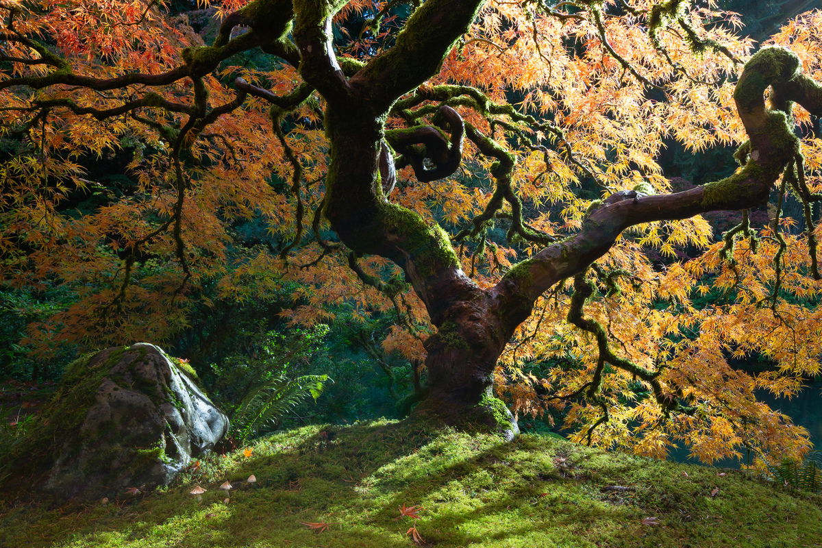
First Version:

Critique Style Requested: Standard

The photographer is looking for generalized feedback about the aesthetic and technical qualities of their image.

Description

When I went to the Portland Japanese Garden last week, I was taken by all of the mushrooms under the maples. I spent a ton of time at one that is somewhat under photographed (it has a bamboo fence behind it, etc.) and then discovered that “THE Tree” had mushrooms as well.

I took a good 15 images of the tree over the course of two different visits, and after sharing my favorites on facebook to get a sense of which ones were preferred by friends, this was the clear winner due to the shadows, light on the rock, etc. It was not my favorite, which I’ll share in a separate post.

My goal with this composition was to emphasize the mushrooms and the life under the tree rather than its foliage and dramatic branching, but I’m not sure I really was able to do that or even that such emphasis is desirable. It is an iconic tree, and I didn’t want the iconic shot, but I’m not sure I achieved that either.

I have a tendency to like juxtapositions that create a big guy/little guy, fading life/emerging life kind of story, but I often find that for the viewer, these stories are somewhat secondary to the aesthetic appeal.

Specific Feedback

I’d love whatever feedback you care to offer as well as …

  1. Do the mushrooms have enough presence and add to the impact of the image?
  2. Do the lens flares help or hinder?
  3. Would you adjust the crop at all ( a have about a skosh more on every edge)
  4. Is the light on the rock too hot? I didn’t burn it at all but could.

Technical Details

Canon 5d3 with 16-35mm at 25mm
ISO 160, f/14, 1/8


Critique Template

Use of the template is optional, but it can help spark ideas.

Vision and Purpose:
Conceptual:
Emotional Impact and Mood:
Composition:
Balance and Visual Weight:
Depth and Dimension:
Color:
Lighting:
Processing:
Technical:

1 Like

I do love the light spilling in from behind at an angle. Most images I’ve seen have the light either muted or coming directly from behind. This angle puts the rock in a nice location too.

The mushrooms are pretty small for me. They don’t detract, but I’m not convinced about their impact either.

The lens flare is not overwhelming, but I do think removing it would be optimal.

Crop looks great to me.

I think the rock looks good. I do wish that one bright area on the trunk hadn’t lost detail, and the brightest leaves are close to blowing.

One final thought would be to reduce the saturation of the greens in the background.

I was just discussing that with my son. My position that trying to find a story in an image isn’t really art and should be discouraged. My background is in biology and virtually every landscape can be looked at as a biological or geological story. But that’s not what the image is about. That’s science and such images belong in a book of science. However, it’s complicated. A photojournalistic image should tell a story but a good such image is also artistically composed. Photojournalists get miffed when you suggest that art is unimportant in their work. It’s complicated.

I’ve seen many pictures of this tree. It never fails to impress. This is a marvelous image. I do think it’s different than the others. I find it very artistic. I like the shapes and light here. I think that the way the light outlines the tree trunk is marvelous. The rock adds a lot to this composition. I do think it would be nice to try to tame the highlights on that rock. Lovely, absolutely lovely.

  1. Honestly, if you hadn’t mentioned the mushrooms I may have completely missed them. However, having looked at this image and the revised image, I find so many cast of characters in this scene and the mushrooms are one of them.
  2. I don’t mind the lens flares but removing them seems a little bit cleaner although they also add to the whimsical nature of this image.
  3. I prefer the cropped in version because it removes a few distracting elements along the right edge (those two leaves poking in from the lower right side) the spot along the bottom middle of the frame where there is no grass, and the left edge where there is a bright green leaf intruding just behind the rock. It’s very minor but it all adds up.
  4. I like the light on the rock as is. I think it works well. It counters the bright light in the leaves in the upper right third of the image by having some bright light in the lower left third of the image. It provides great balance.
    I’m not sure if the trunk is as purple as it appears in this image but I might tone down the purple just a smidgen. You might also burn some of the background elements just a little bit.
    These re all very tiny nits and blown away by this beautiful image. I would do everything you can to make this perfect before you print it huge and hang it somewhere that shows off its beauty.
1 Like

Thanks @David_Haynes. I can’t not see the purple now, so I made a slight shift in hue there.
ML

Much better. I love it. Print it big and beautiful. :heart:

1 Like

Thanks for the EP Folks!
ML

1 Like

Not sure how I missed this one but it is spectacular!! Congratulations on the EP – very well-deserved!

Thanks, Diane. I posted another composition a few days later. Might have seen one and not the other.
ML