The photographer is looking for generalized feedback about the aesthetic and technical qualities of their image.
Description
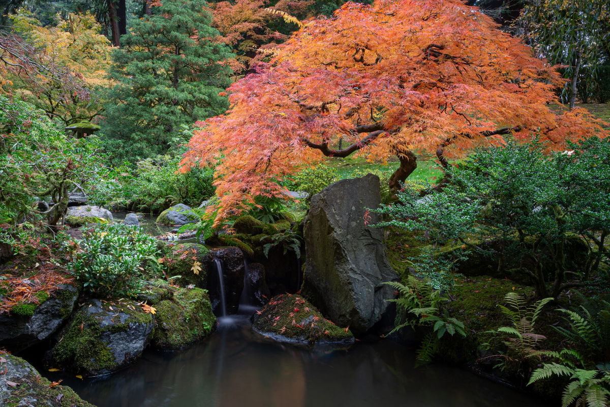
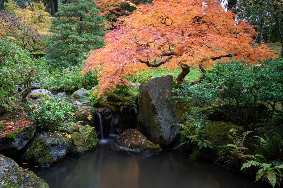
I was captivated by this tree at the Portland Japanese Garden. It’s not the famous one, but its placement near the tiny waterfall made for an interesting composition. Aside from the blown sky, the main challenges were waiting for people to stop taking pictures of it from the other side, and waiting for people walking on the little bridge to get to a different span so the camera would move. It’s a 5 second exposure for the water.
As I was shooting it, I noticed the lantern and decided to shoot with a plan to crop to “cram” the lantern, waterfall, and tree into the frame if possible.
Specific Feedback
I am always open to whatever feedback you all have. I do have some specific questions:
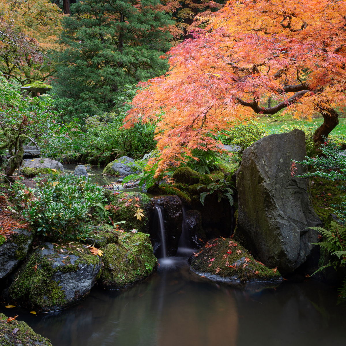
Is the composition too crammed and chaotic in the square crop?
Does the lantern present itself as an intriguing element after a moment? That was my goal…not the main subject, but ultimately the source (light, art, knowledge, life) of all that flows from it.
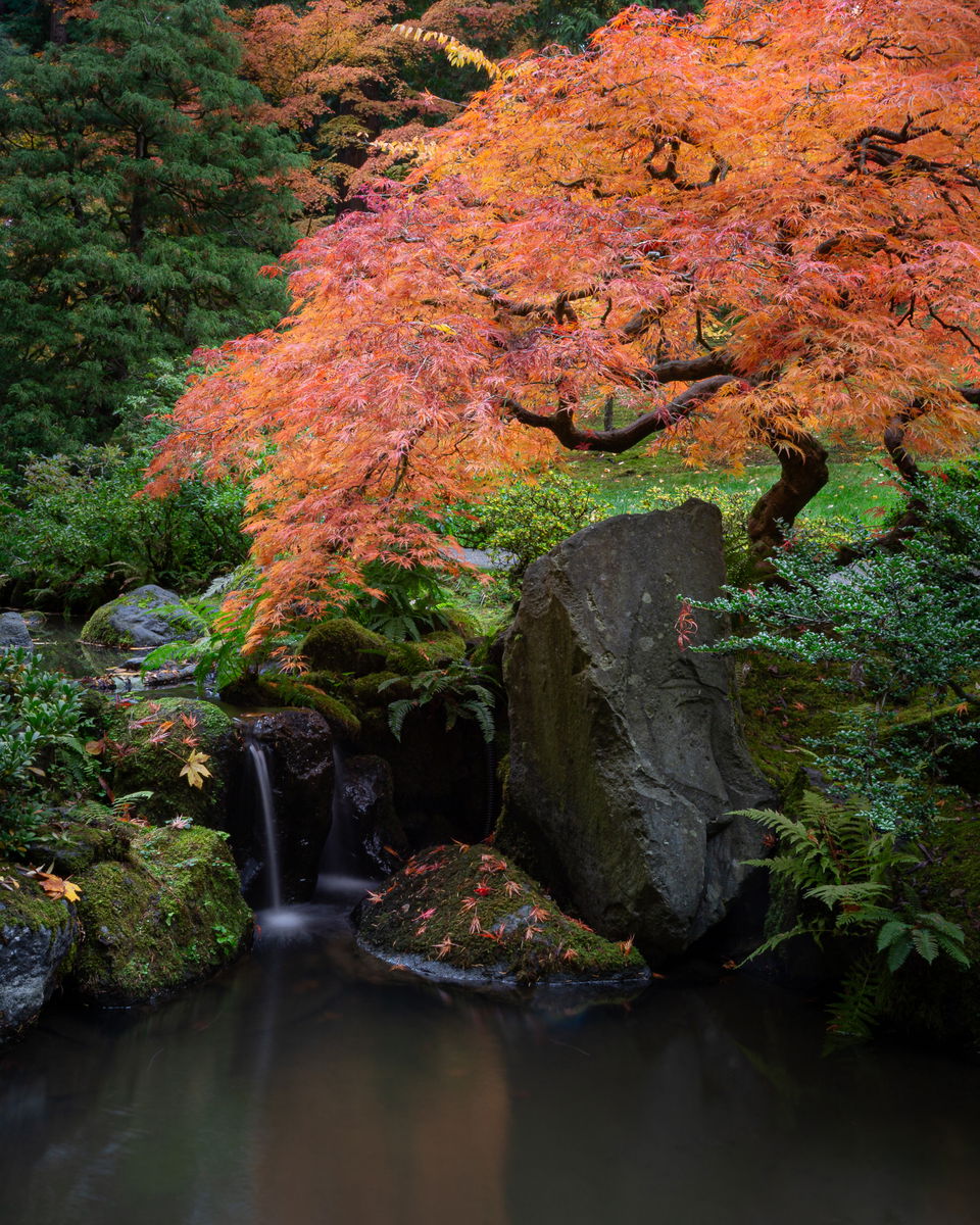
Does cutting off the top and right of the tree feel awkward in this context? There are many other crop possibilities, including one that just takes a bit off the top and right and stays in 4x6 aspect ratio, but I liked the square density of the square crop.
I have a wider crop (shown) that includes the full tree and the sky in the upper right. I “leafed over” similar sky in the upper left, but to me, that sky draws the eye away from the tree, waterfall, lantern too much.
Technical Details
Canon 5d3 with 24-105mm L at 28 mm
ISO 100, f/22, 5 second
Critique Template
Use of the template is optional, but it can help spark ideas.
Vision and Purpose:
Conceptual:
Emotional Impact and Mood:
Composition:
Balance and Visual Weight:
Depth and Dimension:
Color:
Lighting:
Processing:
Technical:
@Marylynne_Diggs I’ll go with the wider version here. But part of that draw is some of my typical landscape over portraiture view mentality. That orange tree is a subject of it’s own for sure. Not being there it is always impossible to critique on compositions in depth. As always, we take’m how we can get’em, so to speak.
I like both versions but lean toward the wider view…
Marylynne, I prefer the horizontal crop, to the square one. I feel the tree is the star of the show, so cutting it off does feel a little awkward. I don’t know your feelings about cloning, but you seem to be ok with some cloning since you said you leafed over some sky. So the sky in the UR should be an easy fix. I like the ss you’ve chosen for the water. The lantern works well in the 1x1 crop since it’s larger in the frame, but it kinda gets lost in the 3x2. I wouldn’t have even noticed it if you hadn’t mentioned it. I feel the tree is a little “hot”
I too prefer the horizontal version as it feels better balanced to me. Overall, the image appears to be a little too bright. 1/2 to 1 stop less exposure and I think it would be an improvement. Compositionally, it works well for me. Did you use a polarizer by chance? I think what I’m seeing in the foliage might be the result of reflections that a polarizer would have eliminated. Regardless, I’d be proud of this image. It’s quite lovely.
Thanks @Paul_Breitkreuz , @Michael_Lowe , and @Bret_Edge. What I love about this sight is the way it changes how I see image. For so long all of my images were way too dark and here I overcompensated a bit. I did lower the exposure and highlights in that first post, but only a smidge.
I am posting two alternatives:
One is a landscape orientation with a more cropping down from the top but not as severely as the square composition. I used the healing tool at full opacity to put leaf over some of the sky on the urc. In the Develop Module, it looks a bit like someone spilled a box of black bandaids in that corner, and I’m not sure it looks good at closer inspection, so I did crop down enough to get rid of most of them. I left some sky shining through to keep it real.
The other comp is a vertical 8x10 that makes the tree truly the subject. I do have a tendency to love a little thing in a frame so much that I make more of it than it can really hold (think mushrooms in my other images from the garden), and in this composition, I give up that lantern to let the tree shine on its own with the tiny waterfall.
I managed the hot tree and the overexpsure a little better in both of these. I didn’t use a polarizer (I was thinking about the water reflection too at the time) so there is likely still some sparkle in the leaves.
Let me know if you have a new preference. If the scene is to “landscaped garden” for your taste anyway, let me know that too.
Reposts at the top momentarily. I’m a little rusty here, and I can’t quite remember our norms on where to comment on our reposts and then place them at the top.
ML
I think your repost at the top is spot on, Marylynne. I really like what you’ve done with it and the slightly darker presentation addresses the issues I originally identified. Very nice!
Marylynne, I too vote for the post at the top. It’s very nicely balanced with the colorful tree and the quiet waterfall and pool. Based on your description, it sounds quite busy, so I expect that this restful view is better than being there…