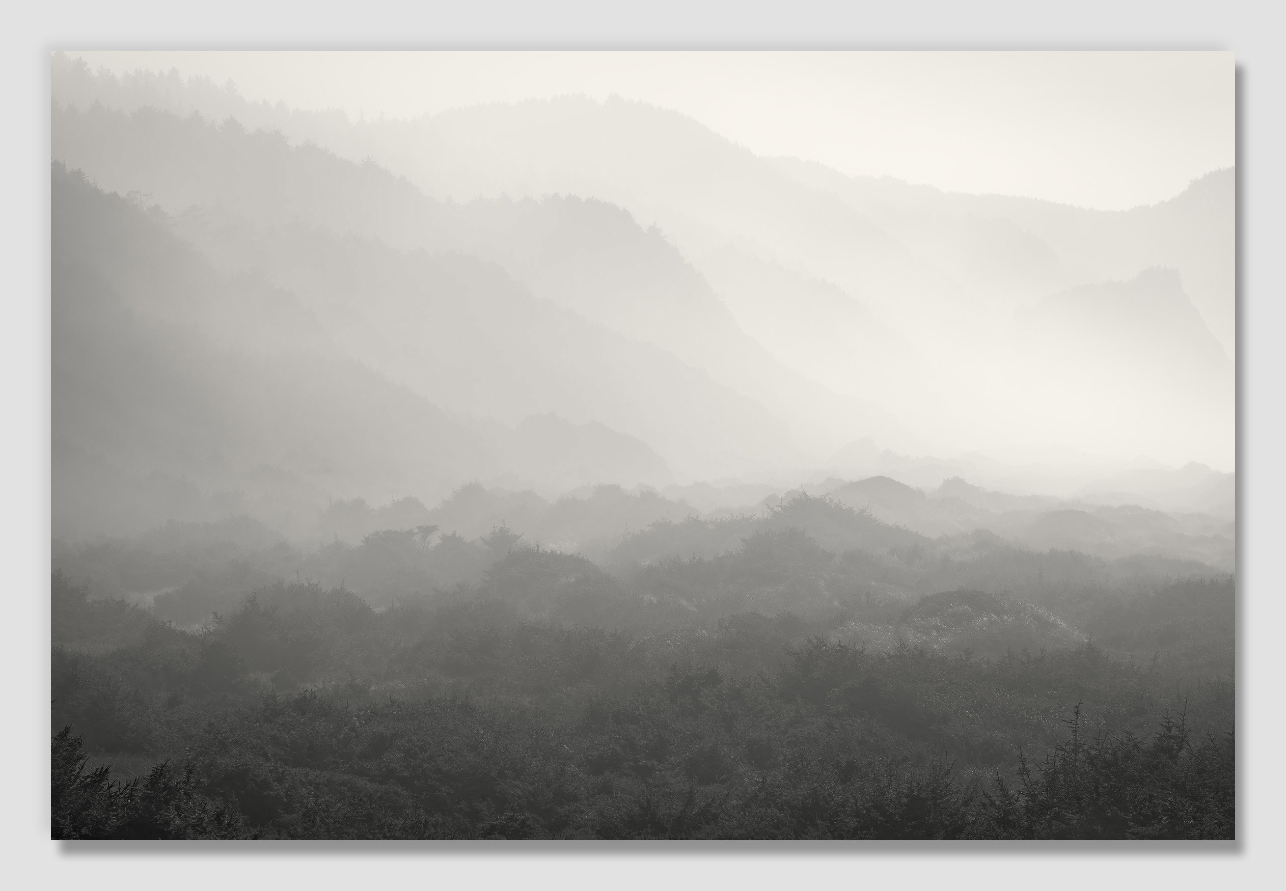
The photographer is looking for generalized feedback about the aesthetic and technical qualities of their image.
Description
Sometimes, from the confinement of this chaos I call my life, the camera becomes a sleeve with which I can wipe away the grime, and see through to the peace and quiet that lies beyond.
(I’m not sure why, but NPN shows images at full-size softer than they really are. If you want to see the correct sharpness, you can download the image to view.)
Specific Feedback
My hope was that the lines fog in the image would create a bit of a compelling mystery. Any suggestions on how to improve it are welcome.
I normally don’t tint black and white images warm, but here it just seemed to fit. Does that work, or would you recommend no (or a cool) tint?
Technical Details
NIKON Z 7II
NIKKOR Z 24-200 f/4-6.3 VR at 200 mm
1/500 sec. at f/16.0 and ISO 64
Critique Template
Use of the template is optional, but it can help spark ideas.
Vision and Purpose:
Conceptual:
Emotional Impact and Mood:
Composition:
Balance and Visual Weight:
Depth and Dimension:
Color:
Lighting:
Processing:
Technical:
Hello John. Wow, a very nice catch!! I love the layers created by trees and mountains in the fog. A lot is going on and at the same time it looks peaceful, quiet and mysterious. For me the tint works, making it soft and this fits with the fog, good choice.
I just wonder, maybe to make the trees in the bottom a bit softer, then the picture would be completely dreamy, like old japanese ink/water paintings. This is of course up to your own preference.
John, this is nicely dreamy/mysterious with a wonderful sense of depth. I do think that some darks dodging along the bottom 1/4th, bringing the misty view to the bottom would add to that feeling.
I find myself prey to the challenge of bias with my images. If I have a certain idea, I probably don’t move far enough in the other direction when suggested. It’s like clinging to an old, beloved but worn out, piece of clothing even when it’s obvious it needs to go.
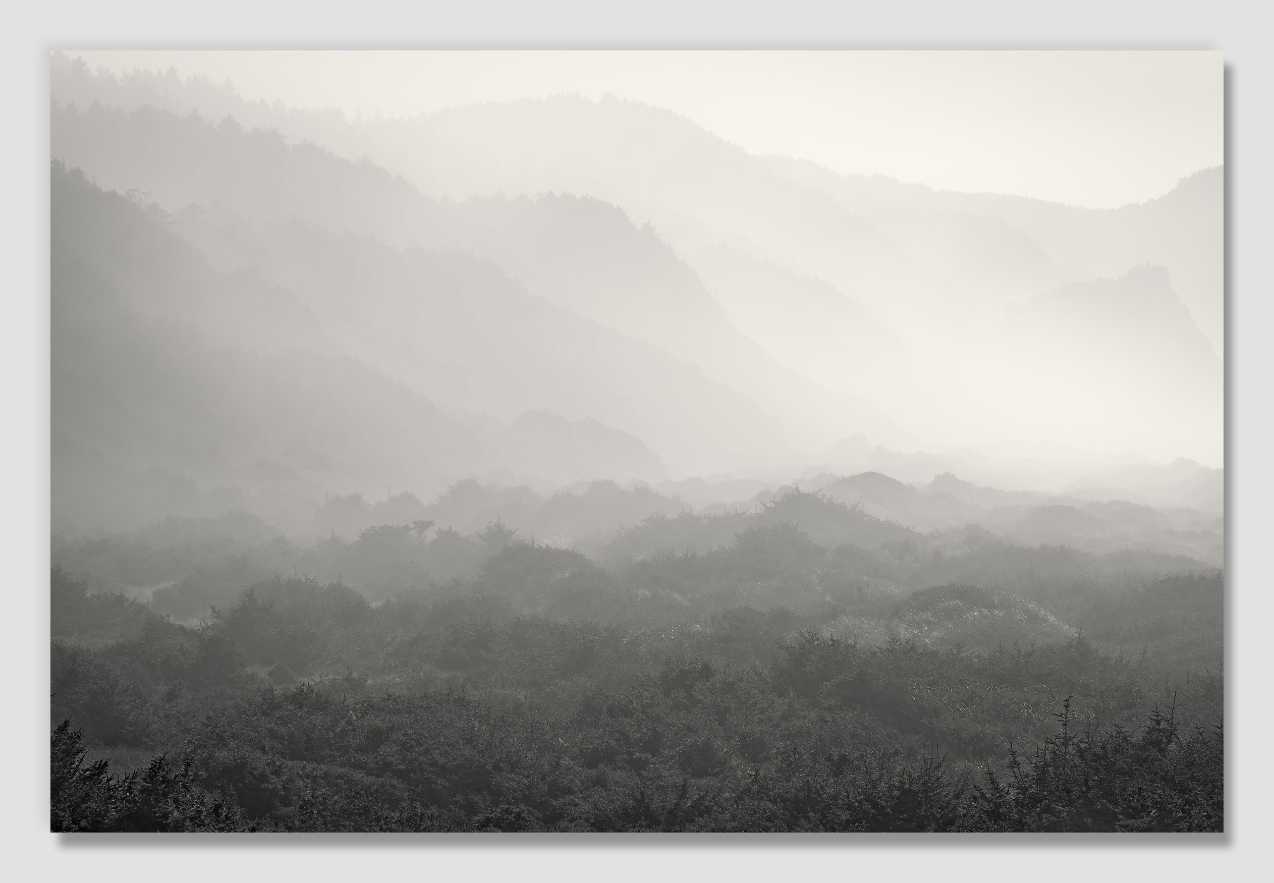
For the edit I posted, I did some quick adjustments to the end file. I’ll try going back to the beginning of processing where I did some of the original clarifying of that foreground and play with brightening/softening it more.
What an amazing and mysterious scene!! The tint feels perfect to me – there is something about the warmth that I can’t describe but it just works. I can’t tell if the vegetation is summer or winter and going monochrome makes it a fascinating puzzle. The atmosphere is wonderful and you brought it out so well. This belongs on a wall – in a high-end gallery!
I do have a preference for the softer version but I don’t think I would have thought to suggest it. And I had never noticed that the downloaded images are a bit sharper – interesting!
John, in the long run, it’s your vision that you want to satisfy and using that vision to try to get a particular response from the viewers. I also firmly believe that subtle change is always better than obvious changes.
John: @Diane_Miller almost took the words out of my mouth so I’ll just be lazy and ditto her comments. This was very well seen, conceived, captured and presented. Yes, the camera can be a soothing place of escape but also tranquility. That image certainly conveys that. >=))>
Hi John,
This image has a soft gentle vibe; with a pinch of mystery; that I find very inviting. I could see myself taking a seat and watching this scene unfold before my eyes as the fog/mist imparted it’s cool dampness while it slowly enveloped the landscape. Both versions are winners in my book, but I do slightly prefer the softer version as it just feels right to me. The processing; from the B&W conversion to the tinting; looks perfect IMO. My only suggestion is to print it and find some wall space. Beautifully done! I hear you on capturing the beauty of nature as it is my escape as well from the insanity that seems to be prevalent these days.
I’m the same way, John. But it’s also among the main reasons I love this site so much. People don’t hold back, and they challenge my assumptions, many of which, in my case, are a little simplistic or set in the stone I was carving in the field. Of course, the options later are so much fun to play with.
In the case of this image, I do like the softer gradient at the bottom. I totally get the instinct to create emphasis there, but I think what the more contrasty version did was add texture in an image that feels more like it is about lines, shape, and shade.
Nice work, and congrats on giving your bias a shove just in case.
ML
Hi John, I really like this picture. I think the soft toning at the bottom of the picture looks perfekt in this scene. The image makes you curious to see the landscape there. The composition is very beautiful, The warm tones used in its processing give it a mystical yet very calm feel. Viewers can wander (?) through the image without distraction and discover many details. Perfect — I really like it!