Project Images
Gallery Overview
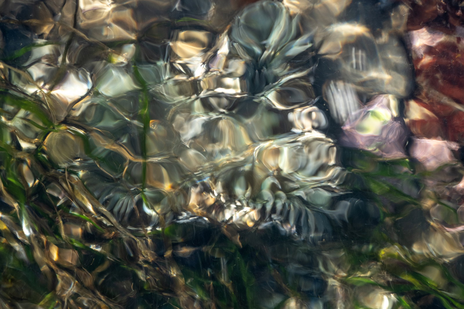
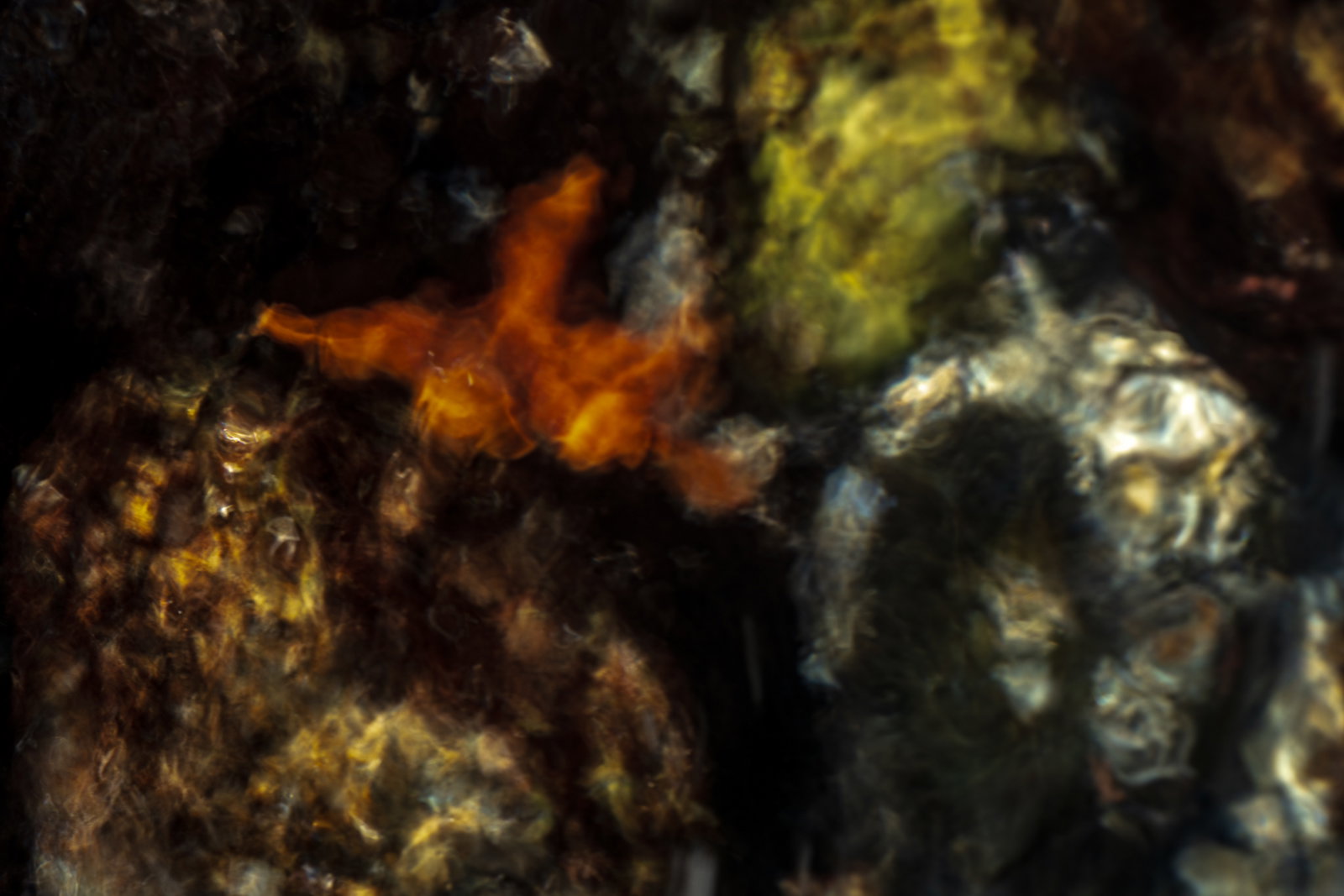
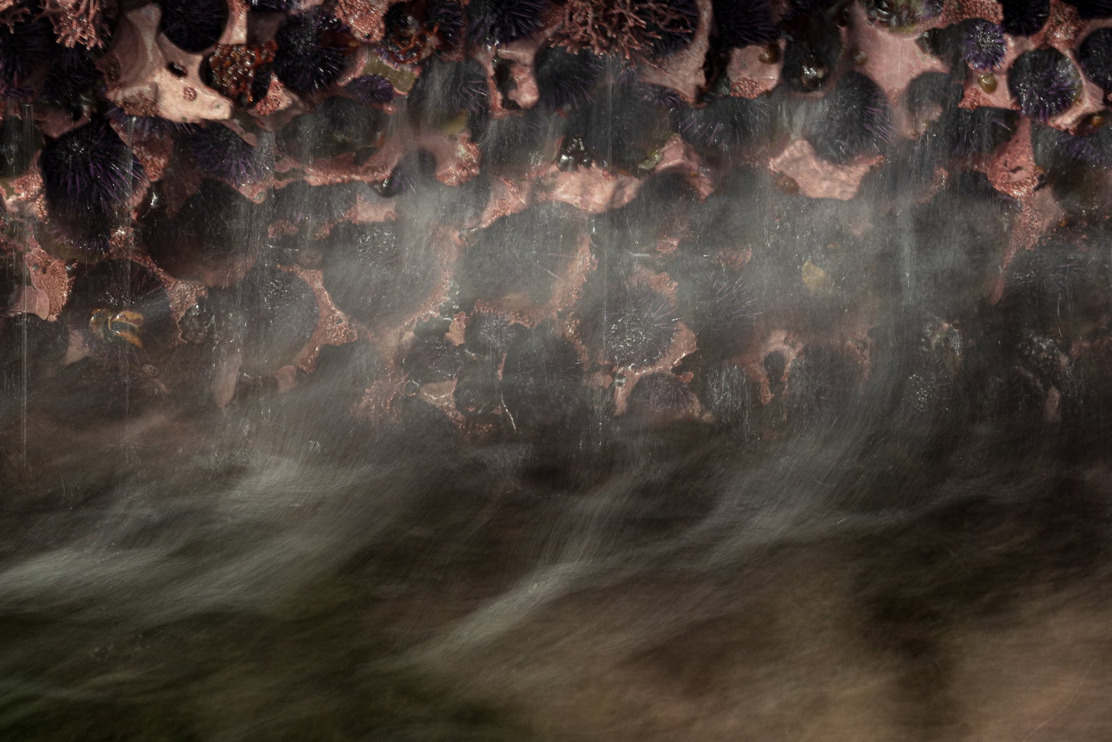
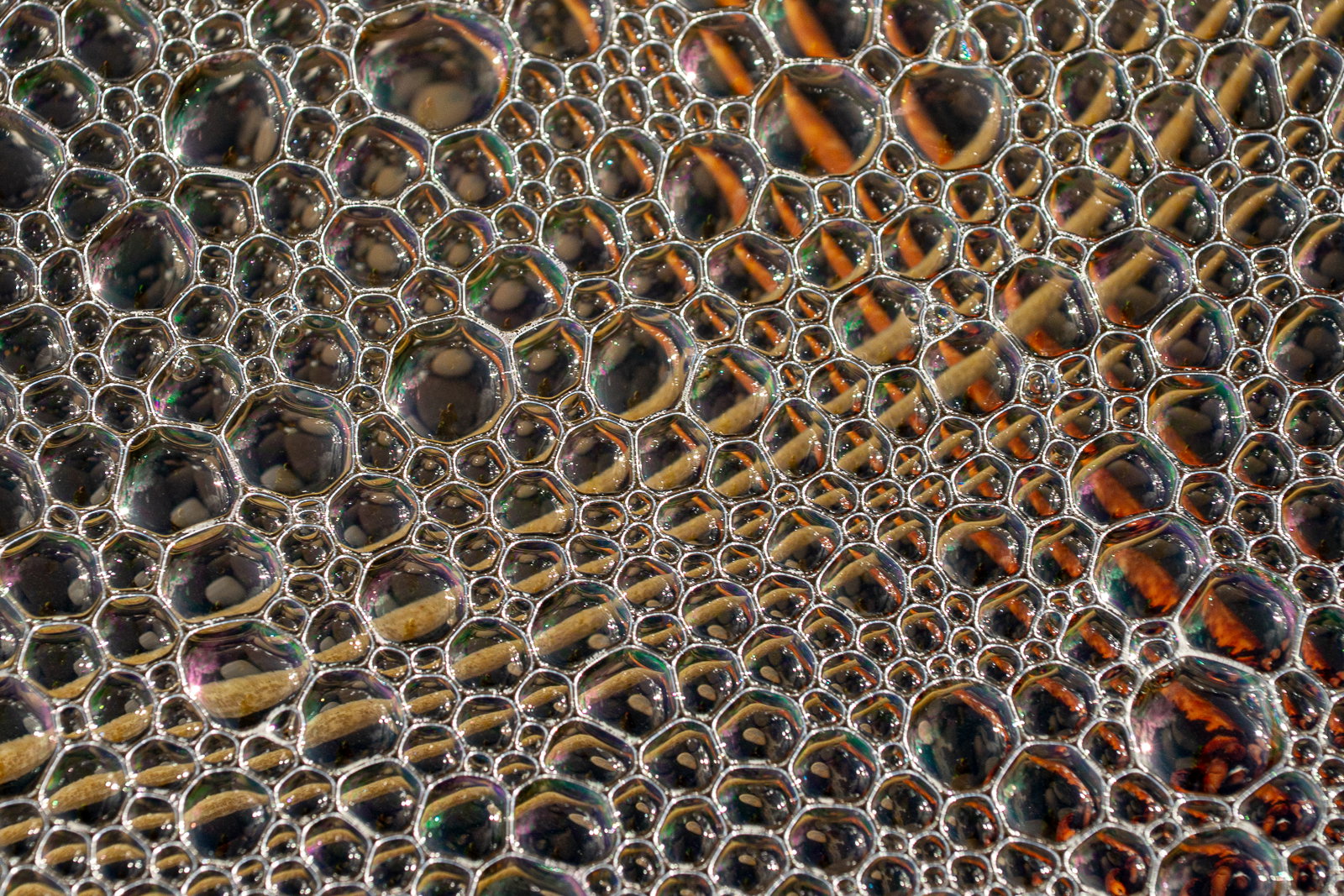


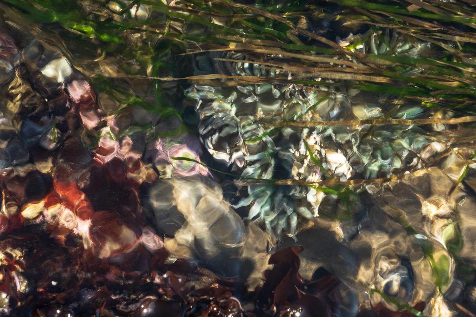
Individual Images
Image 1
Image 2
Image 3
Image 4
Image 5
Image 6
Image 7
Project Description
I’ve been working on a new area for me photographing in the tidal zones of the California coast. I typically shoot mountains and deserts.
Self Critique
This is very different kind of work for me, and I have really enjoyed the hours spent just searching the tidal pools which are very rich in subjects. I’m happy with where it is now, I’m looking for thoughts from people with fresh eyes on it and first impressions.
Creative Direction
This is a revision of my previous project I posted here after working with another photographer to edit it down and make it more cohesive as I prep to enter in for NLPA. I started taking pictures along the coast as I was inspired by Jennifer Renwick’s work, but I was also looking for a way to not repeat what she had done especially with her sea anemone work.
Specific Feedback
Cohesion, flow. Is there any singular image that doesn’t work in the grouping?
Intent of the project
Magazine Submission
Additional Details: First idea is a project for NLPA, eventually a larger collection of images for publication.