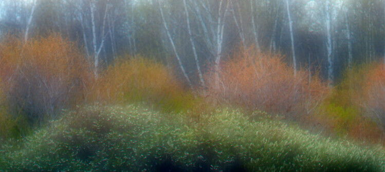
I have a series of spring images on a mildly foggy day. on our lake I augmented the blur a bit. I like the forms in the shot. Not sure if I over did the blur but I like impressionistic images.
i love the impressionist look on the photos.
You really got her some dramatic effect with some nice colors.
Maybe, just maybe in this case you did “overblur” the effect. It’s a matter of personal taste.
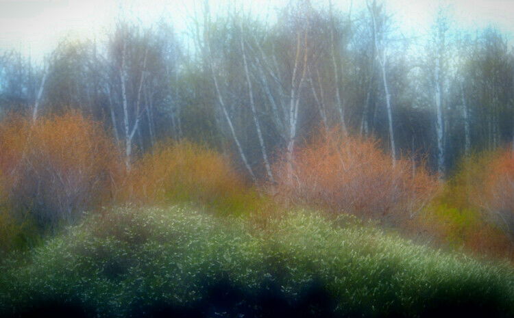
If this was my photo I would make a crop to something like 16x9 or closer to eliminate the sky.
I don’t think you overdid the blur if your goal was to create an impressionistic abstract image. And with the interesting colors, shapes and textures here, this image is a good candidate for this Orton Effect-like soft glow treatment. I really like what the soft glow has done to the green, orange and yellow vegetation here. This gives this image a very soft ethereal dream-like look that is quite appealing.
With that said, I think some aspects of the composition and processing are at odds with the ethereal, dreamy theme. The inclusion of the sky and the very dark black shadows at the bottom, introduces a high degree of contrast that just seems inconsistent with the rest of the image. The featureless sky is not helping, and I like the direction @joaoquintela has taken with the crop in his rework. It eliminates the starkness of the whites and blacks, and leaves just the more gentle pastel colors of the vegetation. The blur may be a bit a bit strong, but I think it’s within the bounds of personal taste for a pure abstract image.
I think that there could be an idea to keep the transition from the dark foreground through the colored parts to the white sky. But the sky part could be reduced.
This image does have an impressionistic mood that I find very relaxing and inviting, Mario. I do like where @joaoquintela was going with his crop as it allows the viewer to focus more on the dreamy colors and shapes in the scene.