Edit: Repost making some suggested changes. Comments in thread below.
Inspired in part by TJ’s recent"Stained Glass" image posted in Landscape Showcase AND for those who remember the images, Nancy Lea Sandy’s “Headwaters” images posted some years back on NPN 1.0 - Nancy Lea, you still out there?
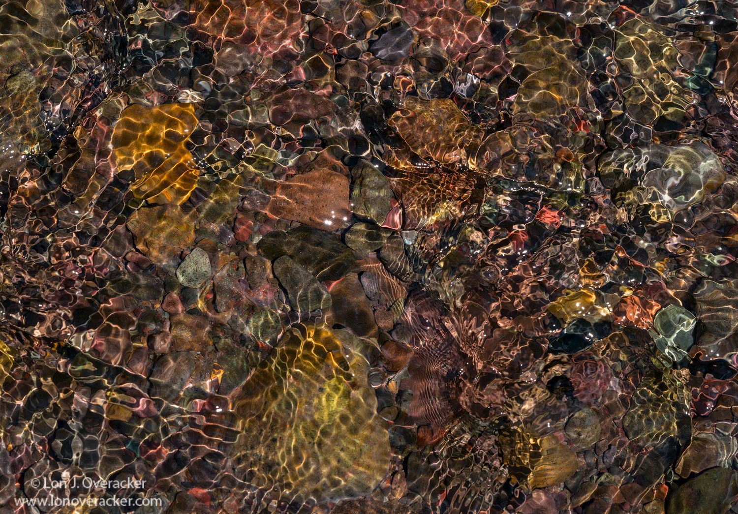
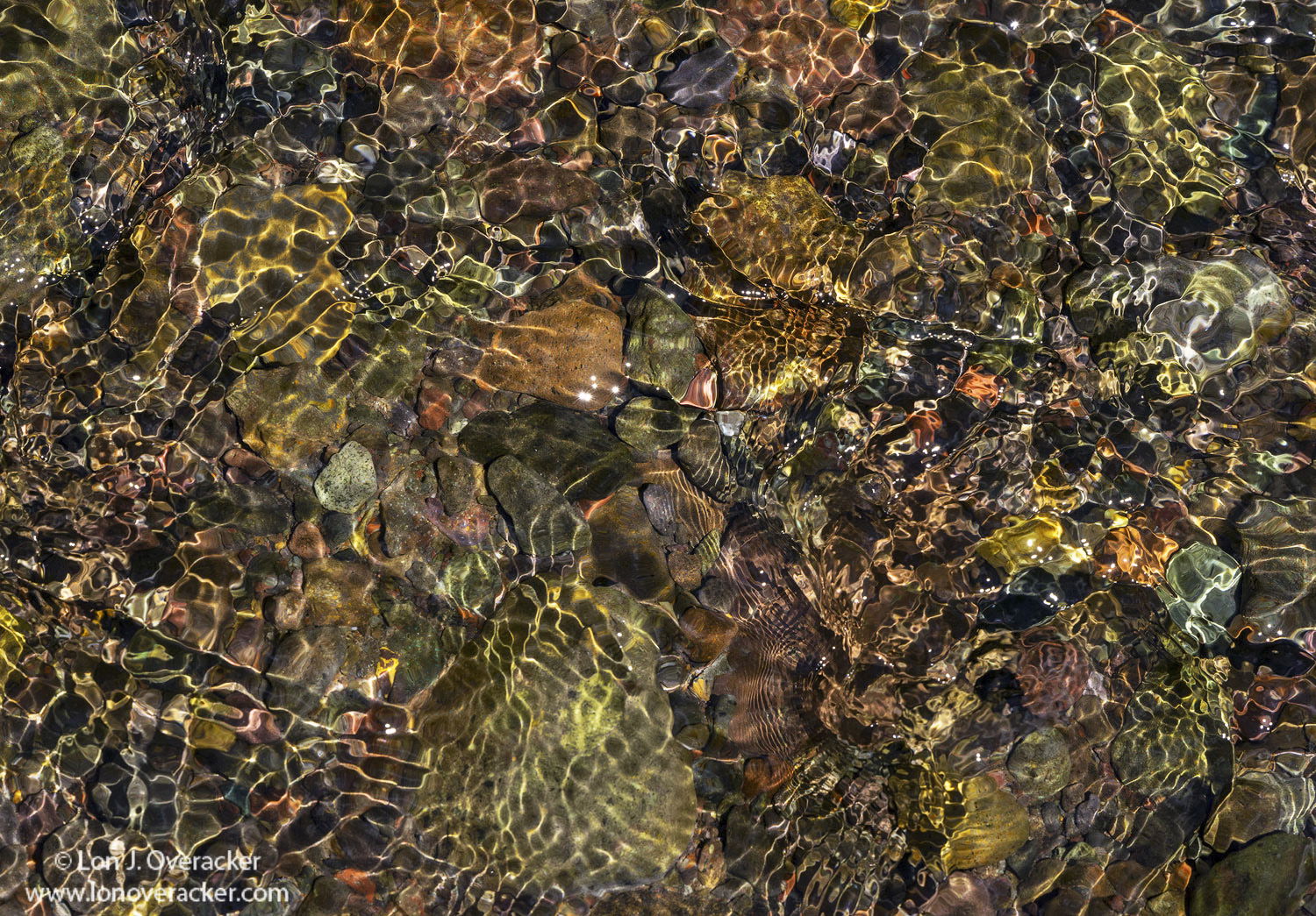
So I guess that makes my image unoriginal, but like TJ I love photographing water and anyone who knows me, I could capture images 24x7 regardless of time or day or conditions. This was actually captured at the same location as my image currently posted in Flora. We had stopped at this little spot for lunch on the east side of Sonora Pass. My grandson was playing in the creek and we were just relaxing. It was a bright, bluebird day around noon. Perfect! for catching glittering jewels in the shallow creek. I was pretty much just experimenting thinking of the above work and seeing what I could capture. I was very happy to see the patterns show up using a fast shutter speed.
There are many crops, but the inspiration to the title can be found in the lower right quadrant. Do you see it?
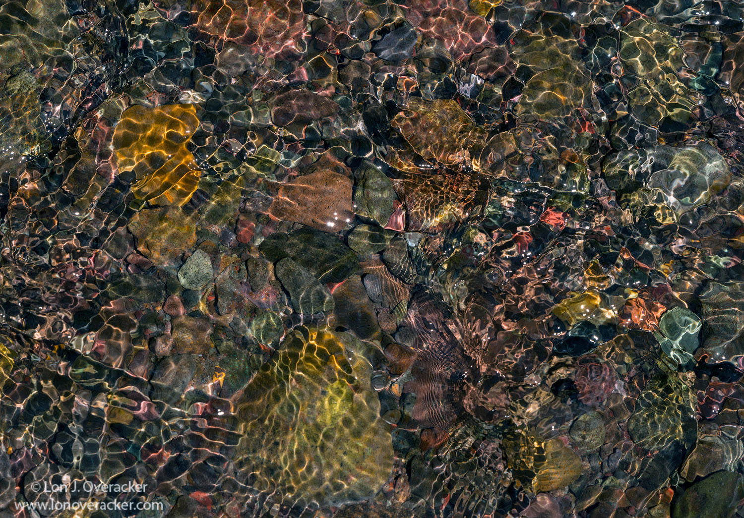
This is beautiful, Lon! The water adds a jewel-like sheen on the image. All of the colors and patterns keep me exploring the frame from corner to corner. Nicely done!
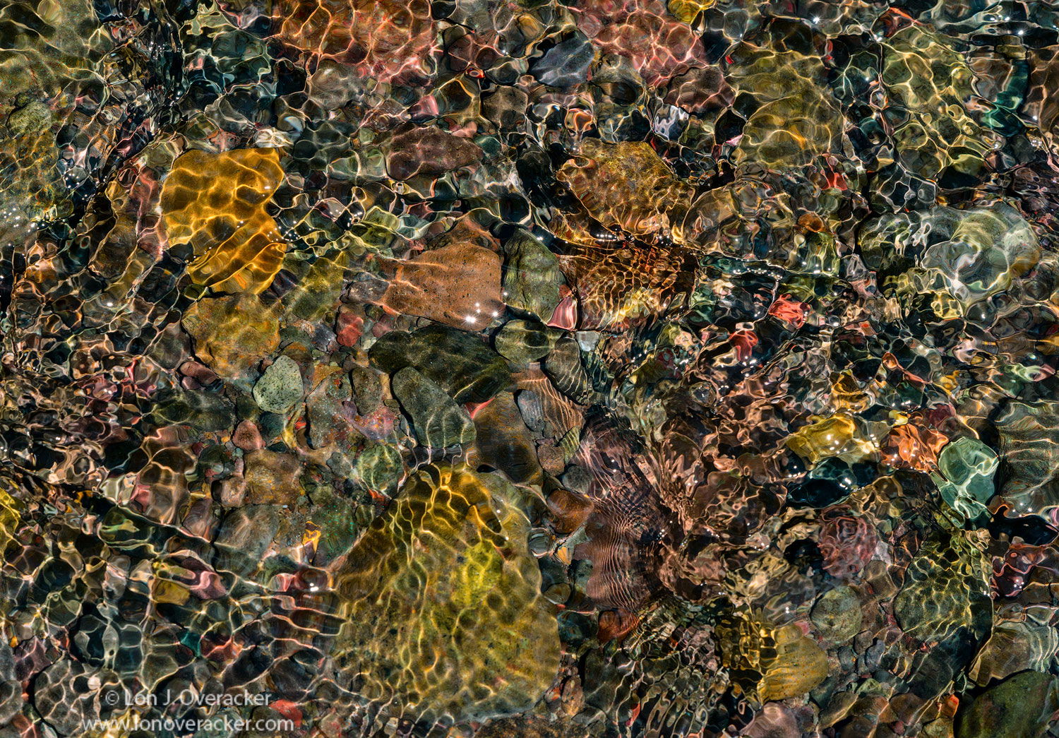
Oh, this looks great, Lon. I wondered what you doing over there as I was lounging on a rock. No nits, here. I do like Harley’s crop–perish the thought.
-P
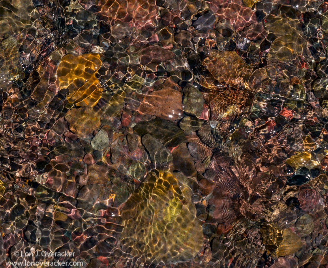
I don’t have much to say about this one. I often find that these images are fairly simple in the processing and don’t usually do too much work to them. The main thing that I do is play around with white balance and contrast, and then the color balance adjustment in photoshop.
I really enjoy this image. It has a lot of textures and designs to explore which is something that I enjoy about these scene shot with a wider focal length (relative to the one I posted). It has good flow too (snicker).
The only thing that jumped out at me is that it feels a little on the red side for my taste. I played around with it a little in PS and came up with this. It feels a little more neutral to me. You can see the adjustment I made on the file which is available here: https://www.dropbox.com/s/j8gb10dbw8y5w5k/lon.tif?dl=0
Wow, excellent feedback! It’s like having a live adviser right in Photoshop… well almost. It’s so, so helpful to get different eyeballs looking at things and this was a perfect example and exercise.
@TJ_Thorne - thanks! I never saw the red! Well, of course, but I saw all colors and didn’t see the cast until you pointed it out. I added a Selective Color layer to add +10 cyan, -3 magenta to the neutral tones. I suppose this looks more green when comparing side by side, but I think more neutral than my original. Awesome. Of course, we’re in that personal choice arena, but I most certainly appreciate the fresh look and feedback
Same thing @Igor_Doncov. Putting versions side by side and clearly the original is quite a bit dull. I added some TK midtone Lum masks to boost luminosity; others to add some contrast - oh, and boosted vibrance as well.
It’s great to see what is possible in an image. And how others feel and think about it. So it’s good to follow your own thoughts and feeling and try to learn from others.
I love it, Lon. The variety of water abstracts is always fascinating to me. What’s great about this is that there’s no part of it recognizable’ I love it’s complexity, and I think @Igor_Doncov did a great job giving it a little zing.
Lon,
First off great eye to spot and capture this mesmerizing image for the rest of us to enjoy. This is pure eye candy as my eye wanders around the scene and savors all those lovely details and colors. This would make an awesome puzzle. It might be just me because no one else has mentioned it, but the repost looks a little cyan to me. Either way this is flat out gorgeous.
Lon, this simply brilliant, an amazing job of “seeing” on your part. I agree with @Igor_Doncov, this needed more luminosity and bolder colors to get the most vitality out of it. I think the colors you have in your re-post look great, the sift away from red and more towards green creates some beautiful color contrast. What a wonderful “mosaic” look this image has !!!
Thanks for the compliment. Just to be clear though, for those who have attempted this sort of image knows that one can not “see” what they’re shooting. The end result is due to a high shutter speed that freezes the waters while catching the various reflections at that moment in time. Staring at the moving water only reveals clear moving water with stones visible a couple inches beneath the surface. Just like the eye can’t see silky water, the eye also can’t freeze the motion either; it’s all processed for us visually to see the motion and all those things instantaneously.
Not unlike the ICM technique now - one can’t see or predict the results until you review on your lcd or on the computer later.
Having said all that, I guess there is some vision in recognizing the elements that can produce such images.